ABM KPIs in 2026: The 12 Metrics That Actually Predict Pipeline
Most ABM dashboards measure activity instead of revenue. Here are the 12 ABM KPIs that actually predict pipeline in 2026 — with benchmarks, formulas, and the traps to avoid.
ABM KPIs in 2026: The 12 Metrics That Actually Predict Pipeline
TL;DR
- Account-based marketing dies when teams measure it like demand gen. MQL volume, raw impressions, and total form fills are noise.
- The ABM KPIs that predict pipeline fall into four buckets: coverage, engagement, conversion, and revenue impact. Track 3 from each — not 47 from one.
- Target Account Engagement Rate, Account Penetration, and Pipeline Velocity within Tier 1 are the three metrics most strongly correlated with ABM ROI in 2026 benchmarks.
- The number one mistake: reporting "accounts engaged" without weighting by ICP fit or buying committee depth. A CEO opening one email is not the same as four buying-committee members downloading a pricing page.
- Build your dashboard around leading (engagement, penetration) and lagging (pipeline, win rate, ACV) indicators. If you only watch lagging metrics, you find out you failed six months too late.
What are ABM KPIs and why do they differ from demand gen metrics?#
ABM KPIs measure how a finite list of named accounts moves through awareness, engagement, opportunity, and revenue — at the account level, not the lead level. Demand gen asks "how many MQLs did we generate this month?" ABM asks "how many of our 250 target accounts have three or more buying-committee members actively engaging?"
That difference rewrites the whole dashboard. In demand gen, more is better. In ABM, more of the wrong accounts is worse because it dilutes sales focus and tanks conversion rates downstream.
If you're new to the discipline, start with the revenue operations glossary entry — ABM only works inside a RevOps function that's already aligned on account definitions and pipeline stages.
Which ABM KPIs actually predict pipeline in 2026?#
After reviewing benchmark data from Gartner, Forrester, and the ITSMA/Momentum ABM Council, twelve metrics consistently separate ABM programs that hit pipeline targets from those that don't. Here they are, grouped by the funnel stage they predict.
Coverage KPIs (do we have what we need to engage?)#
1. Account Coverage Rate — % of target accounts with at least 80% of the buying committee identified and enriched in CRM. Below 60% coverage, every downstream metric is unreliable. Use a B2B database or data enrichment workflow to close gaps before campaign launch.
2. Contact Data Accuracy — % of contact records with verified, deliverable email and current title. Stale data is the silent killer of ABM. If your verifier shows under 92% deliverable, pause the campaign and rerun email verification.
3. ICP Fit Score Distribution — % of accounts in Tier 1 / Tier 2 / Tier 3 buckets. Healthy distribution: 15-20% Tier 1, 30-40% Tier 2, rest Tier 3. If 80% of your list is Tier 1, your scoring model is broken.
Engagement KPIs (are the right people paying attention?)#
4. Target Account Engagement Rate — % of target accounts with measurable, weighted engagement in the last 30 days. This is the single best leading indicator of pipeline 90 days out.
5. Account Penetration Depth — average number of distinct buying-committee members engaged per active account. Single-thread engagement converts at 4-6%. Four-thread engagement converts at 22-28%.
6. Engagement Velocity — change in engagement score week-over-week. A flat or declining number on Tier 1 accounts is a five-alarm fire.
Conversion KPIs (are engaged accounts becoming opportunities?)#
7. Engaged-to-Opportunity Conversion Rate — % of engaged accounts that become qualified opportunities within 60 days. Benchmark: 8-14% for Tier 1, 3-6% for Tier 2.
8. Time to Opportunity — median days from first meaningful touch to opportunity creation. Shorter is not always better; trend matters more than absolute number.
9. Meeting-to-Opportunity Rate — % of first meetings that progress to a validated opportunity. Below 35% means SDRs are booking unqualified meetings.
Revenue impact KPIs (did this actually drive money?)#
10. Pipeline Generated from Target Accounts — total ACV in pipeline sourced from the named list. Compare against the same period of non-ABM pipeline to prove incremental lift.
11. Win Rate within Target Accounts — closed-won opportunities ÷ all opportunities from target accounts. Strong ABM programs run 1.4x–1.8x the company-wide win rate.
12. Average Contract Value (ACV) Lift — ACV of target-account deals vs. non-target deals. If your Tier 1 deals don't close at materially higher ACV, your tiering is cosmetic.
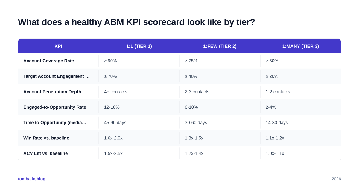
What does a healthy ABM KPI scorecard look like by tier?#
The same metric carries different weight depending on tier. A 1:1 (strategic) program lives or dies on penetration depth; a 1:many (programmatic) program lives or dies on engagement rate and reach. Here is what the scorecard should target.
| KPI | 1:1 (Tier 1) | 1:few (Tier 2) | 1:many (Tier 3) |
|---|---|---|---|
| Account Coverage Rate | ≥ 90% | ≥ 75% | ≥ 60% |
| Target Account Engagement Rate (30d) | ≥ 70% | ≥ 40% | ≥ 20% |
| Account Penetration Depth | 4+ contacts | 2-3 contacts | 1-2 contacts |
| Engaged-to-Opportunity Rate | 12-18% | 6-10% | 2-4% |
| Time to Opportunity (median) | 45-90 days | 30-60 days | 14-30 days |
| Win Rate vs. baseline | 1.6x-2.0x | 1.3x-1.5x | 1.1x-1.2x |
| ACV Lift vs. baseline | 1.5x-2.5x | 1.2x-1.4x | 1.0x-1.1x |
| Cost per opportunity (relative) | High | Medium | Low |
The point is not to hit every cell — it's to know which cells matter for your program type. A 1:1 program with great engagement but a 1.0x win rate is failing. A 1:many program with mediocre penetration but 1.2x ACV lift is winning.
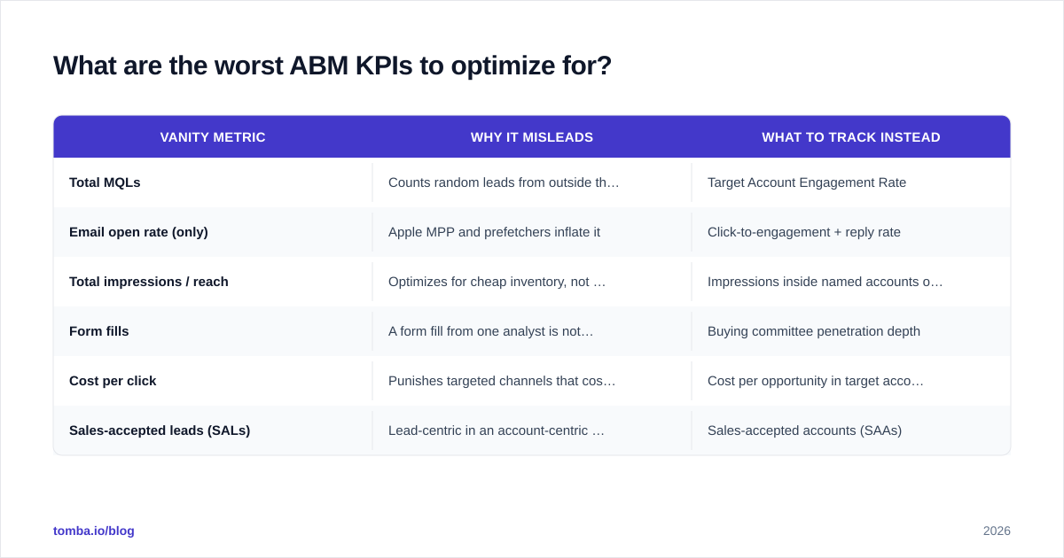
What are the worst ABM KPIs to optimize for?#
Some metrics survive in ABM dashboards out of habit. They actively mislead. Here are the ones to delete from your weekly review.
| Vanity metric | Why it misleads | What to track instead |
|---|---|---|
| Total MQLs | Counts random leads from outside the target list | Target Account Engagement Rate |
| Email open rate (only) | Apple MPP and prefetchers inflate it | Click-to-engagement + reply rate |
| Total impressions / reach | Optimizes for cheap inventory, not accounts | Impressions inside named accounts only |
| Form fills | A form fill from one analyst is not a buying signal | Buying committee penetration depth |
| Cost per click | Punishes targeted channels that cost more but convert | Cost per opportunity in target accounts |
| Sales-accepted leads (SALs) | Lead-centric in an account-centric motion | Sales-accepted accounts (SAAs) |
If your last ABM QBR celebrated MQL growth, you measured demand gen with an ABM label on it.
How do you actually instrument these ABM KPIs?#
You need three layers of plumbing before any dashboard works.
1. Identity resolution. Every touch — ad impression, email open, site visit, content download, meeting accepted — must map to an account, not a lead. Reverse-IP and identity-graph tools handle anonymous web traffic; tools like website visitor reveal and a CRM-side account-stitching workflow handle the rest.
2. Engagement scoring. Weight signals by intent. A pricing page visit is worth 10x a blog visit. A demo request from a VP is worth 5x the same request from an intern. Most teams overweight volume and underweight title seniority.
3. Buying committee mapping. Before scoring engagement depth, you have to know who is the buying committee. Use a LinkedIn finder or domain search to pull the full org chart at each target account, then tag roles (economic buyer, champion, blocker, end user) in CRM.
Once those three layers exist, the twelve KPIs above become trivially calculable from your warehouse.

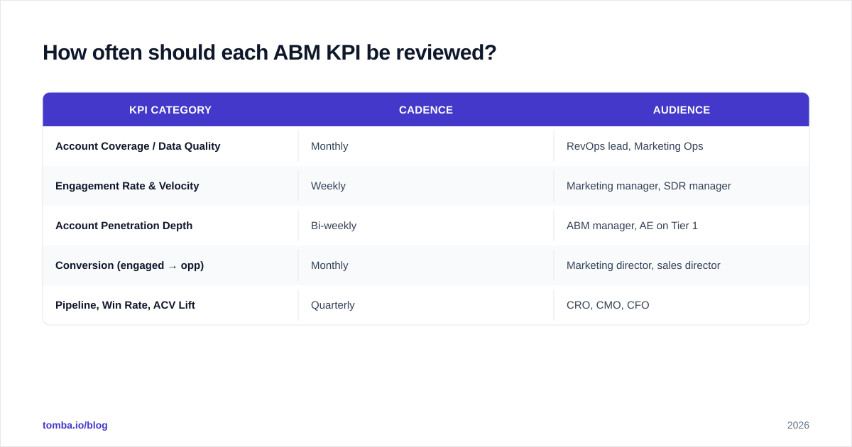
How often should each ABM KPI be reviewed?#
Mismatched review cadence is why most ABM dashboards become wallpaper. Coverage metrics change slowly; engagement metrics change daily. Review accordingly.
| KPI category | Cadence | Audience |
|---|---|---|
| Account Coverage / Data Quality | Monthly | RevOps lead, Marketing Ops |
| Engagement Rate & Velocity | Weekly | Marketing manager, SDR manager |
| Account Penetration Depth | Bi-weekly | ABM manager, AE on Tier 1 |
| Conversion (engaged → opp) | Monthly | Marketing director, sales director |
| Pipeline, Win Rate, ACV Lift | Quarterly | CRO, CMO, CFO |
A common failure pattern: CMO asks for pipeline numbers weekly, so the team optimizes the noise. Pipeline lift takes 60-90 days to register. Leave it on a quarterly cadence and watch engagement weekly instead.
What benchmarks should you use to know if your numbers are good?#
Internal benchmarks always beat external ones, because your ICP, ACV, and sales cycle are unique. Build a 90-day rolling baseline before any campaign, then measure lift against your own numbers.
That said, external benchmarks from ITSMA/Momentum, the LinkedIn B2B Institute, and the TOPO/Gartner ABM Maturity Model are useful for sanity checks. The 2025-2026 figures we keep seeing across credible studies:
- ABM programs report 1.7x higher win rate vs. non-ABM channels at the same companies.
- 76% of ABM marketers see higher ROI from ABM than other marketing investments — but only 34% can quantify the lift, which is a measurement problem, not a program problem.
- Median time-to-pipeline-impact: 5-7 months for new ABM programs. If you expect results in month two, you'll kill a working program.
How do you tie ABM KPIs to sales-side activity?#
The dashboard is only half the story. ABM KPIs collapse the moment marketing engagement doesn't translate into prioritized sales outreach. Two practices keep the loop closed.
Engagement-triggered SDR routing. When an account crosses an engagement threshold, it routes to the named AE/SDR with the engaged contacts pre-loaded. Pair with a bulk email finder and verified phone data to ensure outreach hits a working channel within the same business day. For phone-heavy motions, layer in a phone finder so SDRs are not blocked on missing data.
Shared scorecards. Marketing reports engagement; sales reports follow-up SLA on engaged accounts. Both numbers live on the same dashboard. If marketing engagement is up but sales-touched-within-48-hours is down, the program is leaking at the handoff, not at the top.
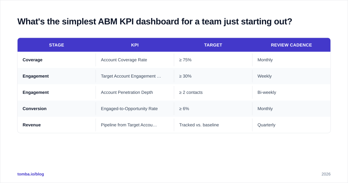
What's the simplest ABM KPI dashboard for a team just starting out?#
If you're shipping your first ABM program in 2026, do not build the full 12-KPI scorecard on day one. Start with five.
| Stage | KPI | Target | Review cadence |
|---|---|---|---|
| Coverage | Account Coverage Rate | ≥ 75% | Monthly |
| Engagement | Target Account Engagement Rate (30d) | ≥ 30% | Weekly |
| Engagement | Account Penetration Depth | ≥ 2 contacts | Bi-weekly |
| Conversion | Engaged-to-Opportunity Rate | ≥ 6% | Monthly |
| Revenue | Pipeline from Target Accounts | Tracked vs. baseline | Quarterly |
Five metrics, one page, one weekly review. You can add the other seven once the first five are stable and trusted by sales leadership. Adding everything at once produces a dashboard nobody reads.
How does data quality break ABM KPI reporting?#
Bad contact data is the most common reason ABM KPIs lie. Three failure modes show up repeatedly.
False engagement. An "engaged contact" who left the company eight months ago shows up as a buying-committee signal. Penetration depth looks healthy; pipeline doesn't follow. Run a catch-all verifier sweep against your target-account contact list every quarter.
Missed engagement. A new VP joined the account, visited the pricing page twice, and isn't in your CRM. Your engagement score reads zero. Use data enrichment on a rolling basis to keep the committee roster current.
Wrong account stitching. "John Smith @ Acme" engages, but your CRM has him on the parent company. Engagement attributes to the wrong tier. Periodically audit account-to-contact mapping; a domain search cross-check catches most drift.
If you fix only one thing this quarter, fix data quality. Every other KPI is downstream of it.
What changes about ABM KPIs in 2026 vs. 2024?#
Three shifts matter for how you build the scorecard this year.
1. Email open rates are officially dead as a primary metric. Apple Mail Privacy Protection, Gmail prefetching, and AI summarizers have rendered opens uninterpretable. The smart move was completed in 2024 — replace with reply rate and click-to-engagement.
2. Intent data is finally affordable enough to weight into engagement scores. Third-party intent (G2, TrustRadius, Bombora) is now a standard input, not a premium add-on. Build it into your engagement-score formula or you're flying with one eye closed.
3. AI-generated content has compressed the top of funnel. Generic outreach gets ignored at higher rates than ever. The KPIs that punish low-quality activity (reply rate, meeting acceptance rate, opportunity conversion) matter more; the KPIs that reward volume (sends, impressions) matter less.
Together, these shifts push the scorecard further toward engagement quality and buying-committee depth and away from lead volume.
Bringing it together#
The ABM programs that win in 2026 share three traits: they measure accounts, not leads; they weight engagement by ICP fit and buying-committee role; and they review leading indicators weekly and lagging indicators quarterly.
If your current dashboard is heavy on MQL volume and impressions, you don't have an ABM measurement problem — you have a demand gen dashboard with the wrong label on it. Strip it back to the five-metric starter scorecard above, get sales to co-own it, and rebuild from there.
The ABM teams hitting 1.7x win-rate lift in 2026 are not running more campaigns. They're measuring fewer things, better.
Get your ABM data right before your dashboard does.
Account coverage and contact accuracy are the foundation underneath every ABM KPI on this page. If your buying-committee data is stale, every downstream metric lies. Tomba's Email Finder helps ABM teams enrich target-account contact lists with verified emails, titles, and direct dials — the Tomba pricing starts free and scales to enterprise-grade bulk runs. Pair it with the Tomba API to keep your CRM-side buying-committee data current automatically. Stop measuring engagement against a contact list that's 30% stale — fix the inputs, and the KPIs start telling the truth.
Get the Tomba newsletter
Practical outbound tactics and product updates — once every two weeks.
About the author