Best Sales Dashboards in Tableau: 2026 Templates & Setup Guide
The best sales dashboards in Tableau turn messy CRM data into decisions. Here are the templates, KPIs, and data-quality fixes that make them work in 2026.

Best Sales Dashboards in Tableau: 2026 Templates & Setup Guide
TL;DR
- The best sales dashboards in Tableau answer one question per view — pipeline health, rep performance, or forecast accuracy — instead of cramming 20 metrics onto one screen.
- Four template types cover 90% of sales teams: pipeline, activity, forecast, and win/loss. Build those first, then specialize.
- Tableau's strength is depth and blending; its weakness is cost and the learning curve. Cheaper alternatives exist if you only need basic CRM charts.
- A dashboard is only as honest as the data behind it. Stale contacts, bad emails, and missing firmographics quietly corrupt every chart.
- Fix the source data first — enrich and verify your CRM records — then the dashboard math takes care of itself.
A sales dashboard is like the dashboard in your car. It does not drive for you, but if the fuel gauge lies, you will run out of gas at the worst possible moment. Most "bad dashboard" complaints are not really about Tableau — they are about the data feeding it. This guide covers both: the best sales dashboards Tableau teams actually build in 2026, and how to keep the numbers trustworthy.
What makes a sales dashboard "good" in Tableau?#
A good dashboard is decisive. You should be able to glance at it and know what to do next. That sounds obvious, but most dashboards fail it — they show everything and recommend nothing.
The best sales dashboards in Tableau share four traits:
- One job per view. A pipeline view shows pipeline. A forecast view shows forecast. Mixing them forces the reader to mentally untangle two stories at once.
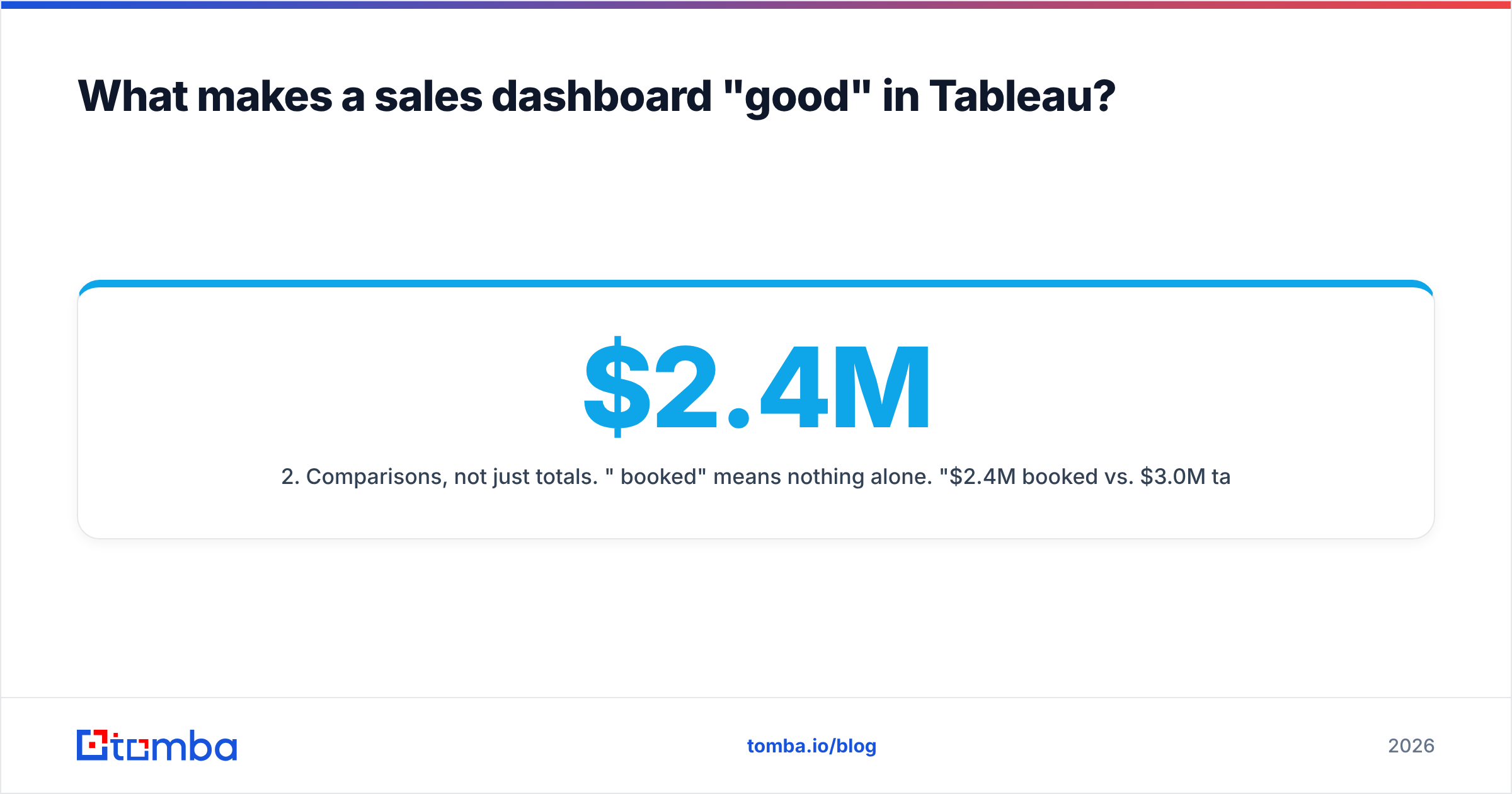
- Comparisons, not just totals. "$2.4M booked" means nothing alone. "$2.4M booked vs. $3.0M target, down 8% from last quarter" means something.
- Drill-down on demand. Tableau's filter actions let a rep click their own name and see only their deals. The summary stays clean; the detail is one click away.
- Refresh you can trust. A dashboard that updates nightly but pulls from a CRM full of bounced emails and duplicate accounts is precise about the wrong numbers.
That last point is where most teams lose. According to Gartner, data quality issues cost organizations millions per year in wasted effort and bad decisions. Your Tableau workbook can be flawless and still mislead if the CRM underneath it is dirty.

What are the best sales dashboard templates to build first?#
Start with the four templates below before you build anything custom. They map to the questions every sales leader asks weekly, and each one is a standard, well-documented Tableau pattern.
1. Pipeline health dashboard#
This is the most-requested sales view. It shows open opportunities by stage, deal size, and age. Use a funnel or stacked bar for stage distribution, and a scatter plot of deal age vs. value to surface stalled deals. Add a "days in current stage" calculated field and color anything over your benchmark in red.
2. Rep activity & performance dashboard#
Tracks calls, emails, meetings, and bookings per rep. The honest version normalizes by working days and shows activity and outcomes side by side — high activity with low conversion is a coaching signal, not a reward. This is where data quality bites hardest: if half your contacts have wrong emails, "emails sent" looks fine while replies crater.
3. Forecast accuracy dashboard#
Compares forecasted revenue to actuals over time, broken down by rep and segment. The key metric is the gap between commit and close, trended across quarters. Tableau's table calculations make rolling-quarter accuracy easy to compute.
4. Win/loss analysis dashboard#
Breaks closed deals into won vs. lost by reason, competitor, segment, and source. This is the dashboard that changes strategy — it tells you which segments to double down on and which to walk away from.
How do the best Tableau sales dashboard options compare?#
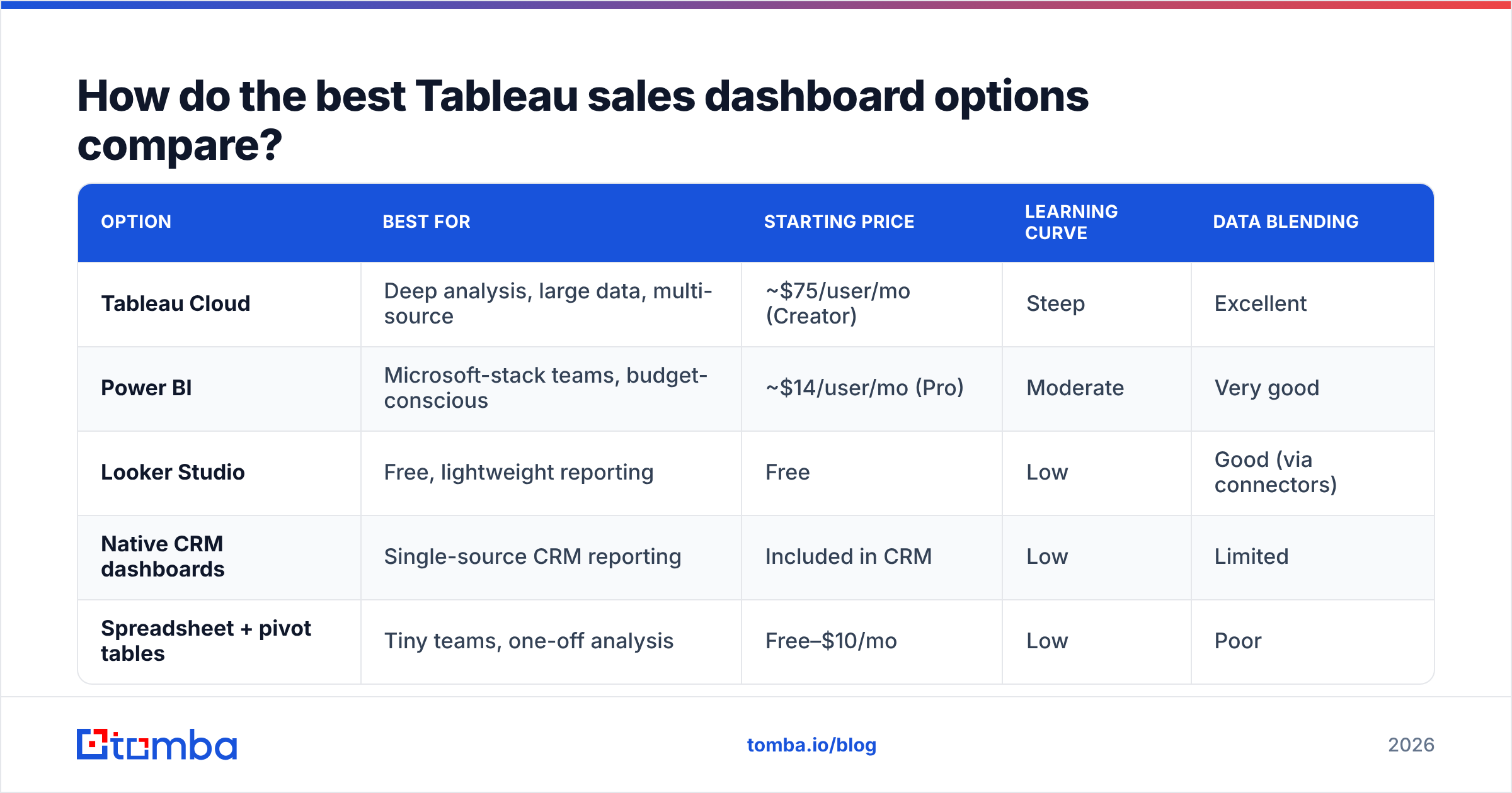
Tableau is not the only way to build sales dashboards, and it is not always the right one. Here is an honest comparison of the main routes teams take in 2026.
| Option | Best for | Starting price | Learning curve | Data blending |
|---|---|---|---|---|
| Tableau Cloud | Deep analysis, large data, multi-source | ~$75/user/mo (Creator) | Steep | Excellent |
| Power BI | Microsoft-stack teams, budget-conscious | ~$14/user/mo (Pro) | Moderate | Very good |
| Looker Studio | Free, lightweight reporting | Free | Low | Good (via connectors) |
| Native CRM dashboards | Single-source CRM reporting | Included in CRM | Low | Limited |
| Spreadsheet + pivot tables | Tiny teams, one-off analysis | Free–$10/mo | Low | Poor |
The pattern is clear: Tableau wins on power and loses on price and ramp-up time. If your data lives in one CRM and you need five charts, native dashboards or Looker Studio will get you there faster. If you are blending CRM, billing, product usage, and marketing data into one source of truth, Tableau earns its cost. You can see how peers rate these tools on G2 before committing.
Which sales KPIs belong on the dashboard?#
Pick metrics that drive action. These six cover most B2B sales motions:
- Pipeline coverage — open pipeline divided by quota. Below 3x is usually a warning.
- Win rate — closed-won over total closed. Trend it; a single number hides decline. (See our note on win rate.)
- Average sales cycle — days from creation to close, segmented by deal size.
- Activity-to-meeting rate — how many touches produce one booked meeting.
- Forecast accuracy — committed vs. actual, the leadership trust metric.
- Response rate — replies over sends, the early signal of data and copy quality.
Is Tableau better than Power BI for sales dashboards?#
It depends on your stack and your team. Tableau is better when analysts need to blend many sources, build sophisticated calculated fields, and design highly customized visuals. Its data engine handles large extracts gracefully, and its viz library is deeper.
Power BI is better when you live in Microsoft 365, want tight Excel integration, and care about per-seat cost. At roughly $14 per user versus Tableau's ~$75 Creator seat, the budget math is hard to ignore for large teams. Microsoft's own Power BI documentation is also more beginner-friendly.
The honest answer for most mid-market sales teams: either tool works, and neither will save you from bad data. The differentiator is rarely the visualization layer. It is whether the contacts, accounts, and activities flowing in are accurate and complete.

Why do good Tableau dashboards still show wrong numbers?#
Because the dashboard inherits every flaw in the data. This is the part teams skip, and it is the part that matters most.
Three silent failures corrupt sales dashboards:
- Bounced and invalid emails inflate activity, deflate results. Your "emails sent" counter does not know the address was dead. Your reply-rate chart does — it just looks like your reps are bad at writing. Verifying addresses before they enter the CRM fixes the denominator. A quick pass through an email verifier removes the noise.
- Duplicate and stale accounts double-count pipeline. When the same company exists three times under slightly different names, your pipeline-coverage chart lies. Deduplication and data enrichment collapse those into one accurate record with current firmographics.
- Missing fields break segmentation. Win/loss by industry is useless if 40% of accounts have no industry. Enrichment backfills company size, sector, location, and revenue so your segments are real.
The fix is upstream, not in Tableau. Standardize the inbound data: verify emails, enrich missing firmographics, and dedupe accounts on a schedule. Many teams wire this directly into their warehouse with an email finder API or sync it through their CRM integration so the data is clean before it ever reaches a chart.
A practical data-quality checklist before you publish#
Run this list before any sales dashboard goes live:
- Verify every contact email — strip bounces so activity metrics reflect reality.
- Enrich missing firmographics — fill industry, size, and revenue for clean segmentation.
- Deduplicate accounts and contacts — one company, one record, accurate counts.
- Standardize stage and status values — "Closed Won" and "closed-won" must not be two categories.
- Set a refresh + re-verification cadence — data decays roughly 2–3% per month; schedule monthly cleanups.
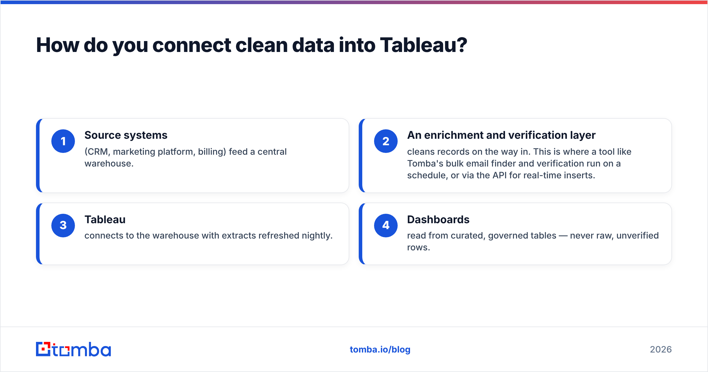
How do you connect clean data into Tableau?#
Tableau connects to almost anything — CRMs, warehouses, Google Sheets, flat files, and live SQL. The architecture that holds up over time looks like this:
- Source systems (CRM, marketing platform, billing) feed a central warehouse.
- An enrichment and verification layer cleans records on the way in. This is where a tool like Tomba's bulk email finder and verification run on a schedule, or via the API for real-time inserts.
- Tableau connects to the warehouse with extracts refreshed nightly.
- Dashboards read from curated, governed tables — never raw, unverified rows.
Skipping step two is the single most common mistake. Teams connect Tableau straight to a raw CRM export, build beautiful views, and then spend months distrusting their own numbers. Clean first, visualize second.
What does the best Tableau sales dashboard setup cost?#
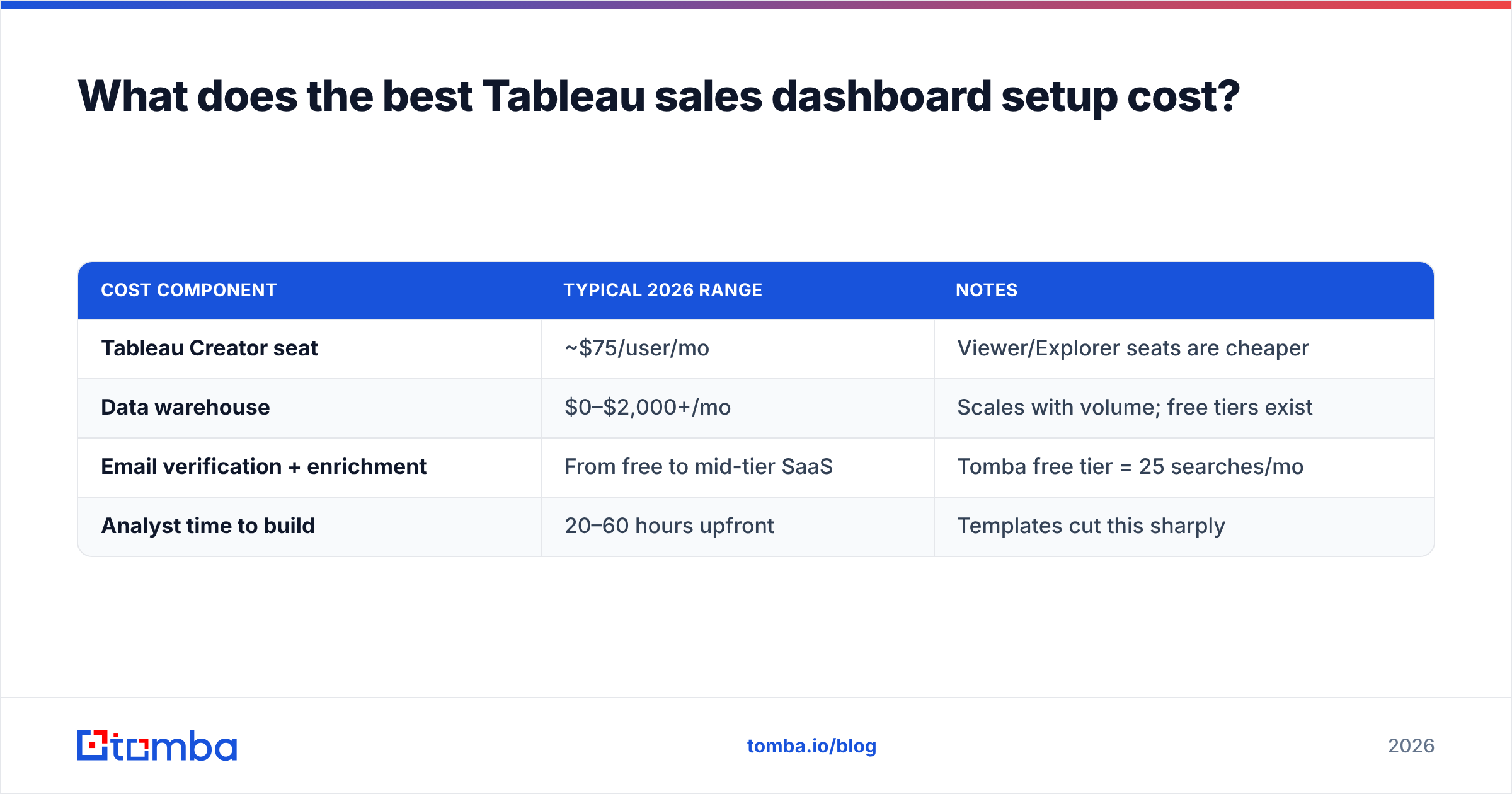
Budget for three things, not one: the BI license, the data infrastructure, and the data quality layer.
| Cost component | Typical 2026 range | Notes |
|---|---|---|
| Tableau Creator seat | ~$75/user/mo | Viewer/Explorer seats are cheaper |
| Data warehouse | $0–$2,000+/mo | Scales with volume; free tiers exist |
| Email verification + enrichment | From free to mid-tier SaaS | Tomba free tier = 25 searches/mo |
| Analyst time to build | 20–60 hours upfront | Templates cut this sharply |
For the data-quality layer, Tomba pricing runs a Free tier (25 searches/month), Starter at $49/mo, Growth at $99/mo, and Pro at $249/mo — a fraction of what a single Tableau Creator seat costs over a year, and it is what keeps those expensive seats showing the truth.
What's the fastest path to a working dashboard?#
If you need a sales dashboard live this week, do this in order:
- Pick one template from the four above — pipeline health is the safest start.
- Clean the underlying data — verify emails, enrich accounts, dedupe. Do not skip this.
- Build three charts, not thirty — stage funnel, deal-age scatter, coverage gauge.
- Add one filter action so reps can drill into their own deals.
- Schedule the refresh and a monthly data re-verification.
- Ship it, then iterate based on the questions people actually ask.
The teams that succeed treat the dashboard as the last 20% of the work. The first 80% is getting clean, complete, current data into the warehouse — and that is a solvable, mostly automatable problem.
The bottom line#
The best sales dashboards in Tableau are not the ones with the most charts or the cleverest calculated fields. They are the ones whose numbers you trust enough to act on without double-checking in a spreadsheet first. That trust comes from the data layer, not the visualization layer.
Before you spend another hour styling a workbook, audit what is flowing into it. If your contact emails bounce, your firmographics are half-empty, or the same account appears three times, no dashboard can save you. Start there.
Get your data right before you chart it. Tomba's Email Finder finds and verifies professional email addresses by domain, name, or company — so the contacts feeding your CRM, your warehouse, and ultimately your Tableau dashboards are accurate from day one. Pair it with enrichment and bulk verification, and every chart you build inherits clean inputs instead of garbage. Start free with 25 searches a month and see how much sharper your numbers get when the source data is finally trustworthy.
Ready to find emails that actually work?
Join 150,000+ professionals who stopped guessing and started sending. Free credits on signup — no credit card required.
Get the Tomba newsletter
Practical outbound tactics and product updates — once every two weeks.
About the author