Sales Hub Sales Management & Productivity Metrics Guide 2026
Most sales dashboards track motion, not progress. Here are the sales management productivity metrics that predict revenue in 2026—and how to build a Sales Hub review cadence around them.
Sales Hub Sales Management, Enablement & Productivity Metrics
You can have a sales floor that looks busy all week and still miss quota. Activity is not progress. The job of a sales manager in 2026 is to measure the few signals that actually predict revenue—and to ignore the dozens that just feel productive.
This guide breaks down the sales management productivity metrics worth tracking inside a tool like HubSpot Sales Hub, how to separate leading indicators from lagging ones, and how to run a weekly enablement cadence that turns numbers into coaching instead of theater.
TL;DR#
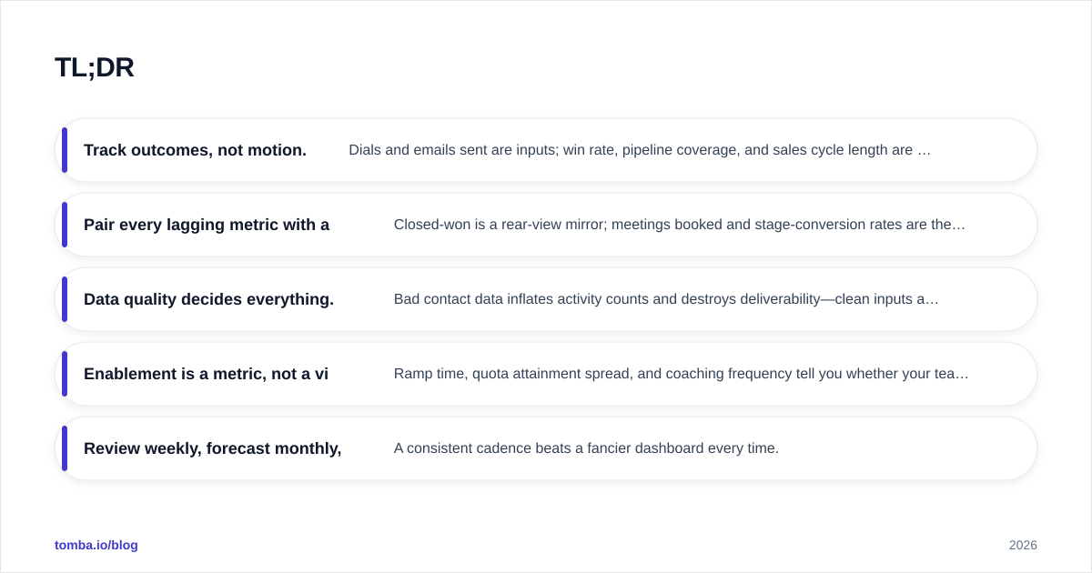
- Track outcomes, not motion. Dials and emails sent are inputs; win rate, pipeline coverage, and sales cycle length are what forecast revenue.
- Pair every lagging metric with a leading one. Closed-won is a rear-view mirror; meetings booked and stage-conversion rates are the windshield.
- Data quality decides everything. Bad contact data inflates activity counts and destroys deliverability—clean inputs are a prerequisite, not a nice-to-have.
- Enablement is a metric, not a vibe. Ramp time, quota attainment spread, and coaching frequency tell you whether your team is actually getting better.
- Review weekly, forecast monthly, re-baseline quarterly. A consistent cadence beats a fancier dashboard every time.
What are sales management productivity metrics?#
Sales management productivity metrics are the quantified signals a leader uses to judge whether a team is converting effort into revenue efficiently. They sit in three buckets: activity (what reps do), pipeline (what's in flight), and outcome (what closed).
Here's the everyday analogy. Activity metrics are how many times you swing the bat. Pipeline metrics are how many runners you have on base. Outcome metrics are the actual runs scored. A manager who only celebrates swings will lose games—but a manager who only looks at the final score has nothing to coach on Monday morning. You need all three, weighted correctly.
The mistake most teams make is over-indexing on activity because it's the easiest thing to count. A CRM will happily show you that 4,000 emails went out last week. It won't tell you that 30% bounced because the contact data was stale, that another 20% landed in spam, and that the "personalized" sequence was identical across 800 prospects.
Which metrics actually predict revenue?#
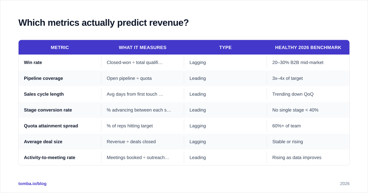
Not all numbers carry equal weight. Below is a working framework that separates the metrics that forecast from the metrics that merely describe. The goal is to pair each lagging outcome with the leading behavior that drives it, so coaching has a lever.
| Metric | What it measures | Type | Healthy 2026 benchmark |
|---|---|---|---|
| Win rate | Closed-won ÷ total qualified opps | Lagging | 20–30% B2B mid-market |
| Pipeline coverage | Open pipeline ÷ quota | Leading | 3x–4x of target |
| Sales cycle length | Avg days from first touch to close | Leading | Trending down QoQ |
| Stage conversion rate | % advancing between each stage | Leading | No single stage < 40% |
| Quota attainment spread | % of reps hitting target | Lagging | 60%+ of team |
| Average deal size | Revenue ÷ deals closed | Lagging | Stable or rising |
| Activity-to-meeting rate | Meetings booked ÷ outreach sent | Leading | Rising as data improves |
The column that matters most is "Type." Lagging metrics tell you how last quarter went. Leading metrics—pipeline coverage, stage conversion, cycle length—tell you what's about to happen, while you can still influence it. A manager who reviews only win rate is driving by looking in the mirror.
Pipeline coverage deserves special attention. If a rep carries a $200K quarterly quota and only $400K of open pipeline, that's 2x coverage—below the 3x–4x most B2B teams need to absorb normal slippage. You learn this in week two of the quarter, not week eleven. That's the entire point of a leading indicator.
Why does data quality break your metrics?#
Because every metric in your dashboard is downstream of the contact records feeding it. Garbage in, confident-looking garbage out.
Consider a simple chain. Your reps run a sequence to 1,000 prospects. If 18% of those email addresses are invalid—a normal decay rate for a list more than a few months old—then 180 sends bounce. Your "emails delivered" metric is wrong, your activity-to-reply rate is artificially depressed, and worse, the bounces hammer your sender reputation, which quietly drags down deliverability for the valid 820 prospects too.
Now your dashboard shows a falling reply rate. A manager reacts by pushing reps to send more, which sends more bounces, which sinks reputation further. The metric created a doom loop, and none of it was a rep-performance problem. It was a data problem masquerading as a productivity problem.
This is why disciplined teams treat list hygiene as a first-class part of the metrics stack. Verifying addresses before a campaign and keeping records enriched isn't busywork—it's what makes your conversion math trustworthy. A quick pass with an email verifier before a send protects both the numbers and the domain reputation behind them.
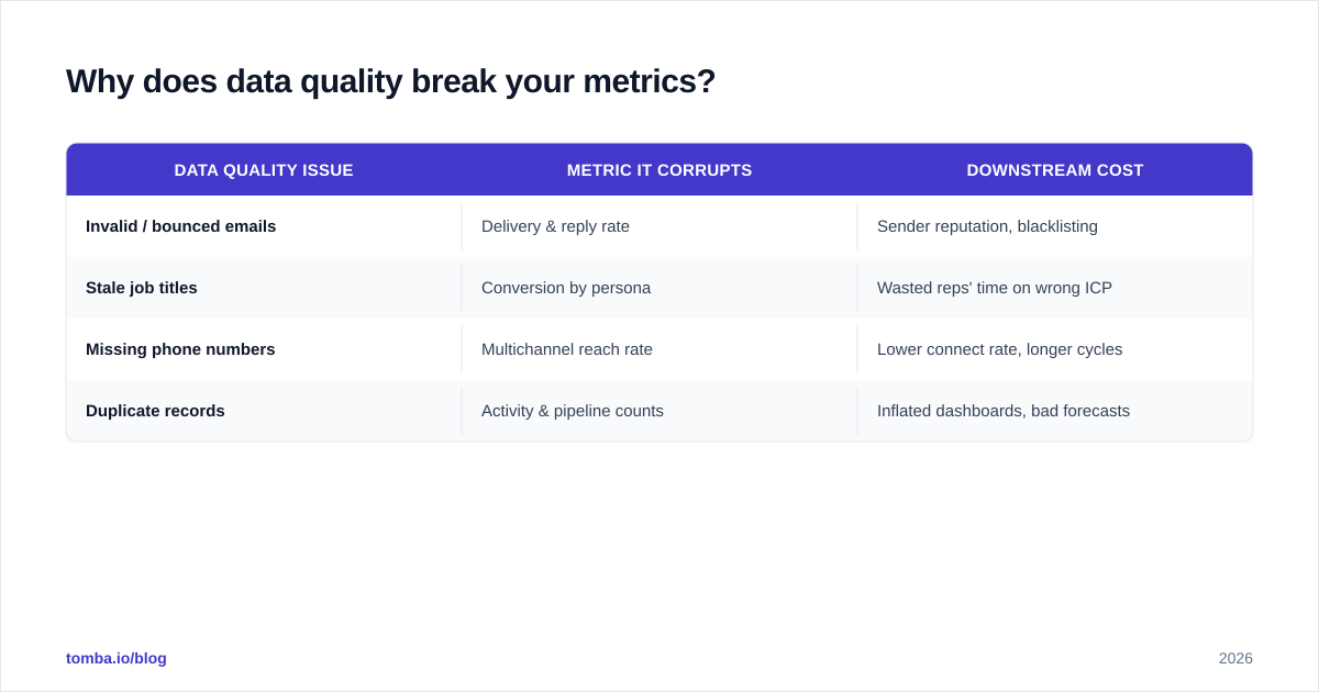
| Data quality issue | Metric it corrupts | Downstream cost |
|---|---|---|
| Invalid / bounced emails | Delivery & reply rate | Sender reputation, blacklisting |
| Stale job titles | Conversion by persona | Wasted reps' time on wrong ICP |
| Missing phone numbers | Multichannel reach rate | Lower connect rate, longer cycles |
| Duplicate records | Activity & pipeline counts | Inflated dashboards, bad forecasts |
How do you measure sales enablement, not just selling?#
Enablement is the part most dashboards ignore because it's harder to count. But "are my people getting better?" is a measurable question. Three metrics answer it.
Ramp time is the number of days from a rep's start date to their first quota-attaining month. If new hires take seven months to ramp and your average rep tenure is 20 months, you're losing roughly a third of every rep's productive life to onboarding. Shortening ramp is one of the highest-leverage moves a sales leader can make, and it's invisible unless you track it.
Quota attainment spread tells you whether success is systemic or heroic. If 70% of your team hits target, you have a repeatable process. If 20% hit target and three reps carry the whole number, you have a coaching and enablement gap—and a retention risk when those three leave.
Coaching frequency and impact closes the loop. Log how often each rep gets a structured 1:1, then correlate it with their stage-conversion improvement over the next month. Teams that coach weekly consistently out-convert teams that coach "when there's time." Gartner's sales research has repeatedly tied structured coaching cadence to measurable win-rate lift; the mechanism is simply more reps over the line, faster. You can read more on enablement benchmarks at Gartner's sales practice.

What does a healthy review cadence look like?#
The metrics are only useful if they drive a rhythm. Dashboards don't change behavior—conversations do. Here's a cadence that works across most B2B teams.
Weekly (rep + manager, 30 minutes): Review leading indicators only—pipeline coverage, meetings booked, stages that stalled. The question is never "did you hit the number?" It's "what's blocking the next three deals, and what can I unblock today?" This is where coaching happens.
Monthly (team forecast): Roll up the lagging outcomes—closed-won, win rate, average deal size, quota attainment spread. This is where you spot whether the leading indicators from the past four weeks actually converted, and where you recalibrate the forecast.
Quarterly (leadership re-baseline): Re-set benchmarks. Did the sales cycle shorten? Did ramp time improve? Are the healthy ranges in your metrics table still realistic given the market? This is also where you audit data quality and tooling, because a quarter is long enough for a contact database to decay measurably.
The discipline is keeping the layers separate. When a weekly 1:1 drifts into forecast debates, coaching dies. When a monthly forecast turns into activity micromanagement, trust dies. Each cadence has one job.
Which tools track these metrics—and how do they compare?#
HubSpot Sales Hub is the reference point for most teams asking this question, but it's worth understanding where the native reporting is strong and where you'll bolt on specialized tooling. The native CRM is excellent at pipeline and outcome metrics; it's weaker at the front of the funnel, where data sourcing and verification live.
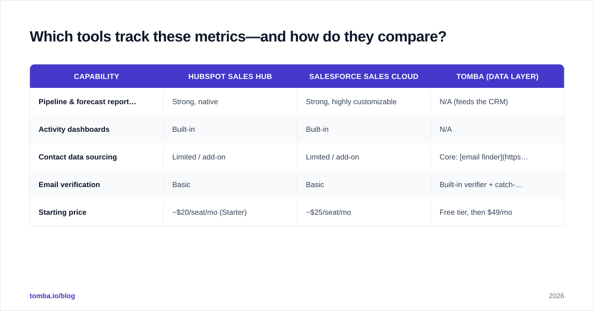
| Capability | HubSpot Sales Hub | Salesforce Sales Cloud | Tomba (data layer) |
|---|---|---|---|
| Pipeline & forecast reporting | Strong, native | Strong, highly customizable | N/A (feeds the CRM) |
| Activity dashboards | Built-in | Built-in | N/A |
| Contact data sourcing | Limited / add-on | Limited / add-on | Core: email finder + enrichment |
| Email verification | Basic | Basic | Built-in verifier + catch-all |
| Starting price | ~$20/seat/mo (Starter) | ~$25/seat/mo | Free tier, then $49/mo |
The pattern most teams land on: a CRM owns the pipeline and outcome metrics, a sequencing tool owns the activity execution, and a data platform keeps the contact records accurate so the metrics mean something. You can compare HubSpot's tiers directly on hubspot.com and Salesforce's on salesforce.com, then check independent reviews on G2 before committing.
Where a tool like Tomba fits is the data layer underneath all of it. If your activity-to-meeting rate is the leading indicator you're trying to improve, the fastest lever is often not "send more"—it's "send to verified, correctly-targeted contacts." That's a data enrichment and verification problem, and it's upstream of every productivity metric you report. Automating that hygiene with sales automation keeps the dashboard honest without adding manual work.
What's the single biggest mistake managers make with metrics?#
Tracking too many of them. A dashboard with 40 widgets isn't insight—it's noise with a UI. When everything is highlighted, nothing is.
The fix is to pick one north-star leading indicator per quarter and make the whole team's weekly conversation orbit it. If pipeline coverage is the constraint, that's the number on the wall. If sales cycle length is bloating, that's the focus, and you instrument the stages where deals stall. Next quarter you may shift. But chasing 40 metrics simultaneously guarantees you improve none of them.
The second-biggest mistake is treating the metric as the goal. Win rate is a measurement of a healthy process, not the process itself. The moment reps start gaming a number—sandbagging opps to protect win rate, for instance—the metric stops describing reality. Good managers watch for that and adjust what they measure before it gets gamed.
Frequently asked questions#
How many sales metrics should a manager actively track? Five to seven core metrics, with one designated as the quarterly north star. Anything beyond that dilutes focus and turns the weekly review into a reporting exercise instead of a coaching one.
What's the difference between a leading and a lagging metric? A lagging metric (win rate, closed-won revenue) reports what already happened. A leading metric (pipeline coverage, meetings booked, stage conversion) predicts what's about to happen while you can still change it. Pair every lagging metric with the leading behavior that drives it.
How often should benchmarks be re-set? Quarterly. Markets, deal sizes, and cycle lengths shift, and a benchmark from a year ago can quietly become either unreachable or trivially easy—both of which kill the metric's usefulness for coaching.
Does data quality really affect productivity metrics that much? Yes. Invalid contact data inflates activity counts, depresses reply rates, and damages sender reputation, which then suppresses deliverability for valid contacts too. Clean, verified data is a prerequisite for trustworthy metrics—not an optional extra.
Start with the data your metrics depend on#
Every productivity metric you report sits on top of one thing: the quality of the contacts in your CRM. If those records are stale, every downstream number lies to you. Start at the source—use the Tomba Email Finder to source verified, correctly-targeted contacts, and let your win rate, reply rate, and pipeline coverage finally mean what they say. The free tier covers 25 searches a month so you can test the impact on your own dashboard before scaling up on a paid plan. Clean inputs, honest metrics, better coaching—in that order.
// get started
Find, verify and enrich your first contacts today
Start on the free plan with 25 searches a month, then scale when your team is ready.
Free plan · No credit card required · GDPR & CCPA
// about the author