CRM Analytics for Sales: Metrics That Actually Move Revenue
CRM analytics only works when the data underneath it is clean. Here are the sales metrics worth tracking, the dashboards worth building, and the traps that quietly waste your pipeline.
CRM analytics promises a single screen where your whole sales operation makes sense: what's in the pipeline, what's closing, and where deals stall. The promise is real, but most teams get a fraction of the value because the reports sit on top of contact records that are half-empty, out of date, or duplicated three times over.
This guide covers the metrics that actually predict revenue, the dashboards worth building, and the data-quality foundation that decides whether any of it is trustworthy.
TL;DR#
- CRM analytics is only as good as the data underneath it. Stale contacts and missing fields quietly corrupt every forecast and conversion report.
- Track a small set of decision-driving metrics — win rate, sales cycle length, pipeline coverage, stage conversion, and forecast accuracy — not a wall of vanity charts.
- Build three dashboards, not thirty: a rep activity view, a pipeline health view, and a leadership forecast view.
- Enrichment and verification are prerequisites, not nice-to-haves. Feed your CRM verified contact data so segmentation and attribution hold up.
- Review cadence matters: daily for reps, weekly for managers, monthly for RevOps. Analytics you don't act on is decoration.
What is CRM analytics for sales?#
CRM analytics for sales is the practice of turning the raw records in your customer relationship management system — accounts, contacts, deals, and activities — into metrics and dashboards that guide decisions. Think of your CRM as a kitchen: the raw ingredients are your contact and deal records, and analytics is the recipe that turns them into something you can actually serve to a sales leader who needs to decide where to spend the next quarter.
Technically, it spans a few layers:
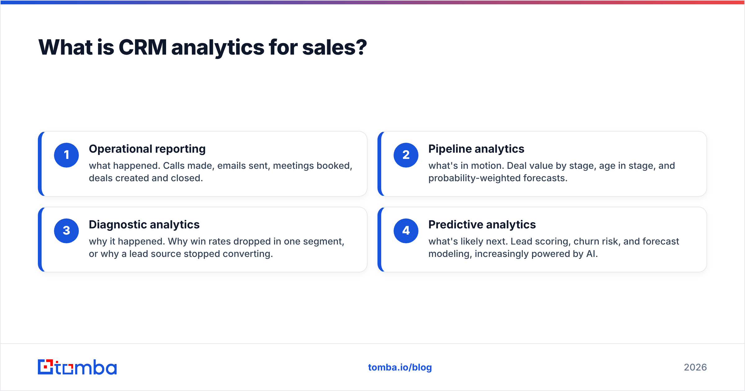
- Operational reporting — what happened. Calls made, emails sent, meetings booked, deals created and closed.
- Pipeline analytics — what's in motion. Deal value by stage, age in stage, and probability-weighted forecasts.
- Diagnostic analytics — why it happened. Why win rates dropped in one segment, or why a lead source stopped converting.
- Predictive analytics — what's likely next. Lead scoring, churn risk, and forecast modeling, increasingly powered by AI.
Most teams live in layers one and two and never reach three or four — usually because the data isn't clean enough to trust a prediction built on it.

Why does data quality decide whether CRM analytics works?#
Bad data doesn't announce itself. Your dashboard still renders. The chart still has bars. But the numbers are lying, and you make real staffing and spending decisions on top of them.
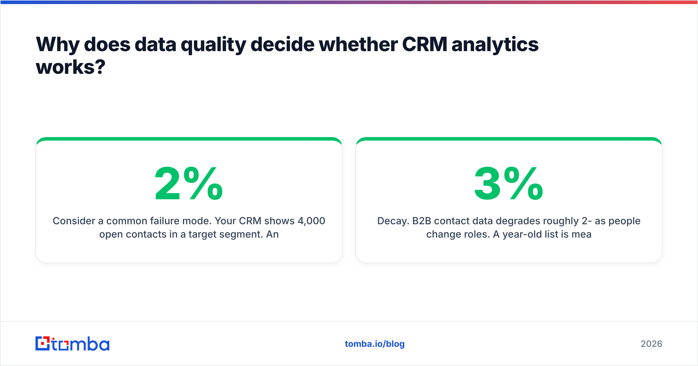
Consider a common failure mode. Your CRM shows 4,000 open contacts in a target segment. Analytics reports a 2% reply rate on outreach to that segment, so leadership deprioritizes it. But 30% of those contacts have bounced or changed jobs, and another 15% are duplicates. The real, reachable universe is closer to 2,200 — and the reply rate against deliverable contacts was actually competitive. You just killed a working channel because of data decay.
This is why enrichment and verification sit upstream of every analytics decision. If you're pulling contacts into your CRM, run them through an email verifier before they count toward any segment size, and use data enrichment to fill the firmographic fields your reports segment on. Clean inputs are not a data-hygiene chore — they're the difference between analytics and guessing.

Three data problems break analytics most often:
- Decay. B2B contact data degrades roughly 2-3% per month as people change roles. A year-old list is meaningfully wrong.
- Sparsity. Segmentation needs fields — industry, company size, region, seniority. Empty fields collapse into a giant "unknown" bucket that no chart can interpret.
- Duplication. The same account under three spellings inflates pipeline counts and double-counts activity.
Which sales metrics are actually worth tracking?#
The temptation is to track everything the CRM can measure. Resist it. A dashboard with forty metrics hides the five that matter. Below are the metrics that reliably drive decisions, grouped by who acts on them.
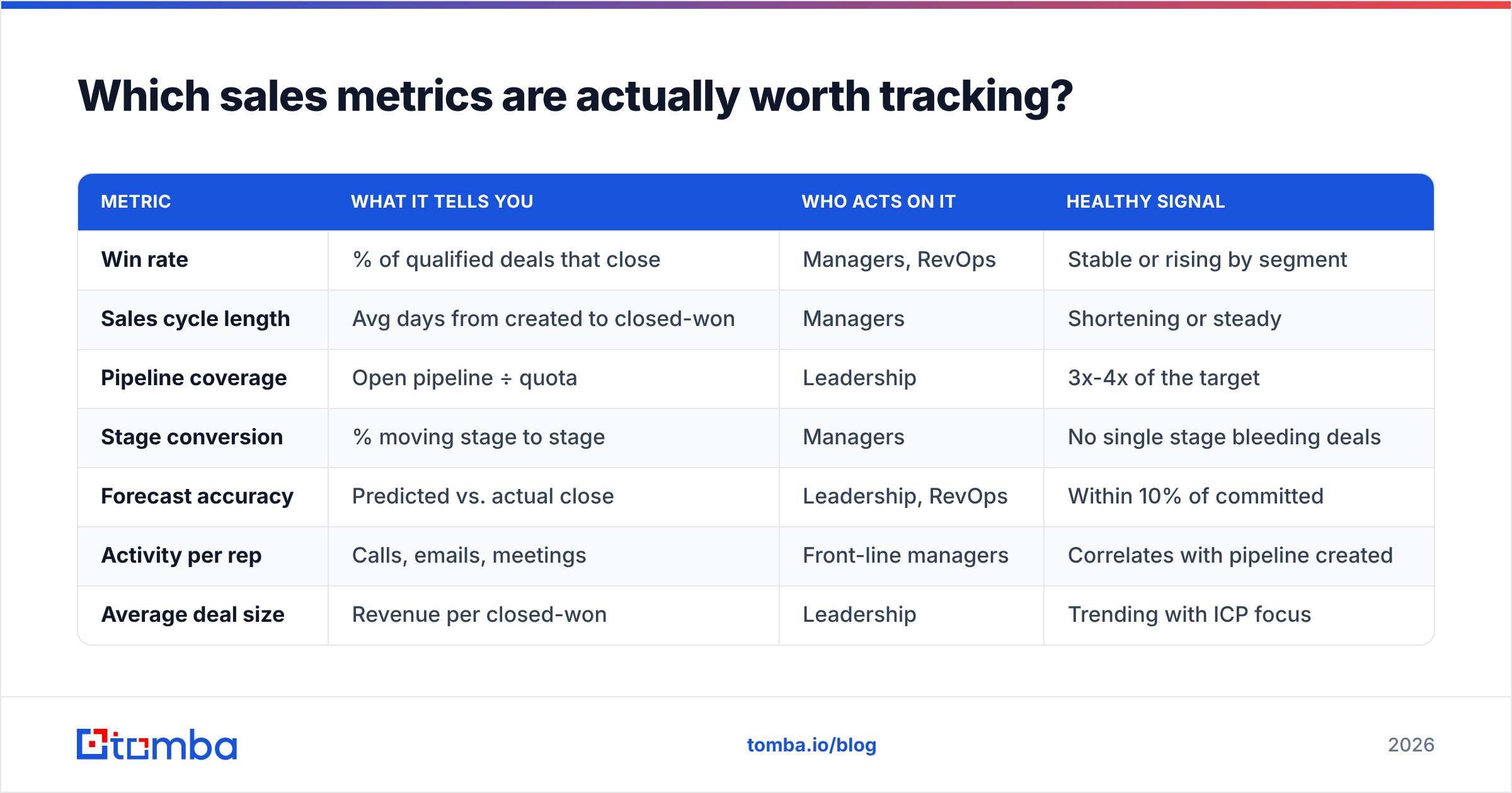
| Metric | What it tells you | Who acts on it | Healthy signal |
|---|---|---|---|
| Win rate | % of qualified deals that close | Managers, RevOps | Stable or rising by segment |
| Sales cycle length | Avg days from created to closed-won | Managers | Shortening or steady |
| Pipeline coverage | Open pipeline ÷ quota | Leadership | 3x-4x of the target |
| Stage conversion | % moving stage to stage | Managers | No single stage bleeding deals |
| Forecast accuracy | Predicted vs. actual close | Leadership, RevOps | Within 10% of committed |
| Activity per rep | Calls, emails, meetings | Front-line managers | Correlates with pipeline created |
| Average deal size | Revenue per closed-won | Leadership | Trending with ICP focus |
| Lead response time | Time to first touch on new leads | Managers | Under an hour for inbound |
Notice what's not there: raw email open counts, total contacts in the database, "touches" as a standalone number. Those are inputs, not outcomes. Track them at the rep level for coaching, but never put them on a leadership dashboard where they'll be mistaken for progress.
A quick word on win rate: always segment it. A blended 22% win rate can hide a 40% rate in your core segment and a 6% rate in a segment you should exit. The blended number tells you nothing actionable; the segmented one tells you where to point the team.
How do you build dashboards people actually use?#
Most CRM dashboards die from over-engineering. The fix is to build for a specific decision a specific person makes on a specific cadence. Three dashboards cover the vast majority of a sales org.
1. The rep dashboard (daily). One rep's own world: their open pipeline by stage, deals with no activity in 7+ days, tasks due today, and their pace against quota. The job here is to answer "what do I do next?" in ten seconds.
2. The pipeline health dashboard (weekly). For front-line managers running pipeline reviews. Deal aging by stage, stage-to-stage conversion, deals slipping their close date, and coverage against the team target. This is where you catch the deal that's been "50% likely" for two months and hasn't moved.
3. The forecast dashboard (monthly). For leadership and RevOps. Weighted pipeline, forecast vs. quota by segment and rep, historical forecast accuracy, and trend lines on win rate and cycle length. This is a decision surface for hiring, territory, and investment — not a status update.
Every one of these depends on the same underlying discipline: consistent stage definitions, required fields at each stage gate, and a shared understanding of what "qualified" means. Analytics can't fix an inconsistent process; it can only reflect it. If your reps define "qualified" five different ways, your conversion chart is noise. Nail down the sales process and pipeline definitions first, then build the dashboard on top.
What role does AI and predictive analytics play in 2026?#
Predictive analytics has moved from a premium add-on to a standard feature in most CRMs. The realistic use cases in 2026 are narrower — and more useful — than the marketing suggests.
- Lead scoring ranks incoming leads by likelihood to convert, using historical closed-won patterns. It works well when you have enough history and clean firmographic data; it fails silently when your fields are sparse.
- Deal risk flagging surfaces open deals showing patterns that historically preceded losses — going quiet, single-threaded contacts, stalled in a stage.
- Forecast modeling blends rep commits with pattern-based predictions to narrow the range of likely outcomes.
- Next-best-action nudges reps toward the activity most correlated with progression for similar deals.
The common thread: every one of these models is trained on your CRM's history. Garbage history produces confident-sounding garbage predictions. Before you turn on predictive scoring, make sure the contact and account records feeding it are enriched and deduplicated. Vendors like Salesforce and HubSpot build strong predictive layers, but they all inherit the quality of what you put in.
For a grounding on how these fit the broader operating model, Gartner's sales technology research is a useful neutral reference on where AI is genuinely moving the needle versus where it's still hype.
How does contact data feed better CRM analytics?#
Analytics reads the fields; someone has to fill them well. This is where the pipeline from prospecting into the CRM matters more than most teams realize.
When you add a contact, you want the record complete on arrival: verified email, role, company, company size, and industry. That completeness is what makes every downstream segment and attribution report trustworthy. A few practical moves:
- Verify before you store. Route new emails through verification so bounces never inflate your segment sizes or deflate your reply rates.
- Enrich on entry. Fill firmographic fields automatically instead of leaving them blank for a rep to skip.
- Use domain-level discovery to complete an account's contact map. A domain search surfaces the reachable people at a target company so your account records aren't single-threaded.
- Deduplicate on a real key. Match on verified email or domain, not on fuzzy company-name strings.
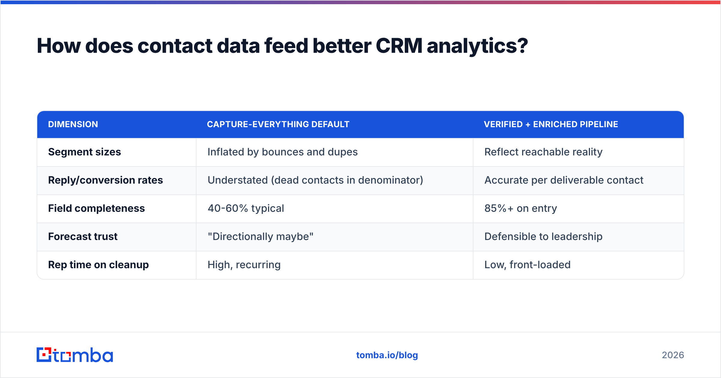
Here's how a data-quality-first approach compares to the default "capture whatever comes in" habit:
| Dimension | Capture-everything default | Verified + enriched pipeline |
|---|---|---|
| Segment sizes | Inflated by bounces and dupes | Reflect reachable reality |
| Reply/conversion rates | Understated (dead contacts in denominator) | Accurate per deliverable contact |
| Field completeness | 40-60% typical | 85%+ on entry |
| Forecast trust | "Directionally maybe" | Defensible to leadership |
| Rep time on cleanup | High, recurring | Low, front-loaded |
Getting contacts in cleanly is a tooling problem you can solve once. Tomba's Free tier gives you 25 searches a month to test the workflow, and paid plans scale from Starter at $49/mo up through Growth and Pro — see the full Tomba pricing breakdown if you're mapping cost to volume.
How often should you review CRM analytics?#
Cadence is where analytics either becomes a habit or becomes wallpaper. Match the review frequency to the decision speed of the role.
- Daily — reps. Glance at their own pipeline and next actions. Two minutes, self-service.
- Weekly — managers. Run pipeline reviews off the health dashboard. Inspect aging deals and slipping close dates. This is coaching time, not a status recital.
- Monthly — RevOps and leadership. Review forecast accuracy, win-rate trends, and segment performance. Adjust territory, targets, and investment.
- Quarterly — strategy. Re-examine which segments and channels earn continued investment based on full-funnel conversion, not gut feel.
The failure mode is reviewing everything weekly. Leadership doesn't need a weekly forecast re-litigation, and reps don't need a monthly deep-dive. Over-frequent review of slow-moving metrics creates noise and false alarms — you react to random variation instead of real signal.
Common CRM analytics mistakes to avoid#
- Measuring activity as if it were outcome. High call volume with flat pipeline isn't productivity; it's motion. Pair every activity metric with a conversion metric.
- One blended number for everything. Blended win rate, blended cycle length, and blended deal size all hide the segment-level truth you actually need.
- Trusting the dashboard over the data. A clean-looking chart built on 50% field completeness is more dangerous than no chart, because it feels authoritative.
- Vanity contact counts. "50,000 contacts in the CRM" means nothing if a third are undeliverable. Report reachable, verified contacts.
- No owner for data quality. If nobody owns dedup, verification, and field completeness, entropy wins within a quarter.
The bottom line#
CRM analytics for sales is not a chart problem — it's a data problem wearing a chart's clothes. Pick a small set of decision-driving metrics, build three focused dashboards, review them on a cadence that matches how fast each role decides, and above all, feed the whole thing verified, enriched contact data. Do the last part and the rest gets easier; skip it and no dashboard will save you.
The cheapest, highest-leverage fix is at the top of the funnel: get complete, verified contacts into your CRM the moment they enter it. Start with the Tomba Email Finder to source accurate professional emails by name, company, or domain — then let your analytics finally reflect reality instead of decay. Your forecasts will thank you.
Related guides#
Ready to find emails that actually work?
Join 150,000+ professionals who stopped guessing and started sending. Free credits on signup — no credit card required.
Get the Tomba newsletter
Practical outbound tactics and product updates — once every two weeks.
About the author