CRM Reporting in 2026: Metrics, Dashboards, and Common Mistakes
CRM reporting turns raw pipeline data into decisions your team can act on. Here are the metrics that matter, the dashboards to build, and the mistakes that quietly wreck your numbers.
TL;DR
- CRM reporting is the practice of turning the raw records in your CRM — deals, contacts, activities — into dashboards and reports that answer real revenue questions.
- The reports that matter fall into four buckets: pipeline health, forecast accuracy, activity/productivity, and data quality. Everything else is vanity.
- Bad data breaks every report downstream. Enrichment and verification at the point of entry matter more than any chart.
- Start with 5-6 core reports, not 40. A focused dashboard that people actually open beats a sprawling one nobody trusts.
- Tools like HubSpot and Salesforce give you the reporting engine; clean contact data is what makes the output believable.
What is CRM reporting, really?#
CRM reporting is the process of taking the records sitting in your CRM and shaping them into answers: how healthy is the pipeline, will we hit the number, which reps are stuck, and where is revenue leaking. Think of your CRM as a kitchen pantry. The pantry alone doesn't feed anyone — reporting is the recipe that turns scattered ingredients into a meal your leadership can actually consume.
Technically, a CRM report is a filtered, grouped, and aggregated view of objects (deals, contacts, companies, activities) rendered as a table, chart, or KPI tile. A dashboard is a saved collection of those reports arranged for a specific audience — a rep sees their own pipeline, a VP sees the whole team's forecast.
The distinction that trips people up: a report answers one question ("how many deals closed last month?"), while a dashboard tells a story ("are we on track this quarter, and if not, why?"). You need both, but you build the report first and the story second.
If your CRM data is messy — duplicate contacts, missing job titles, stale email addresses — reporting doesn't fix that. It amplifies it. Every wrong record becomes a wrong data point, and enough wrong data points turn a dashboard into fiction. That's why serious teams pair reporting with data enrichment and verification long before they argue about chart colors.

Which CRM reports actually matter?#
Most teams drown in reports. You don't need 40 — you need the handful that change a decision. Group them into four categories.
1. Pipeline health reports. These show what's in the funnel right now and whether it's enough.
- Pipeline coverage — total open pipeline divided by your quota. Below 3x for the quarter is a warning sign.
- Pipeline by stage — where deals sit and how much value each stage holds.
- Deal aging — how long deals have been stuck in one stage. Aging deals are the silent killers of a forecast.
- Win rate by stage — the conversion percentage between each stage, which feeds your forecast math.
2. Forecast accuracy reports. A forecast nobody trusts is worse than no forecast. Track forecast vs. actual over time so you can see whether your team sandbags or over-commits.
3. Activity and productivity reports. Calls, emails, meetings booked, and the ratio of activity to closed revenue. These catch effort problems before they become pipeline problems.
4. Data quality reports. The least glamorous and most important. Track the percentage of records missing an email, a phone number, or a job title. If 30% of your contacts have no verified email, your outreach reports are built on sand.
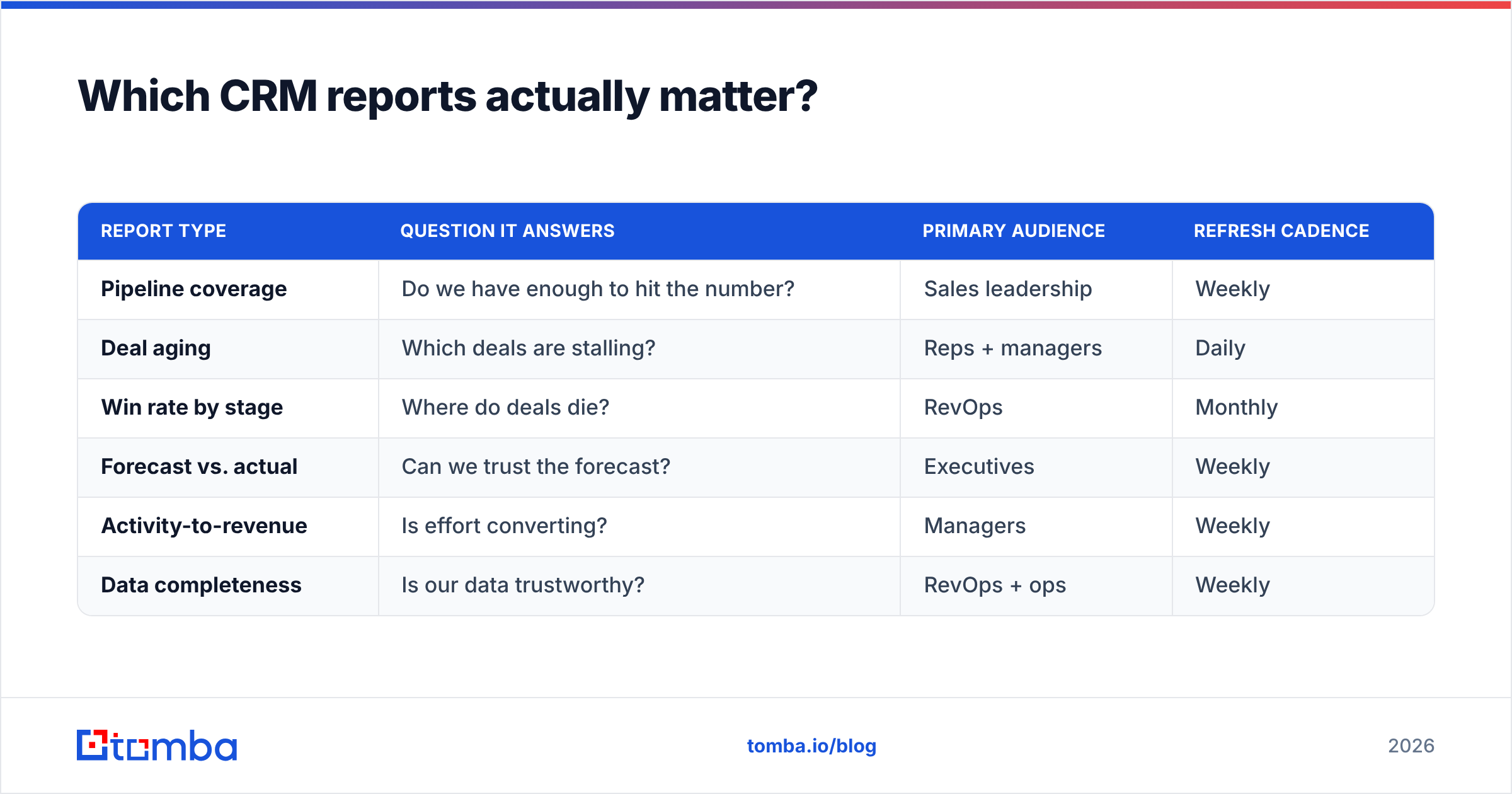
Here's how those categories map to the question they answer and who cares:
| Report type | Question it answers | Primary audience | Refresh cadence |
|---|---|---|---|
| Pipeline coverage | Do we have enough to hit the number? | Sales leadership | Weekly |
| Deal aging | Which deals are stalling? | Reps + managers | Daily |
| Win rate by stage | Where do deals die? | RevOps | Monthly |
| Forecast vs. actual | Can we trust the forecast? | Executives | Weekly |
| Activity-to-revenue | Is effort converting? | Managers | Weekly |
| Data completeness | Is our data trustworthy? | RevOps + ops | Weekly |
Notice that four of the six feed directly off contact and account data. When that data is incomplete, four of your six core reports degrade at once.
How do you build a CRM dashboard people trust?#
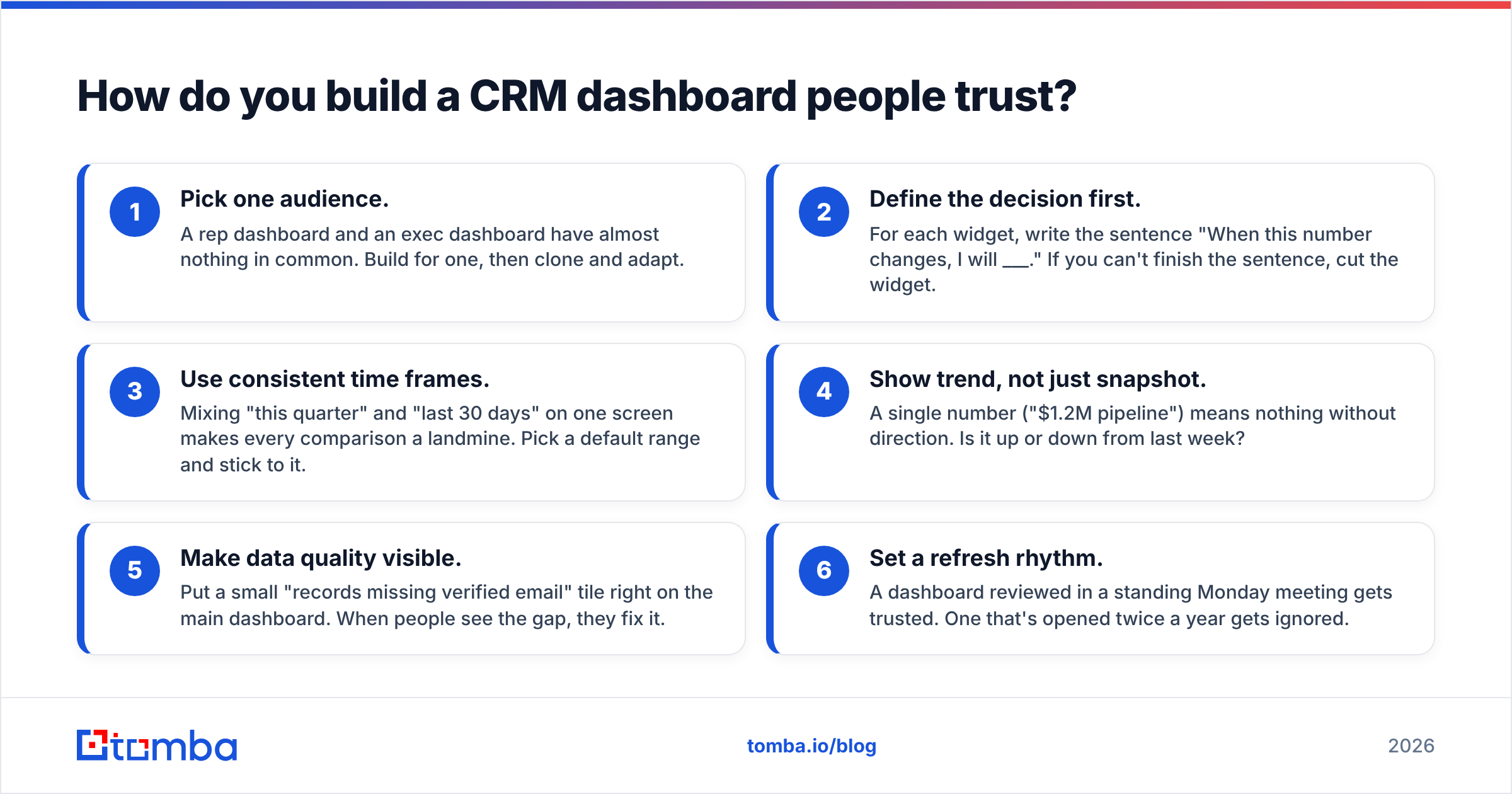
Start narrow, then expand. The fastest way to kill adoption is to ship a 20-widget dashboard on day one. Follow a sequence.
- Pick one audience. A rep dashboard and an exec dashboard have almost nothing in common. Build for one, then clone and adapt.
- Define the decision first. For each widget, write the sentence "When this number changes, I will ___." If you can't finish the sentence, cut the widget.
- Use consistent time frames. Mixing "this quarter" and "last 30 days" on one screen makes every comparison a landmine. Pick a default range and stick to it.
- Show trend, not just snapshot. A single number ("$1.2M pipeline") means nothing without direction. Is it up or down from last week?
- Make data quality visible. Put a small "records missing verified email" tile right on the main dashboard. When people see the gap, they fix it.
- Set a refresh rhythm. A dashboard reviewed in a standing Monday meeting gets trusted. One that's opened twice a year gets ignored.
The teams that get this right treat the dashboard as a living document tied to a ritual, not a one-time build. And they wire their CRM integrations so data flows in automatically instead of arriving via a Friday-afternoon CSV import that's already stale by Monday.
Why does data quality make or break CRM reporting?#
Because every report is a function of the data underneath it, and garbage in is garbage on a very expensive screen. This is the part most "CRM reporting" guides skip, and it's the part that actually determines whether your dashboards get trusted.
Consider a common failure. Your win-rate report says inbound leads convert at 22% and outbound at 9%, so leadership shifts budget to inbound. But half your outbound contacts had bounced or wrong email addresses, so those deals never got a fair first touch. The report wasn't lying about the math — it was lying about the inputs. You made a six-figure budgeting decision on broken data.
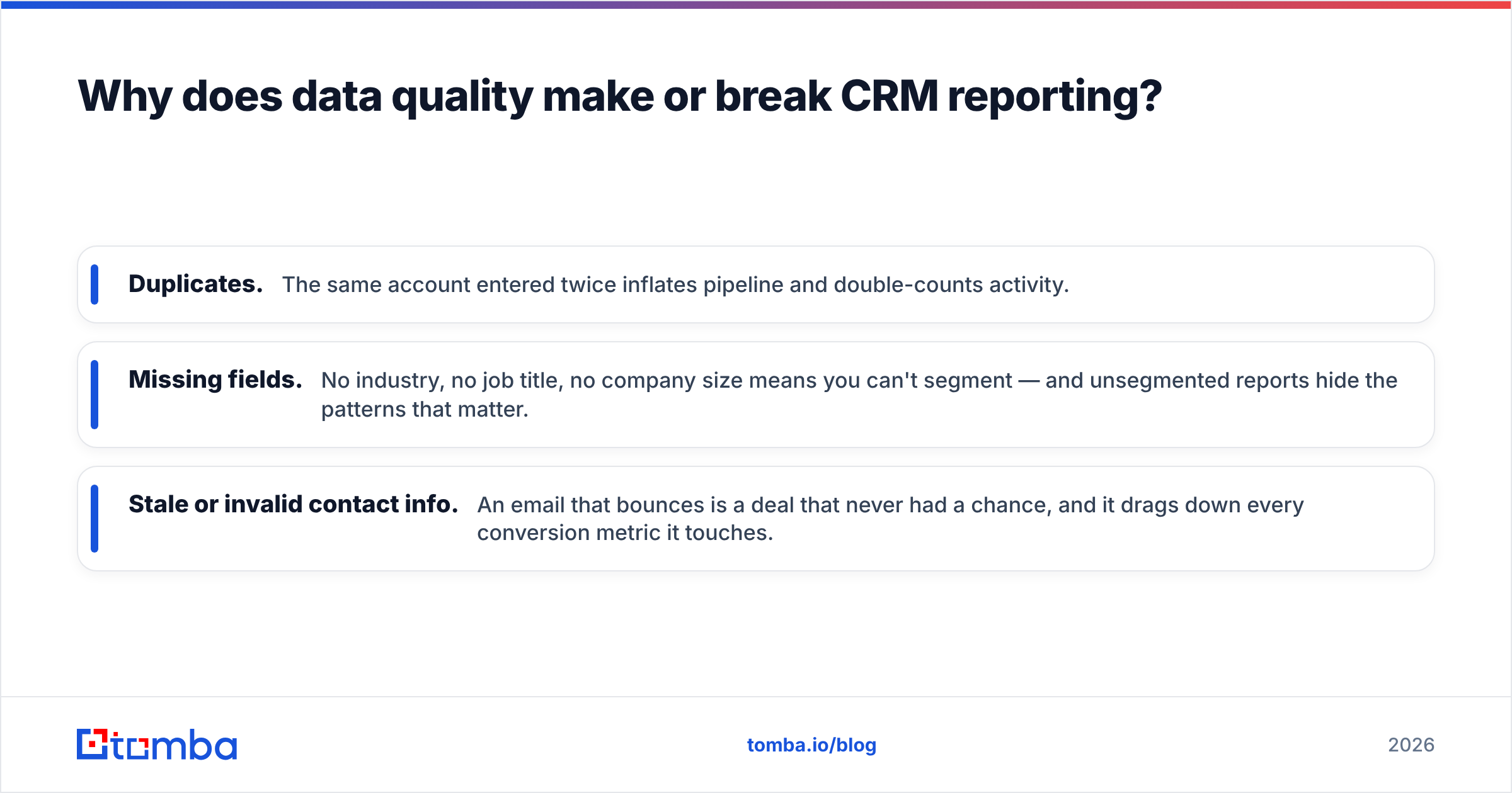
Three data problems corrupt CRM reporting more than any others:
- Duplicates. The same account entered twice inflates pipeline and double-counts activity.
- Missing fields. No industry, no job title, no company size means you can't segment — and unsegmented reports hide the patterns that matter.
- Stale or invalid contact info. An email that bounces is a deal that never had a chance, and it drags down every conversion metric it touches.
The fix is upstream, not downstream. Verify and enrich records as they enter the CRM. An email verifier catches invalid addresses before they pollute your outreach data, and domain search fills in the company-level contacts you're missing so segmentation actually works. Clean the water at the source and every glass downstream is clear.
For a deeper definition of how the underlying system works, the CRM glossary entry is a useful primer for anyone new to the vocabulary — worth sharing with new hires before they touch a dashboard.
Which CRM reporting tool should you use?#
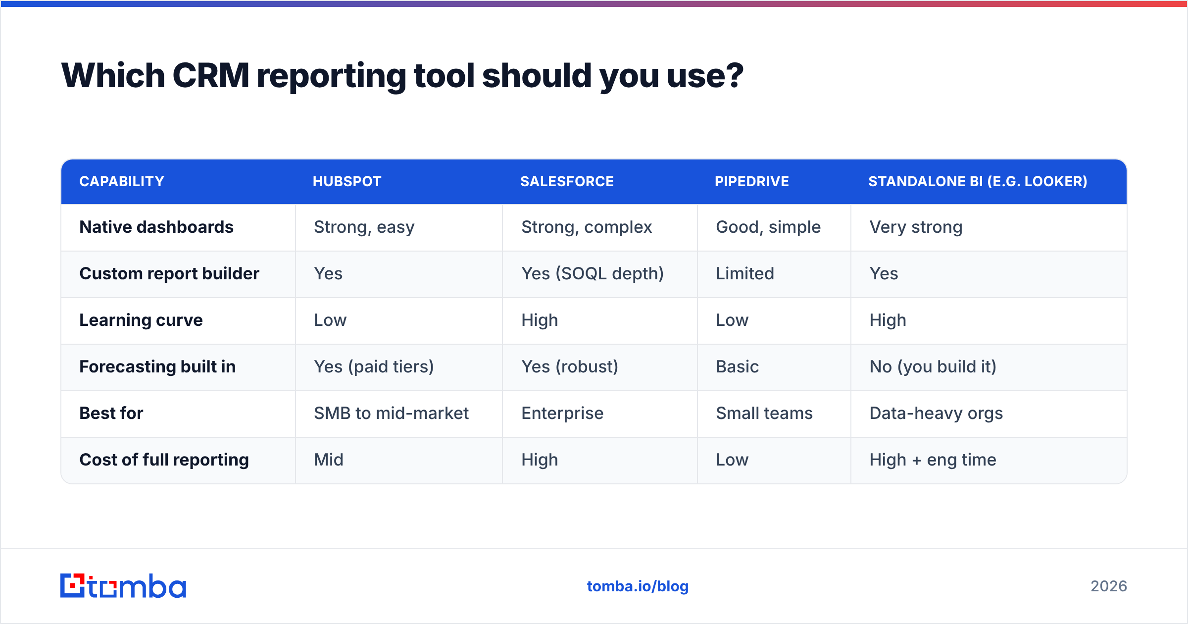
The honest answer: the reporting layer of your existing CRM is usually good enough, and the money is better spent on data quality than on a separate BI tool. But the platforms differ in how far their native reporting goes before you need to bolt something on.
| Capability | HubSpot | Salesforce | Pipedrive | Standalone BI (e.g. Looker) |
|---|---|---|---|---|
| Native dashboards | Strong, easy | Strong, complex | Good, simple | Very strong |
| Custom report builder | Yes | Yes (SOQL depth) | Limited | Yes |
| Learning curve | Low | High | Low | High |
| Forecasting built in | Yes (paid tiers) | Yes (robust) | Basic | No (you build it) |
| Best for | SMB to mid-market | Enterprise | Small teams | Data-heavy orgs |
| Cost of full reporting | Mid | High | Low | High + eng time |
A few guardrails when you choose:
- If you're under ~50 reps, your CRM's native reporting is almost certainly enough. Adding a BI tool adds a maintenance burden you'll regret.
- If you're on Salesforce and drowning in complexity, the problem is usually report sprawl, not missing features. Consolidate before you buy.
- No reporting tool compensates for bad inputs. Budget for enrichment and verification first, then optimize the reporting layer. You can review Tomba pricing to see how data tooling stacks up against a full BI purchase — it's typically a fraction of the cost and fixes the root problem.
Independent review sites like G2 are useful for comparing the reporting depth of each CRM before you commit, since the gaps only show up once you're mid-quarter and can't build the view you need.
What are the most common CRM reporting mistakes?#
These are the traps that turn a reporting project into a graveyard of unused dashboards.
Measuring activity instead of outcomes. A rep who logs 200 calls but closes nothing isn't productive — they're busy. Report on activity in ratio to results, never in isolation.
Vanity metrics on the main dashboard. "Total contacts in database" feels good and decides nothing. If a number won't change an action, it doesn't belong on the executive view.
No single source of truth. When sales, marketing, and finance each keep their own spreadsheet, every meeting starts with a 20-minute argument about whose number is right. Pick the CRM as the source and make everyone read from it.
Ignoring data decay. B2B contact data goes stale at roughly 22-30% per year as people change jobs. A report that looked accurate in January is quietly wrong by June unless you re-enrich. This is where a scheduled bulk verify job earns its keep.
Over-reporting. Forty dashboards means zero trusted dashboards. Ruthlessly cut anything nobody has referenced in 60 days.
Confusing correlation with cause. "Deals with a demo close more often" doesn't mean demos cause wins — it may mean serious buyers ask for demos. Reports show patterns; they don't prove causation. Treat every insight as a hypothesis to test, not a law.
Avoiding these isn't about better software. It's about discipline: fewer reports, cleaner data, and a standing ritual where the numbers actually get looked at.
How often should you review CRM reports?#
Match the cadence to the decision, not to the calendar. A useful default rhythm:
- Daily: deal aging and new-lead flow, for reps and front-line managers.
- Weekly: pipeline coverage, forecast vs. actual, and activity ratios, in the team pipeline meeting.
- Monthly: win rates by stage and segment, for RevOps to spot structural trends.
- Quarterly: a full data-quality audit and a review of which reports are still being used.
The quarterly data-quality audit is the one teams skip and the one that pays off most. That's when you catch the 25% of records that went stale, re-run enrichment, and reset the foundation your reports stand on.
Putting it together#
CRM reporting isn't a charting exercise — it's a data-quality exercise with charts on top. Get the inputs right and the simplest dashboard becomes trustworthy. Get them wrong and the fanciest BI stack becomes a very persuasive way to make bad decisions faster.
Start with six reports, tie them to a weekly ritual, and audit your data every quarter. Then keep the data clean at the source. That's where Tomba's Email Finder and its verification and enrichment tools do the unglamorous work that makes every report believable: finding the missing contacts, verifying the addresses before they bounce, and filling the fields your segments depend on. Fix the pantry, and every recipe comes out right. Spin up a free Tomba account, clean your next data import, and watch your dashboards start telling the truth.
Related guides#
Ready to find emails that actually work?
Join 150,000+ professionals who stopped guessing and started sending. Free credits on signup — no credit card required.
Get the Tomba newsletter
Practical outbound tactics and product updates — once every two weeks.
About the author