Demand Generation Metrics: The 12 That Predict Pipeline
Most demand generation dashboards track activity, not revenue. Here are the 12 metrics that actually forecast pipeline, the benchmarks to judge them against, and the vanity numbers to stop reporting in 2026.
TL;DR
- Most demand generation dashboards measure effort (impressions, clicks, MQLs) instead of outcomes (qualified pipeline, cost per opportunity, revenue influence). Effort metrics move first and predict least.
- The 12 metrics worth defending in a board meeting split into three groups: efficiency (CAC, CPO, CAC payback), velocity (speed to opportunity, sales cycle length, pipeline velocity), and quality (win rate by source, average contract value, pipeline coverage).
- MQL volume is not useless, but it fails as a primary metric because it rewards whoever can generate the most form fills, not the most revenue.
- Every metric downstream of "lead" inherits the quality of your contact data. Bad emails inflate bounce rates, deflate reply rates, and corrupt attribution before analysis even starts.
- Benchmark against your own trailing four quarters first, industry medians second. Cross-company benchmarks vary wildly by ACV, motion, and sales cycle length.
What are demand generation metrics?#
Demand generation metrics are the numbers that tell you whether your marketing programs are creating buyers, not just creating awareness. Think of them as a restaurant's books versus its foot traffic counter. Foot traffic tells you people walked past the door. Revenue per cover tells you whether the kitchen is a business.
Technically, demand generation covers everything from first touch to closed-won: content, paid media, events, outbound, community, product-led signups. The metrics that matter measure the conversion between those stages and the cost of moving buyers through them.
Three categories cover almost everything you need:
- Volume metrics — how much raw interest you created (sessions, leads, signups, meetings booked). Directional only. Necessary to diagnose a drop, useless to prove a win.
- Efficiency metrics — what that interest cost (CAC, cost per opportunity, cost per meeting, CAC payback period). These decide budget.
- Quality metrics — what happened to it (win rate by source, ACV by channel, sales cycle length, net revenue retention by acquisition source). These decide strategy.
Most teams over-invest in the first group because it's the easiest to instrument and the fastest to move. That's also why so many demand gen dashboards look green during a quarter where nothing closed.
Which demand generation metrics actually predict pipeline?#
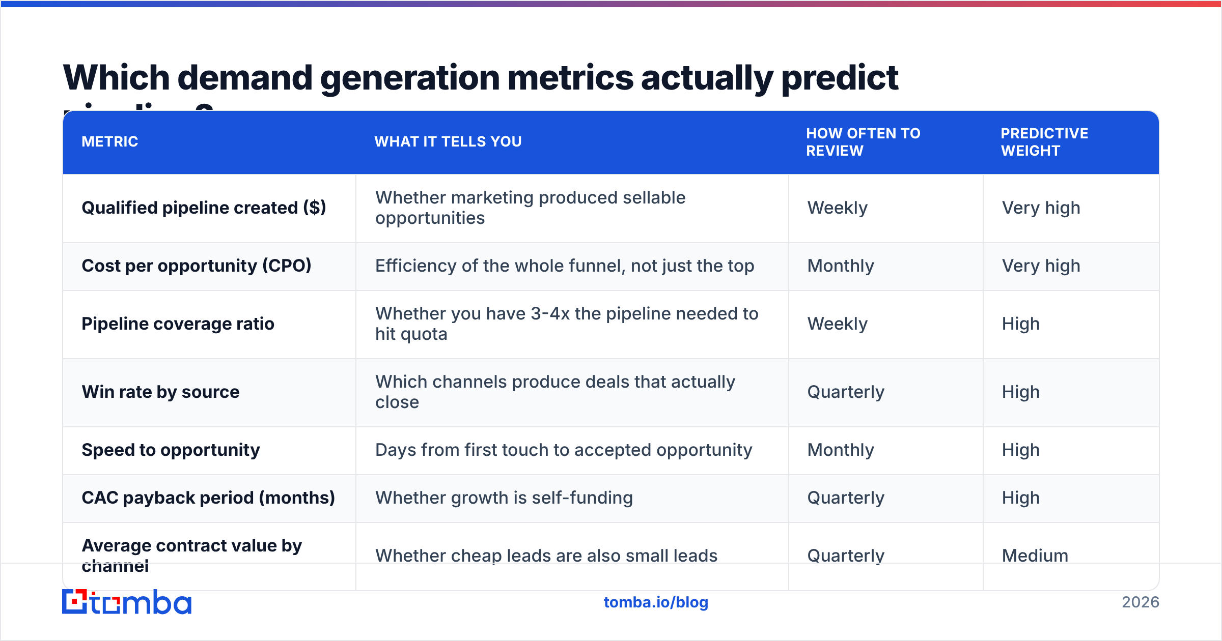
Here's the practical short list, ranked by how much weight it deserves in a quarterly review.
| Metric | What it tells you | How often to review | Predictive weight |
|---|---|---|---|
| Qualified pipeline created ($) | Whether marketing produced sellable opportunities | Weekly | Very high |
| Cost per opportunity (CPO) | Efficiency of the whole funnel, not just the top | Monthly | Very high |
| Pipeline coverage ratio | Whether you have 3-4x the pipeline needed to hit quota | Weekly | High |
| Win rate by source | Which channels produce deals that actually close | Quarterly | High |
| Speed to opportunity | Days from first touch to accepted opportunity | Monthly | High |
| CAC payback period (months) | Whether growth is self-funding | Quarterly | High |
| Average contract value by channel | Whether cheap leads are also small leads | Quarterly | Medium |
| Meeting-to-opportunity rate | Whether SDR/AE handoff quality is holding | Monthly | Medium |
| Reply rate on outbound sequences | Message-market fit and data quality | Weekly | Medium |
| Email bounce rate | Data hygiene, and a leading indicator of deliverability trouble | Weekly | Medium |
| MQL volume | Top-of-funnel supply, nothing more | Weekly | Low |
| Impressions / sessions | Reach. Diagnostic only | Monthly | Very low |
Notice what sits at the top: dollar-denominated and cost-denominated metrics. Anything that can be gamed by publishing more gated PDFs sits at the bottom.
Cost per opportunity is the single most underrated number here. CAC gets all the attention because investors ask about it, but CAC is a lagging composite that includes sales salaries, tooling, and deals that started nine months ago. CPO isolates the demand gen engine: total program spend divided by accepted opportunities in the same period. It moves fast enough to act on and slow enough to be meaningful.
Sorry — that renders as:

Why does MQL volume break as a primary metric?#
Because it optimizes for the wrong constraint. A marketing qualified lead is defined by your own scoring model, which means the team measured by MQLs also controls the definition of MQLs. That's a closed loop.
The failure pattern is predictable:
- Quarter 1 — MQL target set at 2,000. Team hits 2,100. Everyone's happy.
- Quarter 2 — Sales complains about quality. Scoring model gets "tuned." MQL count stays flat, opportunity count drops.
- Quarter 3 — Finance asks why CAC rose 40% while MQLs held steady. Nobody has a clean answer because no one tracked cost per opportunity.
The fix is not to delete MQLs. It's to demote them. Keep MQL volume as a supply indicator on the operational dashboard, and put qualified pipeline created and CPO on the executive one. Forrester, which originally popularized the waterfall model that gave us MQLs, has itself moved toward buying-group and opportunity-centric measurement — a reasonable signal that lead-count-first thinking has aged out.
If you're running a formal revenue operations function, this is exactly the arbitration RevOps exists to do: one definition of an opportunity, one source of truth for cost, one review cadence.
What's the difference between demand capture and demand creation metrics?#
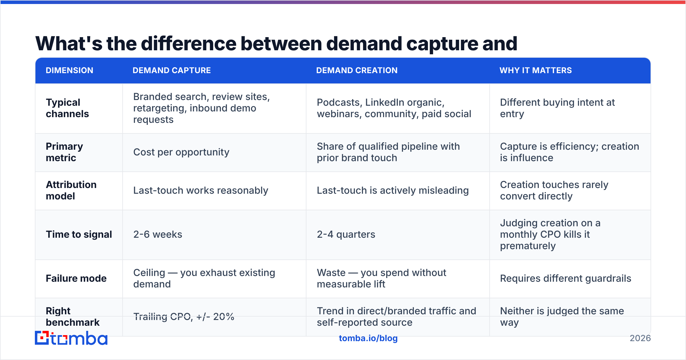
This distinction saves more budget arguments than any other. Demand capture harvests people already looking for a solution. Demand creation makes people aware they have a problem. They fail differently and therefore need different scorecards.
| Dimension | Demand capture | Demand creation | Why it matters |
|---|---|---|---|
| Typical channels | Branded search, review sites, retargeting, inbound demo requests | Podcasts, LinkedIn organic, webinars, community, paid social | Different buying intent at entry |
| Primary metric | Cost per opportunity | Share of qualified pipeline with prior brand touch | Capture is efficiency; creation is influence |
| Attribution model | Last-touch works reasonably | Last-touch is actively misleading | Creation touches rarely convert directly |
| Time to signal | 2-6 weeks | 2-4 quarters | Judging creation on a monthly CPO kills it prematurely |
| Failure mode | Ceiling — you exhaust existing demand | Waste — you spend without measurable lift | Requires different guardrails |
| Right benchmark | Trailing CPO, +/- 20% | Trend in direct/branded traffic and self-reported source | Neither is judged the same way |
The practical rule: never judge demand creation with a demand capture metric. If your LinkedIn thought-leadership program is being measured on last-touch cost per lead, it will be cut within two quarters regardless of its actual contribution.
The cheapest workaround most teams skip is a self-reported attribution field on the demo request form — a free-text or dropdown "How did you hear about us?" Multi-touch attribution platforms are expensive and still miss dark social. A required self-reported field costs nothing and routinely surfaces channels your tracking never sees.
How do you calculate the core demand gen efficiency metrics?#
Definitions vary enough between companies that it's worth writing yours down. Here are the versions most finance teams will accept:
- Customer Acquisition Cost (CAC) — (total sales + marketing spend in period) ÷ (new customers acquired in period). Include salaries and tooling, or state clearly that you didn't.
- Cost per Opportunity (CPO) — (program spend in period) ÷ (sales-accepted opportunities created in period). Exclude salaries so the number reflects program efficiency you can actually reallocate.
- CAC Payback Period — CAC ÷ (average monthly gross-margin-adjusted revenue per customer). Under 12 months is strong for SMB motions; 18-24 is common in enterprise.
- Pipeline Velocity — (number of open opportunities × average deal value × win rate) ÷ average sales cycle length in days. The single formula that shows whether a change helped or just moved the problem.
- Pipeline Coverage — total open pipeline ÷ quota for the period. Below 3x, you are forecasting on hope.
- Speed to Opportunity — median days from first known touch to accepted opportunity. Falling numbers usually mean better targeting; rising numbers mean you're buying attention from people who aren't in-market.
Pipeline velocity deserves special attention because it's the only formula above that punishes fake progress. Add 500 low-quality leads and win rate drops while cycle length rises — velocity gets worse, not better. That's exactly the behavior you want a headline metric to have.
What benchmarks should you compare against in 2026?#
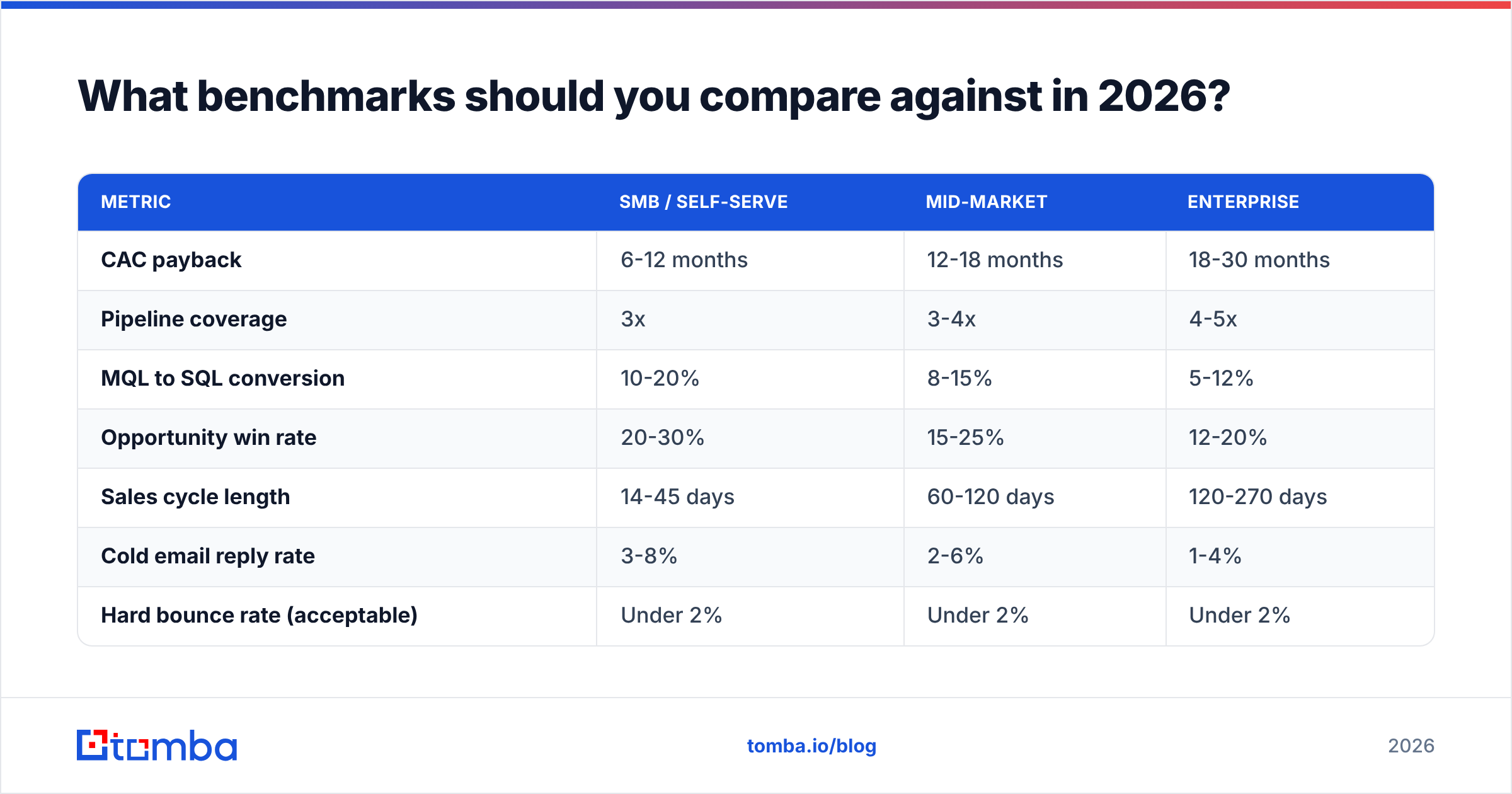
Use these as sanity checks, not targets. Your ACV, motion, and category maturity move every one of them.
| Metric | SMB / self-serve | Mid-market | Enterprise |
|---|---|---|---|
| CAC payback | 6-12 months | 12-18 months | 18-30 months |
| Pipeline coverage | 3x | 3-4x | 4-5x |
| MQL to SQL conversion | 10-20% | 8-15% | 5-12% |
| Opportunity win rate | 20-30% | 15-25% | 12-20% |
| Sales cycle length | 14-45 days | 60-120 days | 120-270 days |
| Cold email reply rate | 3-8% | 2-6% | 1-4% |
| Hard bounce rate (acceptable) | Under 2% | Under 2% | Under 2% |
Two notes on reading this table. First, the ranges are wide on purpose — anyone quoting a single "industry average win rate" is selling something. Public benchmark libraries from HubSpot and peer-review data on G2 are useful for orientation, but your own trailing four quarters is a far better baseline.
Second, the bounce rate row is not a demand gen metric in the traditional sense, and it's the one most likely to silently break the rest. Which brings us to the part most metrics articles skip.
How does contact data quality distort your demand gen metrics?#
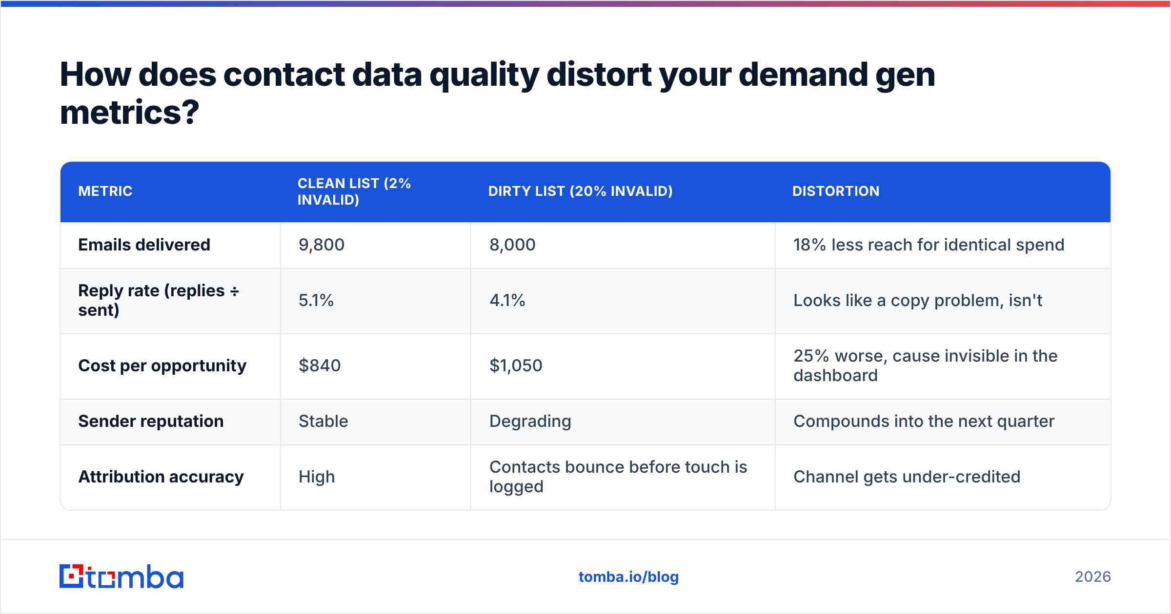
Every metric downstream of "contact" inherits the accuracy of that contact record. This is not a rounding error — it's a systematic bias, and it always points the same direction.
Here's what a 20% bad-data rate does to a 10,000-contact outbound program:
| Metric | Clean list (2% invalid) | Dirty list (20% invalid) | Distortion |
|---|---|---|---|
| Emails delivered | 9,800 | 8,000 | 18% less reach for identical spend |
| Reply rate (replies ÷ sent) | 5.1% | 4.1% | Looks like a copy problem, isn't |
| Cost per opportunity | $840 | $1,050 | 25% worse, cause invisible in the dashboard |
| Sender reputation | Stable | Degrading | Compounds into the next quarter |
| Attribution accuracy | High | Contacts bounce before touch is logged | Channel gets under-credited |
The insidious part is the second row. When reply rates fall, teams rewrite subject lines. They A/B test openers. They hire a copywriter. None of that addresses an invalid-address problem, so the tests come back inconclusive and the team concludes "outbound doesn't work for us."
Three habits prevent it:
- Verify before send, not after bounce. Run every list through an email verifier as a pipeline step, not a cleanup task. Catch-all domains need their own handling — a catch-all verifier distinguishes "accepts everything" from "actually deliverable."
- Enrich at the point of capture. A form that collects an email and nothing else forces your scoring model to guess at firmographics. Data enrichment on submit gives your MQL definition something real to work with.
- Re-verify quarterly. B2B contact data decays roughly 25-30% per year through job changes alone. A list that was clean in January is measurably worse by July.
Track hard bounce rate on the same dashboard as reply rate. When one moves, you'll know instantly whether the other moved for a real reason.
Which metrics should you stop reporting entirely?#
Cut these from executive reporting. Keep them in the operational layer if they help you debug.
- Impressions and reach — no relationship to pipeline at any B2B ACV. Diagnostic only.
- Email open rate — Apple Mail Privacy Protection and similar features made this number structurally unreliable. Reply rate and meetings booked survived; open rate didn't.
- Social followers — unless you can show a conversion path from follower to opportunity, this is a vanity count.
- Total leads — undifferentiated lead count hides the mix shift that actually explains your results.
- Content pieces published — an input, reported as an output.
- Website sessions in isolation — meaningful only as a ratio (sessions to demo request) or a trend in branded/direct traffic.
The test: if the number went up 50% next quarter and nothing else changed, would you be happier? For impressions, followers, and content volume, the honest answer is no.
How do you build a demand gen dashboard people actually use?#
Three tiers, three audiences, three cadences.
- Executive view (monthly) — qualified pipeline created, CPO, CAC payback, pipeline coverage, win rate by source. Five numbers, each with a trailing four-quarter trend line. No channel breakdowns.
- Program view (weekly) — CPO and speed to opportunity by channel, meeting-to-opportunity rate, reply rate, bounce rate. This is where reallocation decisions get made.
- Operational view (daily) — sequence-level reply and bounce data, form conversion rates, list health, bulk verification job status. Owned by RevOps and demand gen ops, not reviewed in meetings.
Two rules keep the whole thing honest. First, every metric needs a written definition stored somewhere both marketing and finance can see. Second, no metric goes on the executive view unless someone can name the action they'd take if it moved 20% in either direction. Metrics without an attached decision are decoration.
Start with the data layer, not the dashboard#
You can build the most rigorous demand gen scorecard in your category and still get misleading answers if the contacts feeding it are stale, unverified, or missing firmographics. Fix the input before you refine the measurement.
Tomba's Email Finder gives you verified professional email addresses by domain, name, or company, so the contacts entering your funnel are real before they touch your attribution model. Pair it with the verifier and enrichment layer and your bounce rate stops polluting every metric downstream of it. The free tier includes 25 searches a month to test against a real list; paid plans start at $49/mo — see Tomba pricing for the full breakdown. Clean inputs first, then trust the dashboard.
Related guides#
// get started
Find, verify and enrich your first contacts today
Start on the free plan with 25 searches a month, then scale when your team is ready.
Free plan · No credit card required · GDPR & CCPA
// about the author