Email Analytics Dashboard: The 2026 Guide to Metrics That Matter
Open rates have been unreliable since Apple MPP, yet most teams still report them. Here is how to build an email analytics dashboard that tracks reply rate, deliverability, and pipeline instead of vanity numbers.
TL;DR
- An email analytics dashboard is only useful if it connects send volume to replies, meetings, and pipeline — not to opens.
- Apple Mail Privacy Protection and image proxies broke open-rate accuracy years ago. Treat opens as a directional signal at best, and never as a KPI.
- The seven metrics worth a tile on your dashboard: delivery rate, bounce rate, spam-complaint rate, reply rate, positive-reply rate, meetings booked, and pipeline per 1,000 sends.
- Your dashboard is only as honest as your list. Unverified contacts inflate send counts and deflate every downstream rate.
- Build vs buy: sending platforms give you channel metrics free, but cross-channel attribution needs a warehouse plus Looker Studio or similar.
What is an email analytics dashboard?#
An email analytics dashboard is a single view that turns raw sending activity into decisions: which sequence to kill, which domain to pause, which segment to double down on. Think of it like the instrument panel in a car. You do not need forty gauges — you need speed, fuel, engine temperature, and a warning light that fires before something expensive breaks.
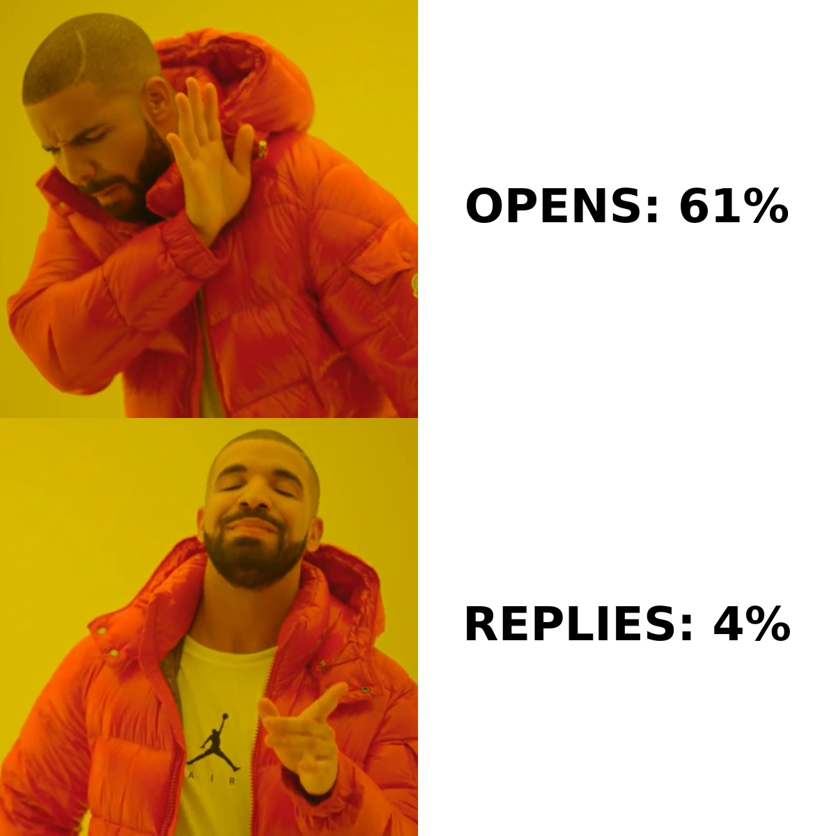
Most teams get this wrong in the same way. They plug their sending tool's default report into a slide, screenshot a 61% open rate, and call it reporting. That number tells you almost nothing about whether your outbound is working. Meanwhile the metric that would have caught a deliverability collapse three weeks earlier — spam-complaint rate creeping past 0.2% — never made it onto the panel.
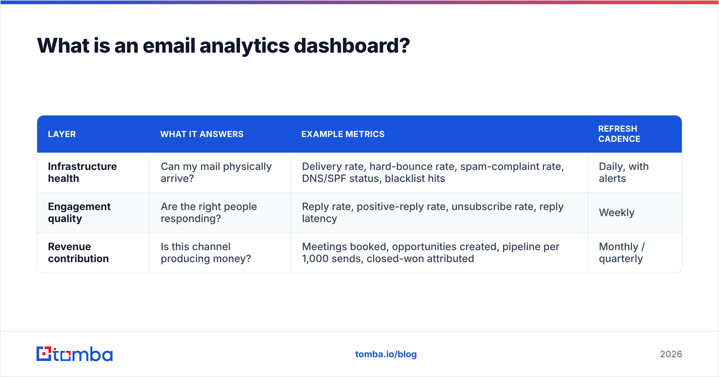
A working dashboard has three layers, and confusing them is the root cause of most bad email reporting.
| Layer | What it answers | Example metrics | Refresh cadence |
|---|---|---|---|
| Infrastructure health | Can my mail physically arrive? | Delivery rate, hard-bounce rate, spam-complaint rate, DNS/SPF status, blacklist hits | Daily, with alerts |
| Engagement quality | Are the right people responding? | Reply rate, positive-reply rate, unsubscribe rate, reply latency | Weekly |
| Revenue contribution | Is this channel producing money? | Meetings booked, opportunities created, pipeline per 1,000 sends, closed-won attributed | Monthly / quarterly |
Infrastructure metrics are early-warning systems and belong on a daily view with thresholds. Engagement metrics are for iteration — copy, targeting, offer. Revenue metrics are for budget conversations. If all three live on one flat grid of twelve equally sized tiles, nobody knows what to look at first.
Why did open rate stop working?#
Open rate is measured by a 1×1 tracking pixel. When the recipient's client loads that image, your tool records an open. Apple Mail Privacy Protection, introduced in iOS 15 and now the default for a large share of consumer and mixed-domain inboxes, pre-loads those images through a proxy regardless of whether a human ever looked at the message. Gmail has proxied images since 2013. Corporate security gateways scan and fetch images too.
The result is not "slightly noisy data." It is a metric with a floor that has nothing to do with human behavior, layered on top of a real signal you cannot separate out. A sequence can show 68% opens while the actual human read rate is a third of that, and a different sequence can show 40% opens simply because its audience skews toward Outlook desktop with images disabled.

Three practical consequences for your dashboard:
- Never A/B test subject lines on open rate alone. Compare reply rate. If you must use opens, require a very large sample and treat the delta as a hint.
- Never gate follow-up logic on "opened but did not reply." Proxy opens will trigger that branch for people who never saw the message.
- Do keep opens as a break-glass diagnostic. If opens fall off a cliff for one sending domain while others hold steady, that is a deliverability signal worth chasing even though the absolute number is meaningless.
Google and Yahoo's bulk-sender requirements made the replacement metrics explicit. Google's own sender guidelines tell you to keep spam-complaint rate below 0.3% and ideally under 0.1%. That is a hard operational threshold you can put a red line on. Open rate has no such threshold, because nobody — including your ESP — can tell you what a "good" one means anymore.
Which metrics belong on the dashboard?#
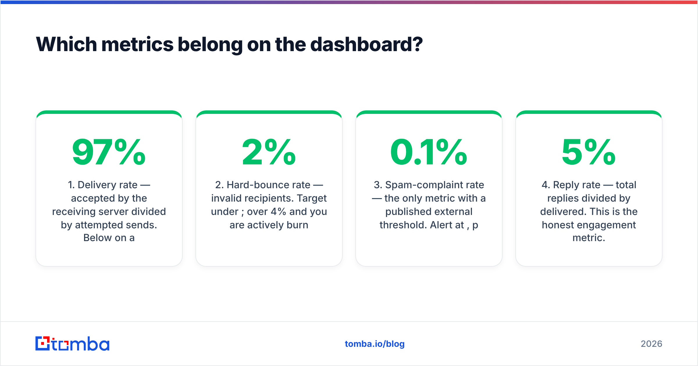
Seven tiles. If you add an eighth, remove one first.
- Delivery rate — accepted by the receiving server divided by attempted sends. Below 97% on a cold list means your data or your infrastructure is broken. This is your first-line check.
- Hard-bounce rate — invalid recipients. Target under 2%; over 4% and you are actively burning sender reputation. Bounces are almost always a list-quality problem, not a sending problem.
- Spam-complaint rate — the only metric with a published external threshold. Alert at 0.1%, panic at 0.3%. Track it per sending domain, not just in aggregate, so one bad domain does not hide inside a good average.
- Reply rate — total replies divided by delivered. This is the honest engagement metric. Cold outbound benchmarks land in the low single digits; 3–5% is healthy for a well-targeted list, and anything above 8% usually means a narrow, high-fit segment.
- Positive-reply rate — replies that express interest, split from "not interested," "wrong person," and out-of-office. This is the number that actually predicts pipeline, and it is the one most dashboards omit because it needs classification (manual tagging, or an AI classifier on the reply body).
- Meetings booked per 1,000 sends — normalizes across campaigns of wildly different size. A 40-contact campaign at 3 meetings beats a 4,000-contact campaign at 12, and only this metric shows it.
- Pipeline per 1,000 sends — the CFO-legible number. Requires CRM join, which is why it usually lives on a monthly view rather than a live one.
Two supporting cuts make these seven far more useful: segment by ICP tier (so you can see that tier-1 accounts reply at 3× tier-3), and segment by sending domain and mailbox (so infrastructure problems surface as one bad actor rather than a mushy average). HubSpot maintains a large public set of marketing and email benchmarks if you want external reference points, though treat any cross-industry average as a very loose sanity check rather than a target.
What does the tool landscape look like?#
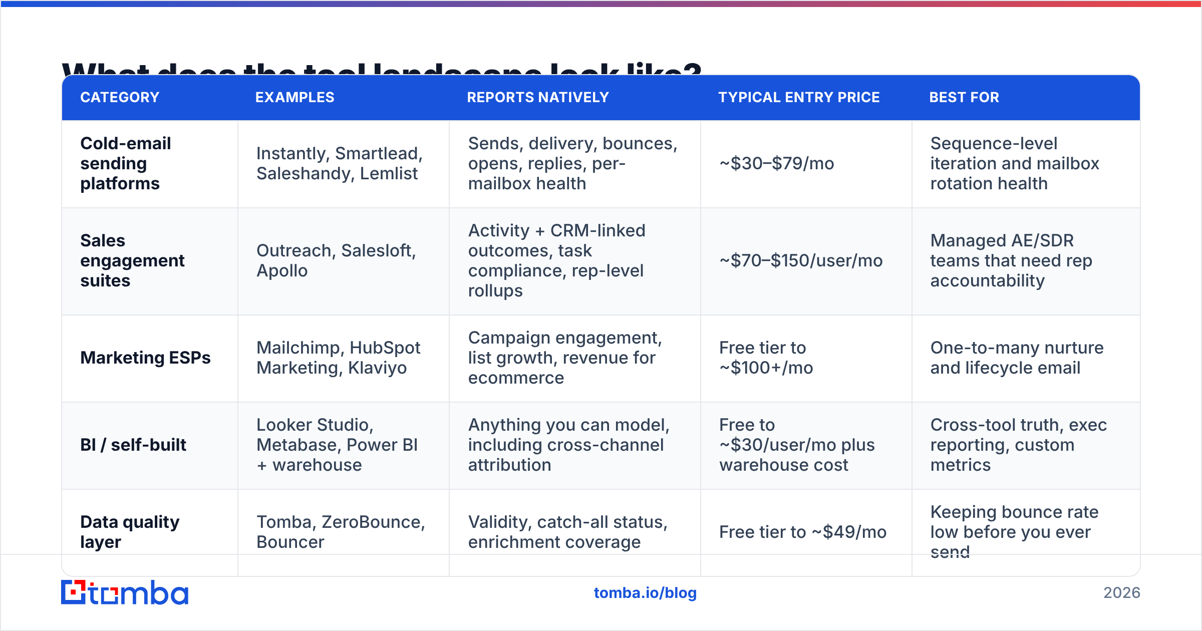
Broadly, four categories, and most teams end up with two of them stitched together.
| Category | Examples | Reports natively | Typical entry price | Best for |
|---|---|---|---|---|
| Cold-email sending platforms | Instantly, Smartlead, Saleshandy, Lemlist | Sends, delivery, bounces, opens, replies, per-mailbox health | ~$30–$79/mo | Sequence-level iteration and mailbox rotation health |
| Sales engagement suites | Outreach, Salesloft, Apollo | Activity + CRM-linked outcomes, task compliance, rep-level rollups | ~$70–$150/user/mo | Managed AE/SDR teams that need rep accountability |
| Marketing ESPs | Mailchimp, HubSpot Marketing, Klaviyo | Campaign engagement, list growth, revenue for ecommerce | Free tier to ~$100+/mo | One-to-many nurture and lifecycle email |
| BI / self-built | Looker Studio, Metabase, Power BI + warehouse | Anything you can model, including cross-channel attribution | Free to ~$30/user/mo plus warehouse cost | Cross-tool truth, exec reporting, custom metrics |
| Data quality layer | Tomba, ZeroBounce, Bouncer | Validity, catch-all status, enrichment coverage | Free tier to ~$49/mo | Keeping bounce rate low before you ever send |
Prices move; check the vendor page before you budget. The structural point holds regardless: no single category gives you all three dashboard layers. Sending platforms own infrastructure and engagement data but cannot see closed-won. CRMs own revenue but have lossy activity data. That gap is why the self-built BI layer keeps showing up even at small teams — Looker Studio is free, connects to Sheets and BigQuery, and can join a sequence export to a CRM export in an afternoon.
If you want to compare category leaders on verified reviews rather than vendor claims, G2's email marketing category is a reasonable starting point — filter by company size, because enterprise-weighted scores rarely reflect what a five-person team experiences.
How do you build one without a data team?#
The minimum viable version takes a day and costs nothing beyond what you already pay.
Step 1 — pick your source of truth per metric. Write it down explicitly: delivery and bounce come from the sending tool; positive replies come from your tagged inbox or a classifier; meetings come from the calendar or CRM. When two systems disagree, the written rule prevents a two-hour Slack argument.
Step 2 — export on a schedule. Every serious sending platform has an API or a scheduled CSV export. Land those in Google Sheets or BigQuery. Do not hand-copy numbers; hand-copied dashboards die in week three.
Step 3 — normalize the join key. This is where most builds break. Sequence exports key on email address, CRM keys on contact ID, calendar keys on attendee email. Lowercase and trim everything, and resolve aliases so j.doe@acme.com and jdoe@acme.com do not become two contacts with half the story each. A reverse email lookup helps when you have an address in a reply thread but no matching CRM record.
Step 4 — model the rates, not the counts. Store raw counts, compute rates in the BI layer. Rates computed upstream cannot be re-segmented later.
Step 5 — add thresholds and alerts before you add charts. A dashboard nobody opens is worthless; an alert that fires when spam complaints cross 0.1% on any domain earns its keep the first week.
Step 6 — review on a fixed cadence with a fixed question. Daily: "is anything red?" Weekly: "which sequence gets cut?" Monthly: "does the channel still pencil out?"
How does list quality distort your numbers?#
More than any other input, and in a direction that flatters you.
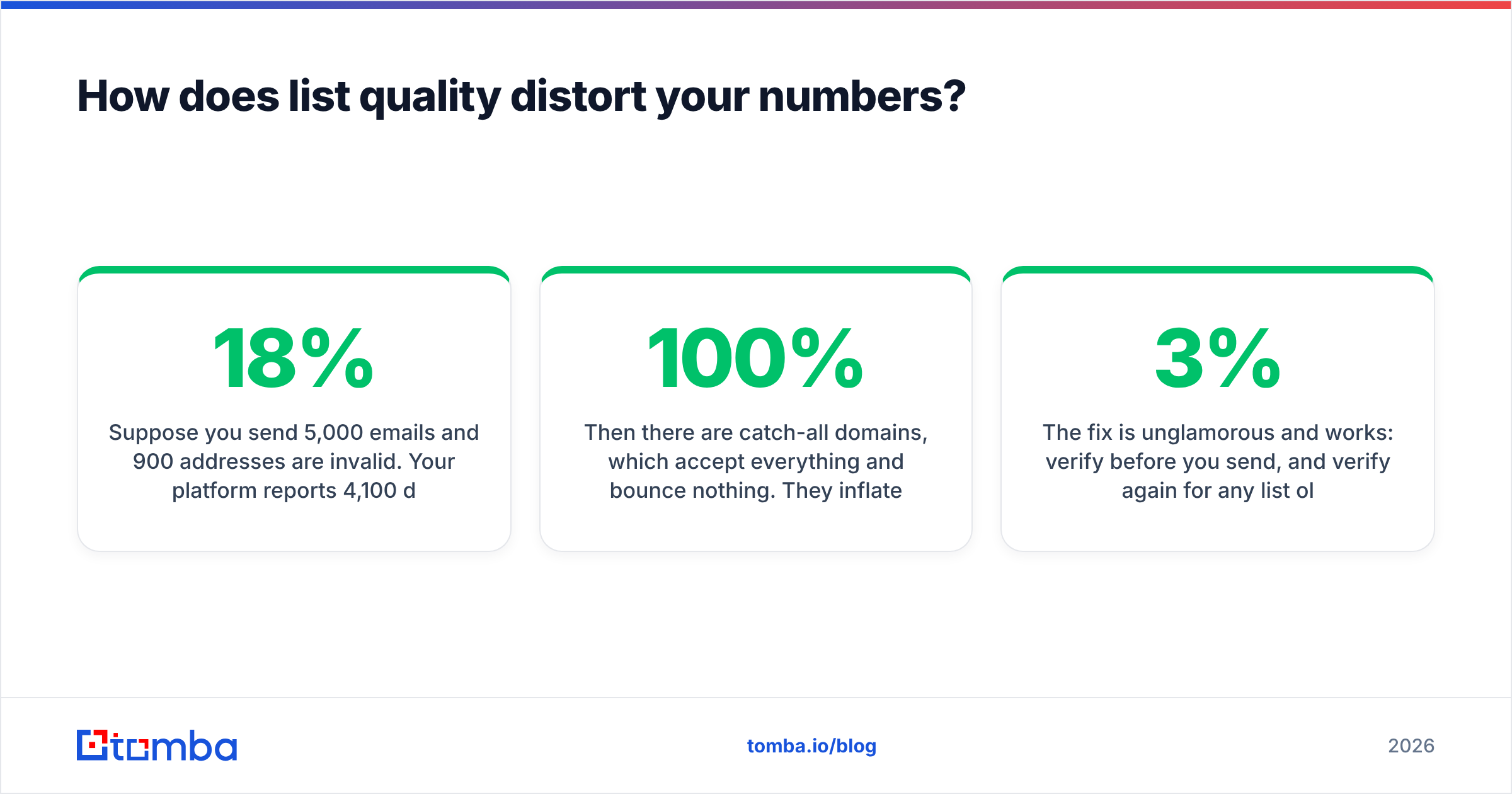
Suppose you send 5,000 emails and 900 addresses are invalid. Your platform reports 4,100 delivered, 900 bounced — an 18% bounce rate that will get your domain throttled within days. But the subtler damage is arithmetic. Reply rate calculated on delivered looks fine. Reply rate calculated on attempted looks terrible. Two people report the same campaign with a 2× difference and both are technically right.
Then there are catch-all domains, which accept everything and bounce nothing. They inflate your delivery rate to near 100% while quietly swallowing messages that never reach a human. If a meaningful slice of your list is catch-all, "delivery rate: 99.4%" is not good news — it is missing information. Split catch-all sends into their own dashboard segment, or run them through a catch-all verifier so you know which ones resolve to real mailboxes before you count them as delivered.
The fix is unglamorous and works: verify before you send, and verify again for any list older than 90 days. B2B contact data decays roughly 2–3% per month as people change roles, so a list you built in January is materially different by April. Run bulk lists through an email verifier as a pipeline step rather than a one-off cleanup, and use bulk verify for the quarterly re-check on your existing database. If you would rather wire it into the export step directly, the Tomba API handles verification inline so the dashboard only ever ingests deliverable contacts.
Also worth a tile: sender reputation itself. A sender reputation checker plus a weekly blacklist check gives you the leading indicator that precedes a bounce-rate spike, rather than the lagging one you notice after a bad week.
What does a mature dashboard get you?#
Three things you cannot get from a screenshot of your sending tool.
Faster kill decisions. When reply rate is segmented by ICP tier and job title, an underperforming sequence stops being "the copy is bad" and becomes "this works on VP Ops, not on Directors of Finance." That is an actionable finding in a week rather than a quarter.
Defensible budget. Pipeline per 1,000 sends, tracked over six months, is the argument for more mailboxes or more data credits. "Our open rate is up" is not.
Earlier failure detection. Deliverability collapses are gradual and reversible if caught early. Complaint rate and per-domain delivery, with alerts, buy you the two weeks that make the difference between a warmup adjustment and a burned domain.
None of that requires expensive tooling. It requires deciding which seven numbers matter, agreeing where each one comes from, and keeping the underlying contact data clean enough that the numbers mean something.
Ready to fix the input before you fix the report?#
A dashboard cannot rescue a bad list — it just documents the damage in higher resolution. Start at the source: use the Tomba Email Finder to build lists from verified, deliverable addresses so your bounce rate stays under 2% and every downstream rate on your dashboard reflects real human behavior instead of dead mailboxes. The free tier covers 25 searches per month if you want to test accuracy against a sample of your current list first; paid plans start at $49/mo, with full Tomba pricing laid out per tier. Verify first, then measure — in that order.
Related guides#
Ready to find emails that actually work?
Join 150,000+ professionals who stopped guessing and started sending. Free credits on signup — no credit card required.
Get the Tomba newsletter
Practical outbound tactics and product updates — once every two weeks.
About the author