Email CTA Buttons: Design, Copy and Placement That Convert
Most email CTA buttons fail for boring reasons: wrong ask, wrong placement, or a button that never renders. Here's what actually moves click rates in 2026.
TL;DR
- One primary ask per email beats three competing ones. Multiple CTAs split attention and depress total clicks, not just clicks per link.
- Bulletproof HTML/VML buttons render everywhere; image-only buttons disappear the moment a client blocks images — which is most of the time on first open.
- Copy the outcome, not the mechanic. "Get the 12-point audit" outperforms "Click here" and "Submit" because it tells the reader what they receive.
- Placement follows commitment: low-commitment asks can sit above the fold, high-commitment asks need the body copy first.
- A CTA is only as good as the inbox it reaches. Clean lists and verified addresses come before button color arguments.
What are email CTA buttons and why do they decide your click rate?#
An email CTA button is the single clickable element that carries your email's job — book the demo, download the guide, reply to the thread. Think of it like a door in a hallway: your copy is the hallway, and the button is the only door. If there are five doors and no signs, people walk out the way they came in.
Most teams treat the button as decoration. It isn't. It's the conversion surface. Everything above it exists to make one click feel obvious and low-risk. Everything below it is usually noise.
Two numbers matter and they measure different things:
- Click-through rate (CTR) — clicks divided by emails delivered. Useful for comparing campaigns, useless for diagnosing a button.
- Click-to-open rate (CTOR) — clicks divided by unique opens. This is your button's actual scorecard. If CTOR is under 2% on a warm B2B list, the problem is the ask or the button, not the subject line.
- Reply rate — the metric that matters most in one-to-one cold outbound, where a button often hurts you.
- Conversion rate post-click — a beautiful button that sends people to a mismatched landing page is a leak, not a win.
Track CTOR per CTA variant, not per campaign. That is the only way to know whether "Book a 15-min call" beat "Schedule time" or whether the winning email just landed on a better send day. For broader context on how clicks fit into the funnel, see the definition of response rate.
How many CTAs should one email have?#
One primary CTA. Optionally one secondary, styled clearly weaker.
The reasoning is not aesthetic. Every additional decision point adds cognitive cost, and readers resolve cost by doing nothing. In practice, when teams cut a three-button newsletter down to one primary button plus a plain text link, total clicks usually hold or rise even though the number of clickable elements dropped.
The exception is the digest email — a weekly roundup where each item legitimately has its own destination. There, the "one CTA" rule applies per block, not per email. Each block gets one link, formatted identically, and the email gets a visual hierarchy that makes the top block obviously primary.
Repeating the same CTA is different from adding CTAs. A long-form email can carry the identical button twice — once after the value proposition, once at the close — without splitting attention. Same copy, same URL, same styling. That's one ask presented twice, not two asks.
Which button style should you use: HTML, VML, or image?#
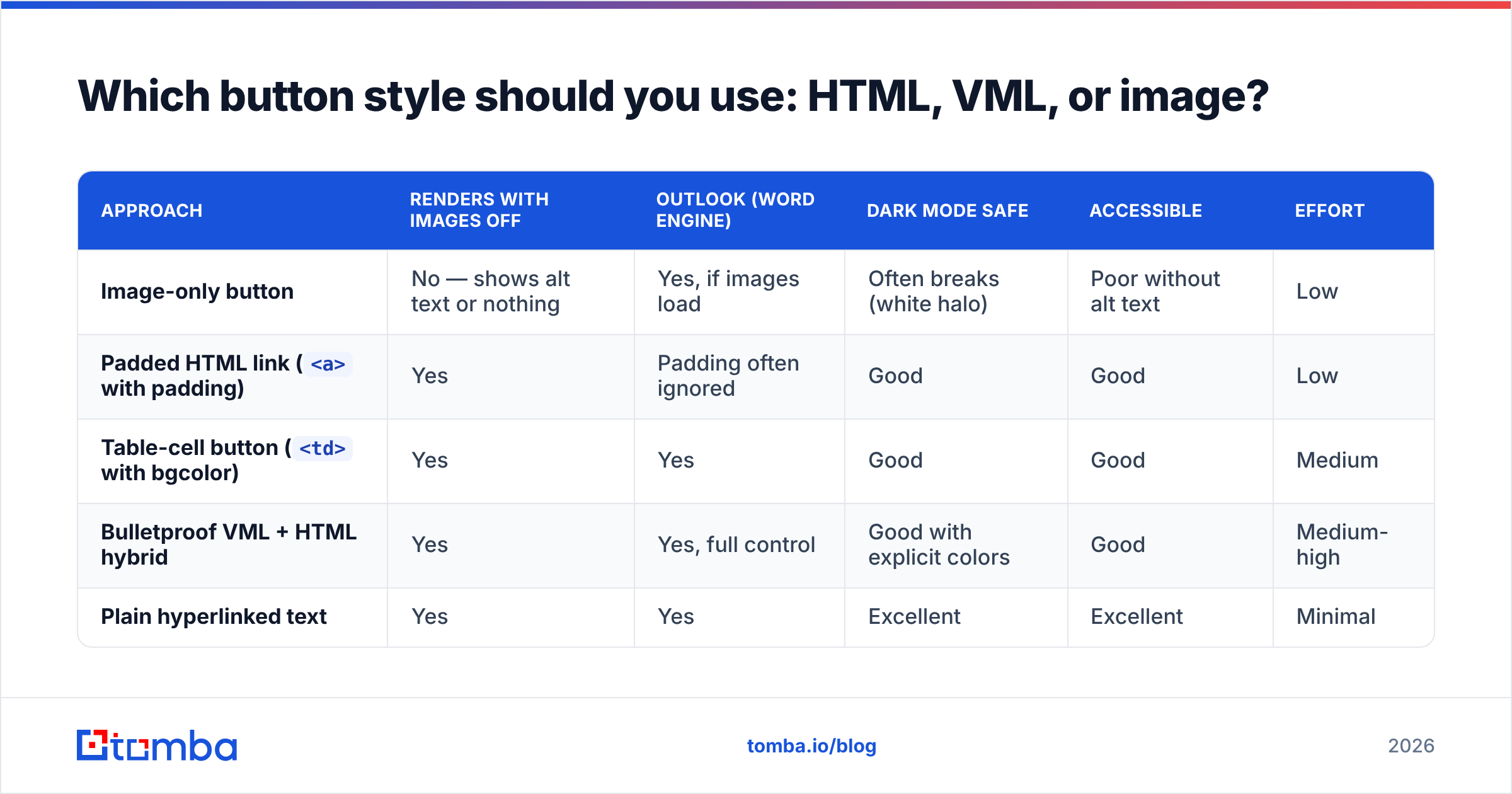
This is where good copy dies. If your button doesn't render, none of the rest matters.
| Approach | Renders with images off | Outlook (Word engine) | Dark mode safe | Accessible | Effort |
|---|---|---|---|---|---|
| Image-only button | No — shows alt text or nothing | Yes, if images load | Often breaks (white halo) | Poor without alt text | Low |
Padded HTML link (<a> with padding) |
Yes | Padding often ignored | Good | Good | Low |
Table-cell button (<td> with bgcolor) |
Yes | Yes | Good | Good | Medium |
| Bulletproof VML + HTML hybrid | Yes | Yes, full control | Good with explicit colors | Good | Medium-high |
| Plain hyperlinked text | Yes | Yes | Excellent | Excellent | Minimal |
The practical rule: use a bulletproof button (table cell with bgcolor plus a VML fallback wrapped in conditional comments for Outlook) for marketing sends, and plain hyperlinked text for one-to-one sales outreach. Image-only buttons should be treated as a legacy pattern.
Three details that break buttons in real inboxes:
- Dark mode inversion. Some clients force-invert backgrounds. Set explicit
background-colorandcoloron both the<td>and the<a>, and avoid pure white button text on a light-when-inverted fill. - Touch target size. Minimum 44×44 px. A 30px-tall button on mobile produces mis-taps that register as clicks and then bounce — inflating CTR while destroying conversion.
- Bare
#orjavascript:hrefs. They pass QA in the browser preview and fail in the inbox. Always ship a real absolute URL withhttps://.
Run a rendering pass before every template goes live. Litmus and Email on Acid both cover the client matrix; if you're on a budget, sending to a real Outlook desktop account plus Gmail app on iOS and Android catches the majority of failures.
What CTA copy actually gets clicked?#
Write the outcome the reader receives, in their words, in first person where it fits naturally.
Weak, in descending order of harm:
- "Submit" — describes what the form does, not what the reader gets
- "Click here" — describes the mechanic, invisible to screen readers out of context
- "Learn more" — vague, commits the reader to unknown effort
- "Download" — better, but still about the transfer, not the value
Strong patterns:
- Verb + specific noun. "Get the pricing breakdown", "See the 2026 benchmark data". The reader knows exactly what appears next.
- Time-bounded commitment. "Book a 15-min call" converts better than "Book a demo" because the cost is stated up front.
- First person possessive. "Send me the template" tests well because it reads as the reader's own decision, not the sender's instruction.
- Objection-adjacent microcopy. A line under the button — "No card required. 25 free searches." — removes the hesitation the button itself can't address.
- Reply-as-CTA. In cold one-to-one email, "Worth a quick reply?" beats any button, because it keeps the interaction inside the inbox and avoids link-based spam filtering.
Length: 2–5 words for the button label. Past five words, the button wraps on mobile and looks like a sentence someone accidentally styled.
Sentence case beats ALL CAPS for readability and beats Title Case marginally in most tests. Caps are fine for very short labels ("GET STARTED") but degrade fast at four-plus words.
If you're drafting variants at volume, a subject line generator and a set of cold email templates give you a starting library to edit rather than a blank page.
Where should the CTA button go?#
Placement should match the size of the ask, not a fixed rule about the fold.
| Ask type | Example | Best placement | Why |
|---|---|---|---|
| Low commitment | "See the chart" | Above the fold, repeat at close | Reader needs no convincing; friction is the only enemy |
| Medium commitment | "Download the report" | After the value paragraph | Needs one reason before the click |
| High commitment | "Book a 30-min call" | After proof/social proof block | Requires trust built in body copy |
| Transactional | "Confirm your email" | Immediately, as the only element | Reader already expects it |
| Re-engagement | "Keep getting these?" | Single centered button, near-empty email | Any additional element dilutes the binary choice |
Two placement failures worth naming:
- Button before context in a cold email. Nobody books a call from a first-touch email they haven't read. The button above the fold gets seen, skipped, and never revisited.
- Button after the signature. It reads as a footer element and gets filtered out by the eye along with the unsubscribe link and legal text.
Center-align single buttons. Left-align them only when they sit inside a left-aligned content block and the alignment reads as intentional.
How do you test email CTA buttons without fooling yourself?#
Change one variable per test, and size the test before you run it.
The most common mistake in CTA testing is calling a winner on 400 sends. With a baseline CTOR of 3%, detecting a genuine 20% relative lift needs several thousand recipients per arm. Anything smaller and you're reading noise and shipping superstition.
Test in this order — it's roughly descending by effect size:
- The offer itself. "Book a call" vs "Get the teardown" is a different email, and it moves clicks far more than any styling change.
- CTA copy. Outcome vs mechanic. Reliable, repeatable gains.
- Placement. Above vs below the value paragraph.
- Button vs text link. In one-to-one outbound, plain text often wins.
- Size and padding. Real but small.
- Color. Smallest effect of the set. Contrast against your template matters; the specific hue almost never does. Skip the "red vs green" debates entirely and just ensure a contrast ratio of at least 4.5:1 against the surrounding background — the WCAG contrast guidance is the standard to hold yourself to.
Segment results before concluding. A CTA that wins with existing customers frequently loses with cold prospects, because the two groups price risk differently. If your ESP supports it, run holdout segments rather than pure A/B splits on your most valuable lists.
Does your CTA even matter if the email doesn't land?#
No. And this is the part most CTA guides skip.
Click rate is calculated over emails that reached a human inbox. If 18% of your list is invalid, stale, or a role address, three things happen at once: your denominator is inflated, your bounce rate signals to mailbox providers that you're sending to a bought list, and your genuinely good emails start landing in Promotions or spam. At that point you can optimize button padding forever and never see the number move.
The order of operations that actually works:
- Verify the list before the send. Remove hard bounces, catch-alls you can't confirm, and disposable domains. An email verifier pass takes minutes and protects sender reputation that takes months to rebuild.
- Authenticate the domain. SPF, DKIM, DMARC. Google and Yahoo's bulk sender requirements made this table stakes, not optional — their sender guidelines spell out the thresholds.
- Watch link count and link reputation. Three links in a cold email reads as bulk. One link to a domain with clean history reads as a person.
- Then optimize the button. Now the metric reflects the button and not the deliverability.
There's a related trap on the link itself. Aggressive click-tracking through an unbranded redirect domain — the default on many platforms — associates your email with a shared domain that other senders may have burned. Use a branded tracking domain (links.yourcompany.com) or drop click-tracking entirely on one-to-one sends. Also note that security scanners at enterprise gateways pre-click links, which inflates unique clicks by a few percent on some lists. If your CTOR looks unusually high on enterprise domains, that's usually why.
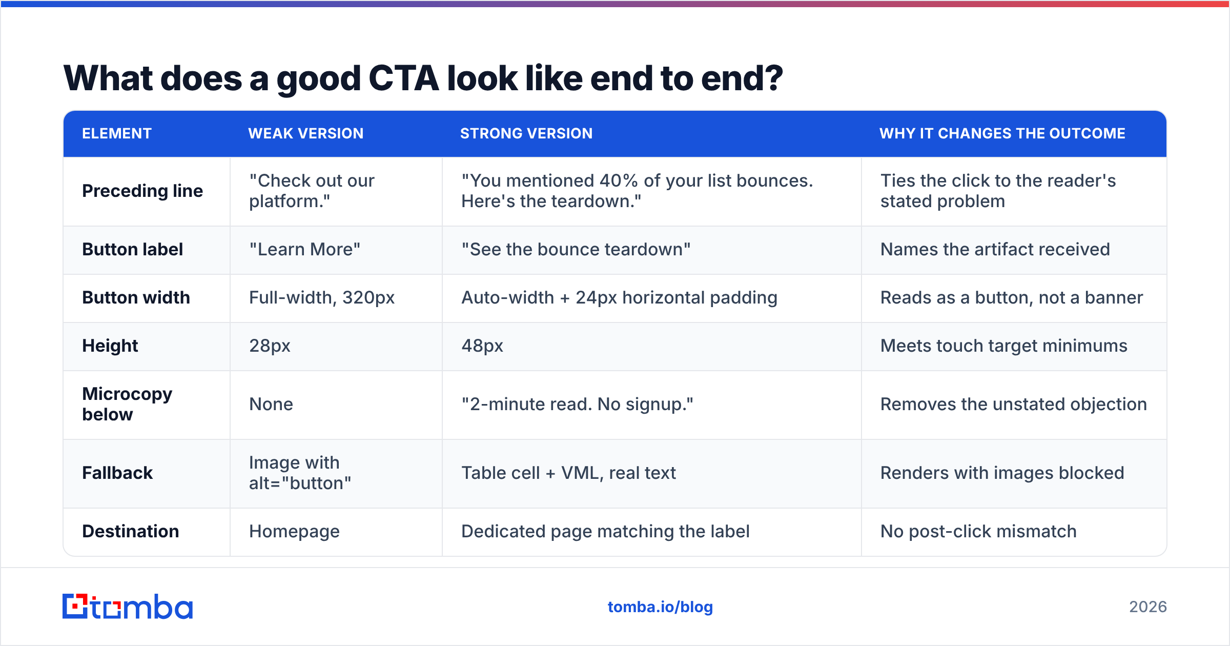
What does a good CTA look like end to end?#
Here's the anatomy of a button that works, using a concrete B2B example.
| Element | Weak version | Strong version | Why it changes the outcome |
|---|---|---|---|
| Preceding line | "Check out our platform." | "You mentioned 40% of your list bounces. Here's the teardown." | Ties the click to the reader's stated problem |
| Button label | "Learn More" | "See the bounce teardown" | Names the artifact received |
| Button width | Full-width, 320px | Auto-width + 24px horizontal padding | Reads as a button, not a banner |
| Height | 28px | 48px | Meets touch target minimums |
| Microcopy below | None | "2-minute read. No signup." | Removes the unstated objection |
| Fallback | Image with alt="button" | Table cell + VML, real text | Renders with images blocked |
| Destination | Homepage | Dedicated page matching the label | No post-click mismatch |
Every row above is a hypothesis you can test independently. Start with the label and the destination match — those two carry the most weight.
How do you build the list your CTAs are for?#
Great buttons need the right recipients. A perfect CTA sent to a wrong-role contact converts at zero.
Build the list around the person who owns the outcome your CTA promises. If the button says "See the bounce teardown", the recipient should be someone accountable for email performance — demand gen, lifecycle, RevOps — not a generic info@ address. Use domain search to map the org, filter by role, and enrich before you write a word of copy. A bulk email finder run followed by a verification pass gives you a list where CTR is a real signal rather than an artifact of bad targeting.
For research-heavy segments, data enrichment adds the seniority, tech-stack, and headcount fields you need to write CTA copy that's specific enough to click. "See the Klaviyo migration checklist" only works when you know they're on Klaviyo.
Both G2 and Capterra list the major providers if you want to compare the space yourself. Tools like BookYourData are strong when you want a ready-built list with firmographic filters; a finder-first workflow like Tomba's suits teams that build lists from a target-account map rather than buying them pre-assembled. Both approaches work — the deciding factor is whether your ICP is defined by attributes (buy a filtered list) or by named accounts (find contacts per domain).
What should you fix first?#
If you only change three things this quarter:
- Cut to one primary CTA per email. Free, immediate, and usually the biggest single lift.
- Rewrite every label from mechanic to outcome. "Submit" → "Get my audit". One afternoon of work across your template library.
- Verify the list before every send. Stops you from optimizing a number that isn't measuring what you think it is.
Then move to rendering (bulletproof buttons), placement by commitment level, and only after all of that, styling tests.
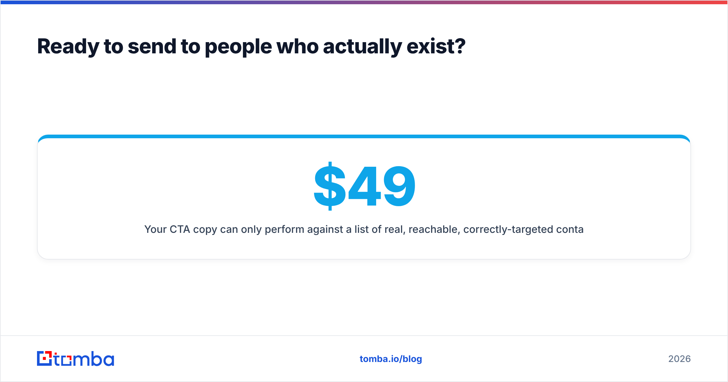
Ready to send to people who actually exist?#
Your CTA copy can only perform against a list of real, reachable, correctly-targeted contacts. Tomba's email finder locates verified professional addresses by domain, name, or company, so the clicks you measure come from the people you meant to reach. The free tier includes 25 searches per month; paid plans start at $49/mo for Starter, $99/mo for Growth, and $249/mo for Pro — full Tomba pricing is on the site. Build the list first, then argue about button color.
Related guides#
Ready to find emails that actually work?
Join 150,000+ professionals who stopped guessing and started sending. Free credits on signup — no credit card required.
Get the Tomba newsletter
Practical outbound tactics and product updates — once every two weeks.
About the author