Email Outreach Analytics: The 2026 Metrics Guide That Works
Open rates went from north star to noise in under two years. Here's the metric stack that actually predicts pipeline in 2026 — with benchmarks, diagnostic thresholds, and what to fix at each stage.
TL;DR
- Open rate is no longer a usable signal. Apple Mail Privacy Protection, Gmail image proxying, and security scanners inflate it by 20–60% depending on your list mix — treat it as a directional diagnostic only, never a KPI.
- The four metrics that actually correlate with pipeline: valid-send rate, reply rate, positive reply rate, and meetings booked per 1,000 sends. Everything else is a supporting diagnostic.
- Bounce rate above 3% is not a "list quality" problem you fix later — it's a deliverability emergency that suppresses every campaign on that domain for weeks.
- Build reporting in three layers: data quality (pre-send), delivery (infrastructure), and engagement (message-market fit). Diagnosing the wrong layer is the single most common reason teams "fix" a campaign and see no change.
- Attribution matters more than volume. A team sending 4,000 emails a month with a tracked reply-to-meeting funnel beats a team sending 40,000 with a spreadsheet and vibes.
What is email outreach analytics?#
Email outreach analytics is the practice of measuring your cold and warm email programs end to end — from list quality before a single message leaves your server, through delivery and inbox placement, all the way to replies, meetings, and closed revenue.
The useful analogy: think of it like a factory production line. Most teams only inspect the finished product (bookings) and the packaging (opens). Analytics done properly puts a quality gate at each station — raw materials in, machines running, output inspected — so when yield drops you know which station broke instead of replacing the whole line.
That distinction matters because outreach failure modes look identical from the outside. A campaign returning zero meetings could be failing at data (you emailed people who don't exist), at delivery (your messages landed in spam), at targeting (right inbox, wrong person), or at copy (right person, terrible pitch). Those are four different fixes and three of them are wasted effort if you guess wrong.
Why did open rate stop being a real metric?#
Because a growing share of "opens" are machines, not humans.
Three things happened. Apple Mail Privacy Protection, introduced in iOS 15, pre-fetches tracking pixels for every message regardless of whether the recipient read it. Corporate security gateways — Proofpoint, Mimecast, Microsoft Defender — detonate links and load images in sandboxes before delivery. And Gmail proxies images through Google's servers, which strips much of the device and location signal the pixel was supposed to carry.
The practical result: on a B2B list skewed toward enterprise accounts with security tooling, your reported open rate can be double the human reality. On a list of small-business Gmail users, it might be roughly accurate. You have no reliable way to know which list you have.

This does not make opens worthless. Use them as a relative diagnostic: if variant A opens at 51% and variant B at 32% on the same list, sent from the same domain, in the same week, the subject line difference is probably real. Use them as an absolute KPI reported to leadership and you're reporting fiction.
The same caution applies to click tracking. Link-wrapping for click attribution rewrites your URLs through a tracking domain, which is itself a spam signal if that domain has poor reputation. Many teams see deliverability improve measurably the week they turn click tracking off.
Which email outreach metrics actually matter in 2026?#
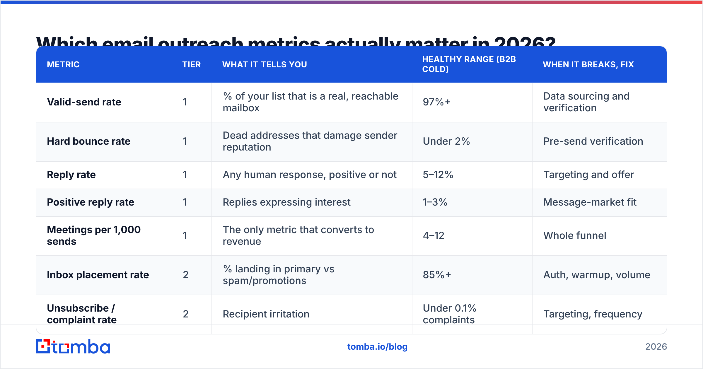
Here's the working hierarchy. Tier 1 metrics go on the dashboard leadership sees. Tier 2 metrics are what you open when Tier 1 moves the wrong way.
| Metric | Tier | What it tells you | Healthy range (B2B cold) | When it breaks, fix |
|---|---|---|---|---|
| Valid-send rate | 1 | % of your list that is a real, reachable mailbox | 97%+ | Data sourcing and verification |
| Hard bounce rate | 1 | Dead addresses that damage sender reputation | Under 2% | Pre-send verification |
| Reply rate | 1 | Any human response, positive or not | 5–12% | Targeting and offer |
| Positive reply rate | 1 | Replies expressing interest | 1–3% | Message-market fit |
| Meetings per 1,000 sends | 1 | The only metric that converts to revenue | 4–12 | Whole funnel |
| Inbox placement rate | 2 | % landing in primary vs spam/promotions | 85%+ | Auth, warmup, volume |
| Unsubscribe / complaint rate | 2 | Recipient irritation | Under 0.1% complaints | Targeting, frequency |
| Open rate | 2 | Directional only, inflated | Ignore absolutes | Subject line A/B only |
| Sequence step yield | 2 | Which follow-up produces replies | Step 2–3 usually peaks | Cadence design |
| Time-to-first-reply | 2 | Speed of interest signal | Under 48h median | Send timing |
Two notes on reading that table. First, "meetings per 1,000 sends" is the denominator that keeps teams honest — reply rate can be gamed by shrinking your list to your ten warmest accounts, but per-1,000 normalizes it. Second, complaint rate is the metric with the sharpest cliff. Gmail's bulk sender requirements put the spam complaint threshold at 0.3%, with 0.1% as the target ceiling. Cross it and you don't get a gentle degradation — you get filtered.
How do you build the three-layer measurement stack?#
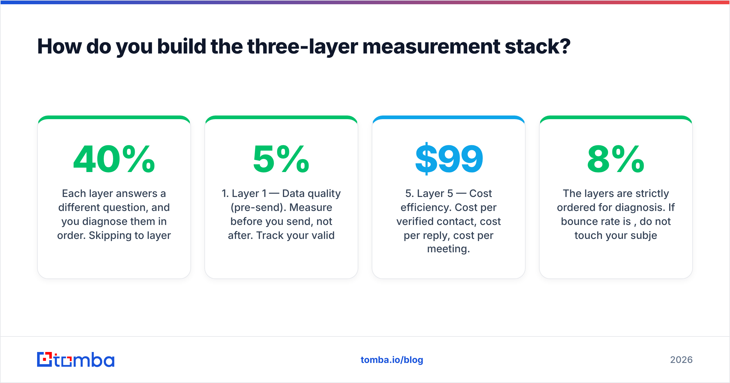
Each layer answers a different question, and you diagnose them in order. Skipping to layer three when layer one is broken is how teams rewrite copy six times on a list that was 40% invalid.
Layer 1 — Data quality (pre-send). Measure before you send, not after. Track your valid-send rate, catch-all percentage, role-account percentage (info@, sales@, support@), and duplicate rate. Run every list through an email verifier before it enters a sequence. If more than 5% of a sourced list fails verification, the problem is your source, not your sender reputation.
Layer 2 — Delivery and infrastructure. SPF, DKIM, and DMARC pass rates; inbox placement by provider (Gmail vs Outlook vs corporate); domain age and warmup status; sending volume per mailbox per day. Google Postmaster Tools and Microsoft SNDS are free and give you provider-side reputation data your sending tool cannot see. Check them weekly, not when something breaks.
Layer 3 — Engagement and message fit. Reply rate, positive reply rate, sentiment breakdown of replies, and per-step yield across the sequence. This is where copy, offer, and personalization live. It is also the only layer worth optimizing once layers 1 and 2 are green.
Layer 4 — Revenue attribution. Meetings booked, opportunities created, pipeline value, and closed-won sourced by outbound. Push reply and meeting events into your CRM so outbound-sourced pipeline is a filterable field, not a manual monthly tally.
Layer 5 — Cost efficiency. Cost per verified contact, cost per reply, cost per meeting. Most teams never compute these and consequently cannot tell whether a $99/month data tool or a $2,000/month platform is the better buy for their motion.
The layers are strictly ordered for diagnosis. If bounce rate is 8%, do not touch your subject lines. Fix the list. If bounce rate is 1% and placement is 92% and you still get zero replies, now the copy is genuinely the problem.
What benchmarks should you actually expect?#
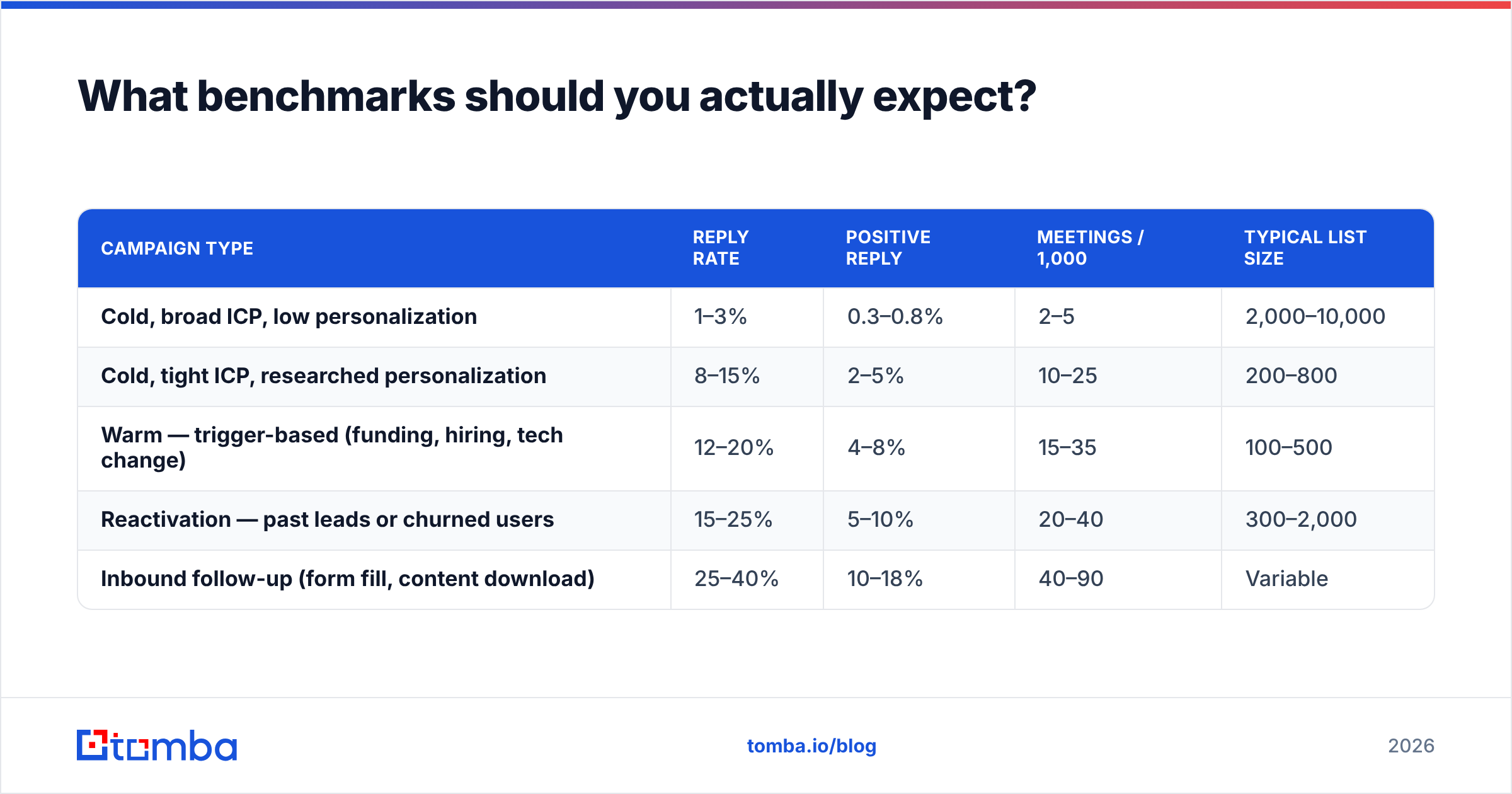
Published benchmarks vary wildly because they average across wildly different motions. Treat these as ranges by campaign type, not universal targets.
| Campaign type | Reply rate | Positive reply | Meetings / 1,000 | Typical list size |
|---|---|---|---|---|
| Cold, broad ICP, low personalization | 1–3% | 0.3–0.8% | 2–5 | 2,000–10,000 |
| Cold, tight ICP, researched personalization | 8–15% | 2–5% | 10–25 | 200–800 |
| Warm — trigger-based (funding, hiring, tech change) | 12–20% | 4–8% | 15–35 | 100–500 |
| Reactivation — past leads or churned users | 15–25% | 5–10% | 20–40 | 300–2,000 |
| Inbound follow-up (form fill, content download) | 25–40% | 10–18% | 40–90 | Variable |
The pattern is obvious once you see it laid out: relevance beats volume by roughly an order of magnitude at every stage. A 500-contact trigger-based campaign will out-book a 10,000-contact spray in absolute meetings, at a fraction of the sending risk. Yet most analytics dashboards are built to celebrate the 10,000.

If your numbers sit below these ranges, work the diagnostic ladder in order. Bounces first, then placement, then targeting, then copy. The industry data on this is broadly consistent — HubSpot's sales research and vendor benchmark reports across G2's outbound category both show the same shape, though the exact numbers shift year to year.
How do you diagnose a campaign that isn't working?#
Run this in sequence. Stop at the first failed check and fix it before moving on.
Check 1: Is your bounce rate under 2%? If not, your list is the problem. Pull the bounce reasons. "User unknown" means invalid addresses — verify before sending next time. "Mailbox full" or "temporarily unavailable" are soft and less alarming. If you're sourcing from scraped lists or an aging exported database, expect 10–25% invalidity; contacts decay at roughly 2–3% per month as people change jobs.
Check 2: Is your authentication passing? SPF, DKIM, and DMARC all aligned and passing. Check the raw headers of a test send to a personal mailbox, not just your tool's green checkmark. A soft-fail SPF record with a ~all and a misconfigured include is the single most common silent killer.
Check 3: Are you in the primary inbox? Seed-list testing across Gmail, Outlook, and at least one corporate domain. If placement is under 80%, stop sending, reduce volume, and warm up. Check Google Postmaster for your domain reputation classification — anything below "High" needs attention.
Check 4: Are you emailing the right person? Look at who replies versus who doesn't, segmented by seniority, company size, and industry. A common finding: your 5% overall reply rate is actually 14% among 50–200 employee companies and 0.4% among enterprise. That's not a copy problem, that's an ICP problem, and the fix is list construction.
Check 5: Is the offer clear in the first two sentences? Only now does copy matter. Pull ten replies that said no and read what they misunderstood. Then pull three that said yes and read what they responded to.
Which tools cover which analytics layer?#
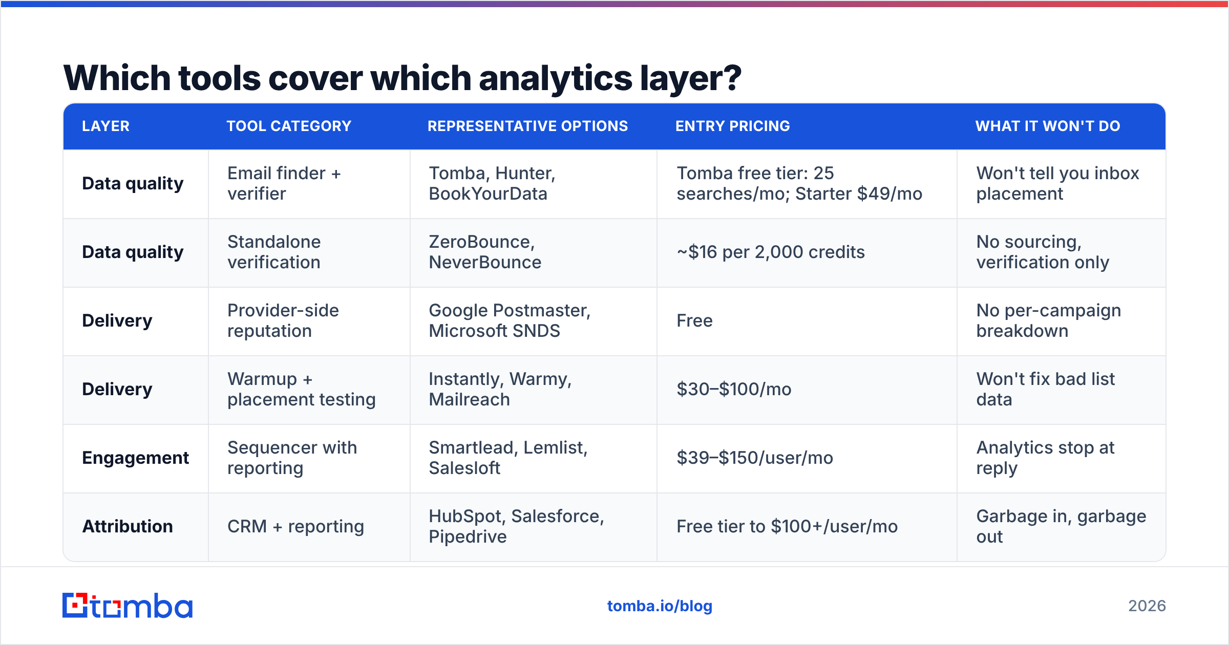
No single tool covers all five layers well. Here's how the categories map, with realistic pricing as of early 2026.
| Layer | Tool category | Representative options | Entry pricing | What it won't do |
|---|---|---|---|---|
| Data quality | Email finder + verifier | Tomba, Hunter, BookYourData | Tomba free tier: 25 searches/mo; Starter $49/mo | Won't tell you inbox placement |
| Data quality | Standalone verification | ZeroBounce, NeverBounce | ~$16 per 2,000 credits | No sourcing, verification only |
| Delivery | Provider-side reputation | Google Postmaster, Microsoft SNDS | Free | No per-campaign breakdown |
| Delivery | Warmup + placement testing | Instantly, Warmy, Mailreach | $30–$100/mo | Won't fix bad list data |
| Engagement | Sequencer with reporting | Smartlead, Lemlist, Salesloft | $39–$150/user/mo | Analytics stop at reply |
| Attribution | CRM + reporting | HubSpot, Salesforce, Pipedrive | Free tier to $100+/user/mo | Garbage in, garbage out |
A note on stacking: teams routinely overspend on layer 3 and underspend on layer 1. A $150/user/month sequencer running on an unverified list produces worse results than a $49/month data tool feeding a basic sequencer. The order of investment should follow the order of diagnosis.
For sourcing plus verification in one pass, bulk email finder workflows let you upload a company or contact list, find addresses, and verify them before anything enters a sequence — which collapses layers 1 into a single measurable step with a valid-send rate you can actually report. Full Tomba pricing runs from a free tier through Starter at $49/mo, Growth at $99/mo, and Pro at $249/mo.
What should you stop tracking?#
Some metrics generate more meetings about metrics than meetings with prospects.
- Absolute open rate as a KPI. Covered above. Keep it for A/B comparison, drop it from the dashboard.
- Emails sent. Volume is an input, not an outcome. Reporting it rewards the wrong behavior and it's the number most likely to grow while pipeline shrinks.
- Click rate on cold email. Cold prospects rarely click, and link tracking hurts placement. If your CTA is "reply with a yes," clicks are irrelevant.
- Time of day optimization, past a rough sanity check. The effect size is real but small, and it's usually the last 3% of optimization dressed up as the first 30%.
- Per-rep leaderboards on sends. They reliably produce more sends of worse quality. Leaderboard on meetings booked or positive response rate instead.
How often should you review outreach analytics?#
Different cadences for different layers, because the signals move at different speeds.
Daily: bounce rate and complaint spikes only. These are alarms, not analysis. Anything above 3% bounces or 0.1% complaints on a given day should pause the campaign automatically.
Weekly: reply rate and positive reply rate by campaign and by segment. One week is roughly the shortest window where reply data has enough volume to be meaningful, assuming you're sending a few hundred emails.
Monthly: meetings per 1,000 sends, cost per meeting, and pipeline sourced. Also re-verify any list older than 60 days — job-change decay makes a three-month-old verified list meaningfully worse than a fresh one.
Quarterly: ICP analysis. Which segments actually converted to closed-won, not just to meetings? This is the review that changes your list-building criteria, and it's the one most teams skip.
What does a good outreach dashboard look like?#
Five numbers, one segmentation, one trend line.
The five numbers: valid-send rate, bounce rate, reply rate, positive reply rate, meetings per 1,000 sends. The segmentation: by ICP segment, not by rep — you're trying to learn which market responds, not which person is trying hardest. The trend line: meetings per 1,000 sends over the trailing 12 weeks, because that's the metric that catches slow deliverability decay before it becomes a crisis.
Everything else lives one click down, in the diagnostic view you only open when one of the five moves. If your dashboard has 22 tiles, nobody reads it, and the two that mattered were buried between "total sends" and "average open rate by day of week."
Where should you start?#
Start at layer one, because it's the cheapest to fix and it invalidates everything downstream if it's broken.
Pull your current active list. Verify it. Note the percentage that fails. If it's above 5%, your sourcing is the bottleneck and no amount of copy testing will move your numbers. If it's clean, move to authentication and placement, then to targeting, then to copy — in that order, checking each before proceeding.
The Tomba Email Finder is built for exactly the first step: find verified professional addresses by domain, name, or company, with verification built into the same pass so your valid-send rate is known before you hit send rather than discovered from your bounce log. Start on the free tier at 25 searches a month, run your existing list through it, and see what your real data quality number is. That single measurement usually explains more about a stalled outbound program than a month of copy iteration.
Related guides#
Ready to find emails that actually work?
Join 150,000+ professionals who stopped guessing and started sending. Free credits on signup — no credit card required.
Get the Tomba newsletter
Practical outbound tactics and product updates — once every two weeks.
About the author