ICP Scoring: How to Build a Model That Actually Predicts Revenue
Most ICP scores are opinion polls with a spreadsheet attached. Here is how to build an ICP scoring model from signals that actually correlate with closed revenue, plus the weights, thresholds, and data plumbing behind it.
TL;DR
- ICP scoring ranks accounts by how closely they resemble your best customers. Lead scoring ranks people by how likely they are to act. Confusing the two is the single most common reason scoring models get ignored.
- A useful model needs three signal families: firmographic fit, technographic/operational fit, and behavioral intent. Fit decides who you should talk to; intent decides when.
- Start with 6 to 10 weighted attributes, not 40. Models with too many inputs are impossible to debug and impossible to trust.
- Your score is only as good as the contact and company data feeding it. Missing emails, stale headcounts, and unverified domains quietly wreck otherwise sound math.
- Validate against closed-won and churn data every quarter. If your A-tier accounts do not close at a materially higher rate than your C-tier, the model is decoration.
What is ICP scoring, and how is it different from lead scoring?#
ICP scoring is the practice of assigning a numeric fit score to a company based on how closely it matches the profile of your best existing customers, then using that score to prioritize outbound, routing, and spend.
The everyday analogy: lead scoring is like checking whether someone at a party is making eye contact with you. ICP scoring is checking whether they are even the kind of person you want to be friends with. Eye contact from the wrong person is a waste of an evening.
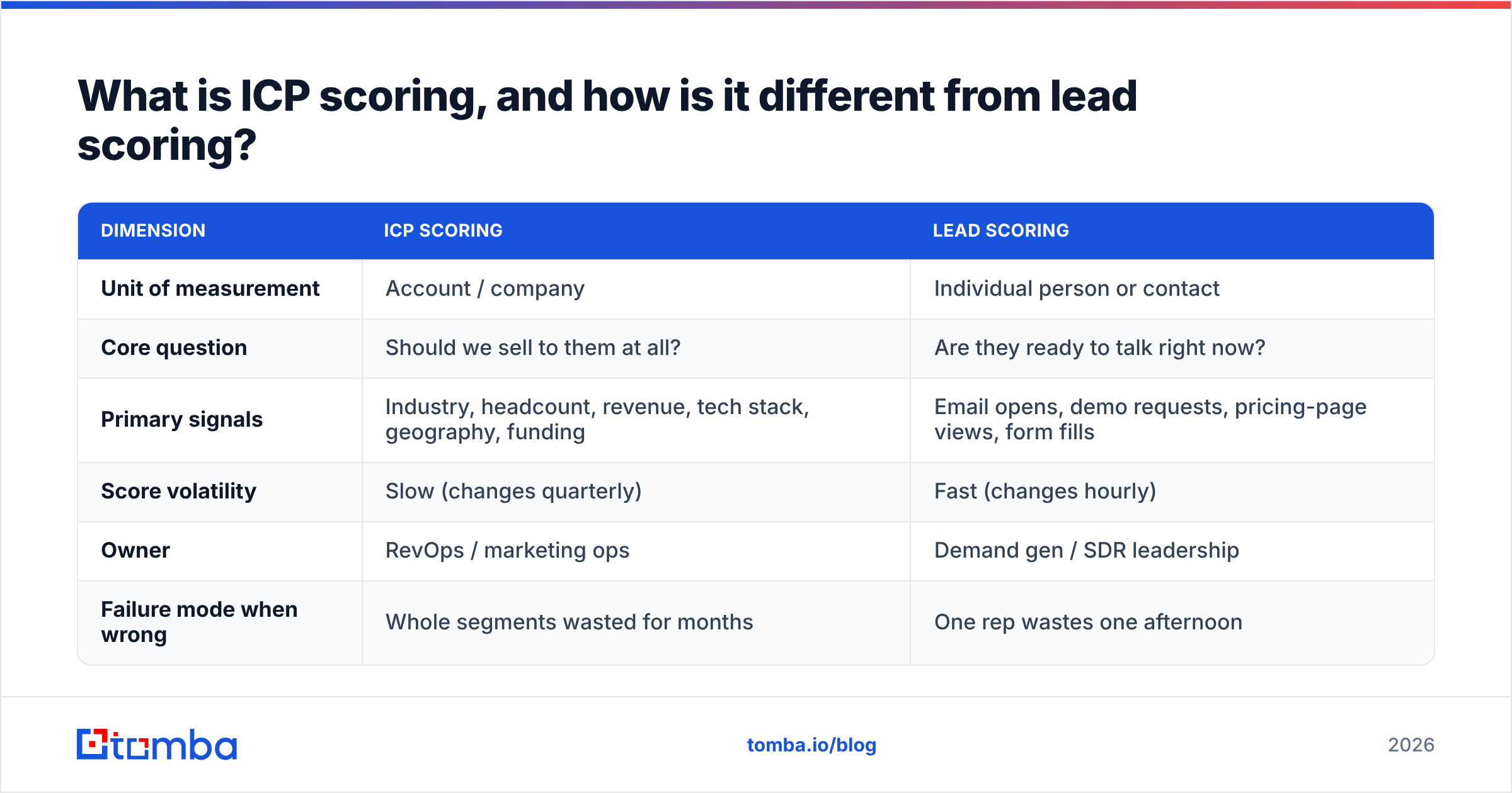
Technically, the two models answer different questions and should stay separate:
| Dimension | ICP scoring | Lead scoring |
|---|---|---|
| Unit of measurement | Account / company | Individual person or contact |
| Core question | Should we sell to them at all? | Are they ready to talk right now? |
| Primary signals | Industry, headcount, revenue, tech stack, geography, funding | Email opens, demo requests, pricing-page views, form fills |
| Score volatility | Slow (changes quarterly) | Fast (changes hourly) |
| Owner | RevOps / marketing ops | Demand gen / SDR leadership |
| Failure mode when wrong | Whole segments wasted for months | One rep wastes one afternoon |
Most teams that say "our scoring does not work" have actually built one blended score that mixes a 40,000-employee enterprise (great fit, no activity) with a solo consultant who opened four emails (terrible fit, lots of activity). Both land at 62 points. The rep cannot tell which is which, so they stop looking at the number.
Keep them as two axes. Fit on one axis, intent on the other. Then your prioritization matrix writes itself: high fit + high intent goes to your best AE today, high fit + low intent goes to nurture and outbound sequences, low fit + high intent goes to self-serve or product-led motion, low fit + low intent gets suppressed.
What signals actually belong in an ICP score?#
Pick signals that pass one test: can you point at a difference between your closed-won accounts and your closed-lost accounts on this attribute? If not, it is trivia.
Here are the six categories worth weighting, in rough order of predictive power for most B2B SaaS and services companies:
- Firmographics that map to budget. Employee count, revenue band, and funding stage. These are proxies for whether the company can afford your ACV without a six-month procurement fight. Headcount is usually more reliable than self-reported revenue because it is observable from multiple public sources.
- Industry and sub-industry, narrowly defined. "Technology" is not a segment. "Series B vertical SaaS selling to healthcare providers" is. The narrower your industry definition, the more your score actually discriminates between accounts.
- Technographics and operational tells. What the company already runs tells you whether you fit their workflow. A prospect running a modern CRM, a marketing automation platform, and an outbound sequencer is signalling they already buy tools in your category. A company with no tracked stack is a longer education cycle.
- Team-shape signals. Not just company size, but the size of the specific team you sell to. If you sell to SDR managers, an account with 40 employees and 12 SDRs is a far better fit than an account with 400 employees and 2 SDRs. This is the single most under-used input in most models.
- Geography, language, and compliance posture. Time zone overlap, data residency requirements, and whether you can legally prospect there under local rules. A perfect-fit account you cannot support is a zero, not a 90.
- Negative signals, weighted as negatives. Competitor logos on the site, a recent acquisition, a hiring freeze, or a known preference for building in-house. Most models only add points. Good models subtract them.
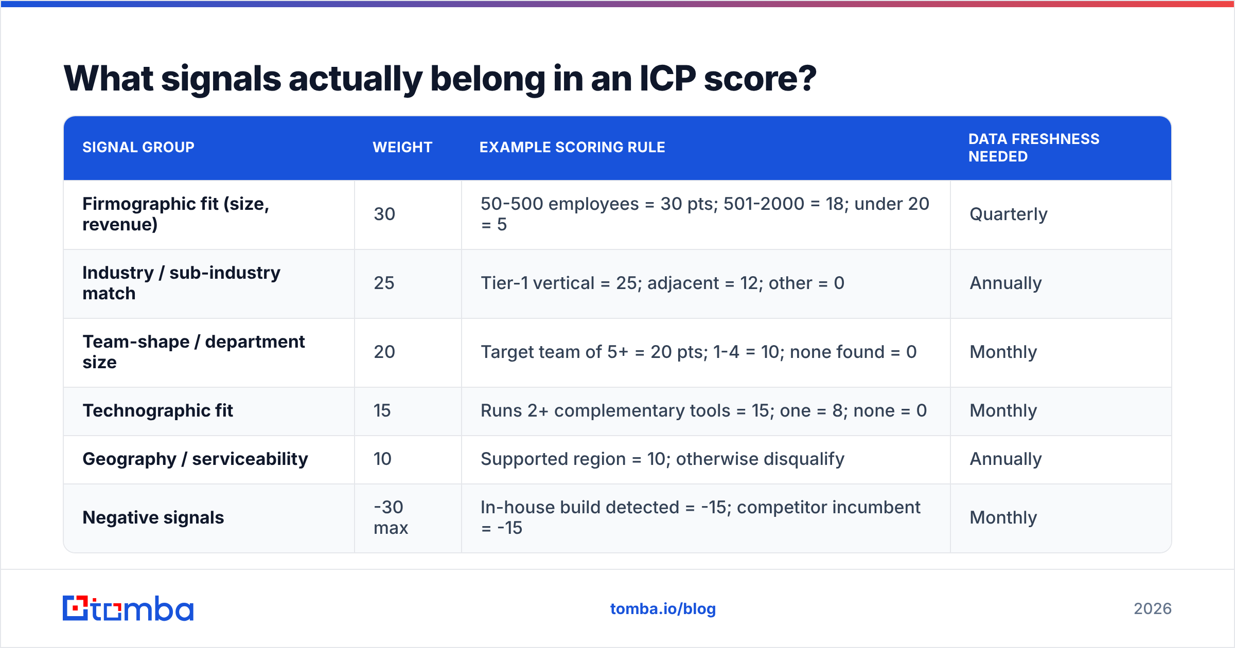
Weights matter more than the signal list. A workable starting distribution for a mid-market B2B tool:
| Signal group | Weight | Example scoring rule | Data freshness needed |
|---|---|---|---|
| Firmographic fit (size, revenue) | 30 | 50-500 employees = 30 pts; 501-2000 = 18; under 20 = 5 | Quarterly |
| Industry / sub-industry match | 25 | Tier-1 vertical = 25; adjacent = 12; other = 0 | Annually |
| Team-shape / department size | 20 | Target team of 5+ = 20 pts; 1-4 = 10; none found = 0 | Monthly |
| Technographic fit | 15 | Runs 2+ complementary tools = 15; one = 8; none = 0 | Monthly |
| Geography / serviceability | 10 | Supported region = 10; otherwise disqualify | Annually |
| Negative signals | -30 max | In-house build detected = -15; competitor incumbent = -15 | Monthly |
Score out of 100, then band it: 75+ is Tier A, 50 to 74 is Tier B, 25 to 49 is Tier C, below 25 is suppressed. The bands, not the raw number, are what reps actually use.
How do you build an ICP scoring model in five steps?#
Do not start with a whiteboard workshop. Start with your own closed-won data. The point of ICP scoring is to formalize a pattern that already exists in your revenue, not to invent an aspirational customer.
Step 1: Pull your last 12 to 24 months of closed-won accounts. Filter out anything that churned inside 90 days and anything that closed through a channel you no longer use. You want the accounts you would be happy to sign again. Aim for at least 40 accounts; below that, you are pattern-matching on noise.
Step 2: Pull a matched set of closed-lost and churned accounts. This is the step almost everyone skips. Without a negative class, every attribute looks predictive. "80% of our customers use email" is meaningless if 80% of your losses do too.
Step 3: Enrich both sets on the same attributes. Headcount, industry, tech stack, department size, funding, region. Consistency matters more than depth here. If you enrich winners from a premium source and losers from a scrape, you will discover attributes of your data vendors, not your customers.
Step 4: Find the attributes with real separation, then assign weights. For each attribute, compute the win-rate lift: what percentage of accounts with the attribute closed, versus the base rate. Keep the attributes with double-digit lift. Assign weights roughly in proportion to that lift, rounded to numbers a human can reason about. Nobody trusts a weight of 7.34.
Step 5: Backtest before you deploy. Score last year's pipeline with this year's model. Your Tier A accounts should show a visibly higher win rate and a shorter cycle than Tier C. If they do not, the model is not ready, and shipping it will burn the credibility you need for version two.
Then rerun step 5 every quarter. An ICP is a snapshot of a market that keeps moving. Teams that ship a model in Q1 and never revisit it are usually the same teams complaining in Q4 that scoring does not work.
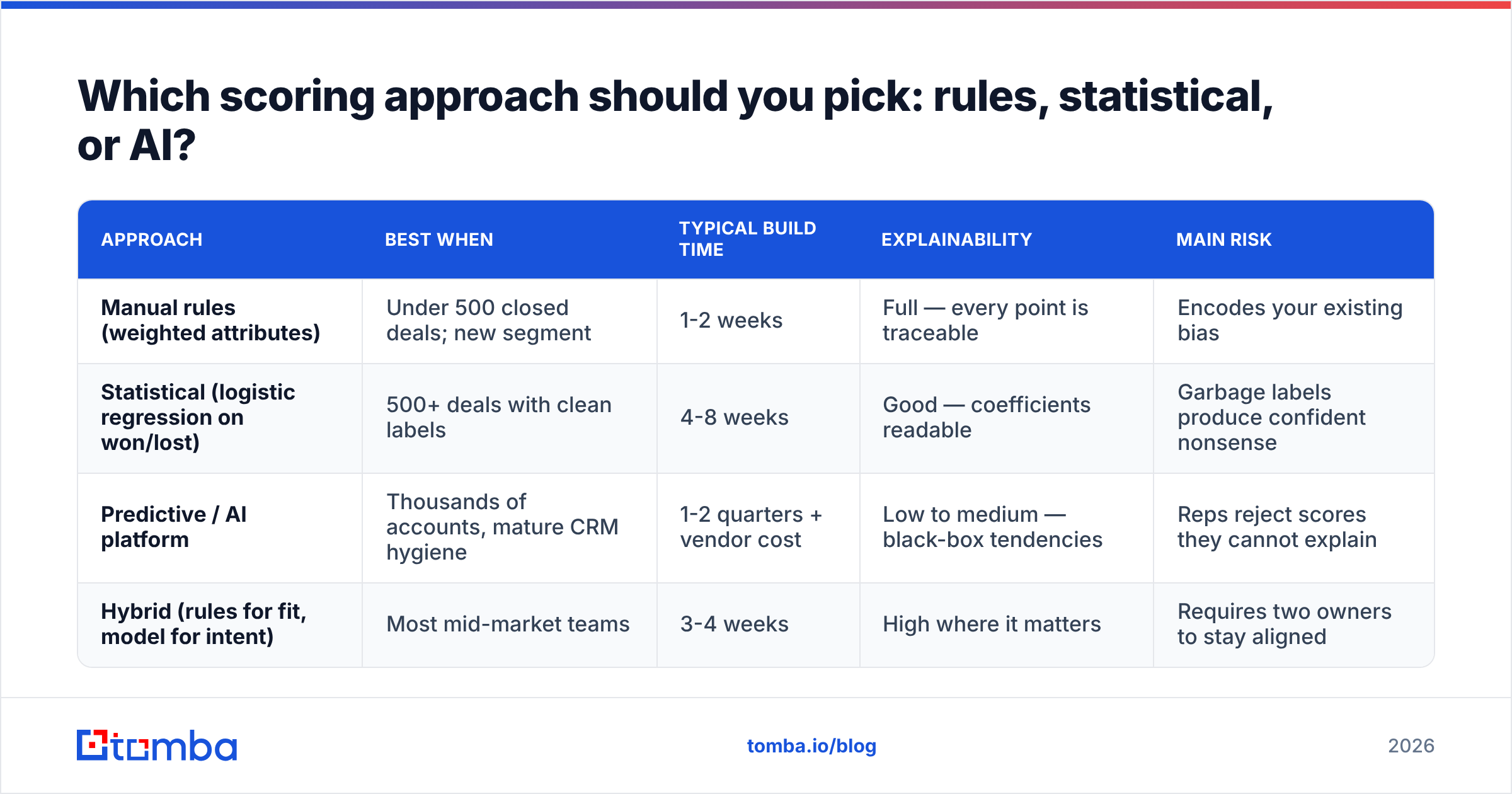
Which scoring approach should you pick: rules, statistical, or AI?#
There are three honest options, and the right one depends far more on your data volume than on your ambition. Frameworks from analyst firms like Gartner and vendor playbooks from HubSpot all converge on the same advice: start simple, earn complexity.
| Approach | Best when | Typical build time | Explainability | Main risk |
|---|---|---|---|---|
| Manual rules (weighted attributes) | Under 500 closed deals; new segment | 1-2 weeks | Full — every point is traceable | Encodes your existing bias |
| Statistical (logistic regression on won/lost) | 500+ deals with clean labels | 4-8 weeks | Good — coefficients readable | Garbage labels produce confident nonsense |
| Predictive / AI platform | Thousands of accounts, mature CRM hygiene | 1-2 quarters + vendor cost | Low to medium — black-box tendencies | Reps reject scores they cannot explain |
| Hybrid (rules for fit, model for intent) | Most mid-market teams | 3-4 weeks | High where it matters | Requires two owners to stay aligned |
The hybrid row is where most teams should land. Use transparent weighted rules for fit, because fit changes slowly and reps need to argue with it. Use a model or a scoring platform for intent, because intent has far more data points and far less need for explanation.
Whatever you choose, the score has to live where the work happens. A brilliant model in a spreadsheet nobody opens loses to a mediocre model that writes a tier field back into the CRM. Push the score into your CRM through your normal sync, stamp it on every account record, and surface it in the list views reps already use.

Why does ICP scoring break on data quality?#
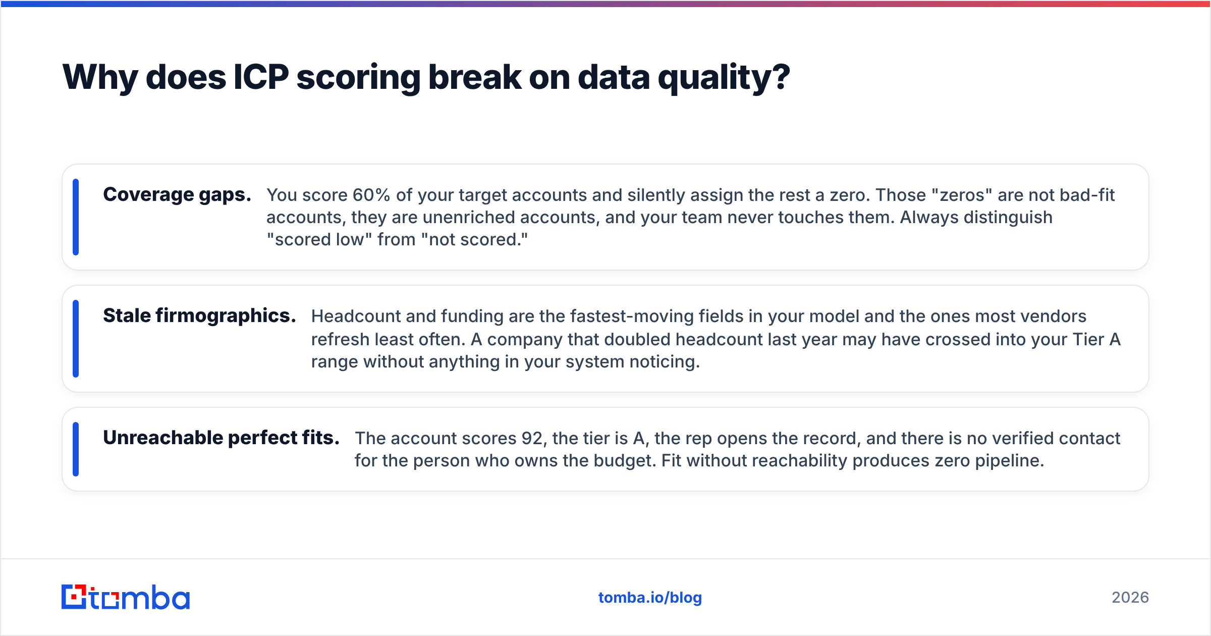
Because scoring is arithmetic on top of attributes, and attributes decay. A model that is 100% correct logically will still misroute accounts if the headcount field is three years old and the contact email bounces.
Three failure patterns show up constantly:
- Coverage gaps. You score 60% of your target accounts and silently assign the rest a zero. Those "zeros" are not bad-fit accounts, they are unenriched accounts, and your team never touches them. Always distinguish "scored low" from "not scored."
- Stale firmographics. Headcount and funding are the fastest-moving fields in your model and the ones most vendors refresh least often. A company that doubled headcount last year may have crossed into your Tier A range without anything in your system noticing.
- Unreachable perfect fits. The account scores 92, the tier is A, the rep opens the record, and there is no verified contact for the person who owns the budget. Fit without reachability produces zero pipeline.
That last one is where scoring meets execution. It is why a scoring program needs a contact-layer plan, not just an account-layer one. Practically: enrich the company, then resolve the actual humans. Use data enrichment to fill headcount, industry, and tech-stack fields on the account, a B2B database or a reputable list provider such as BookYourData to source net-new accounts inside your defined profile, and a verification pass so that Tier A accounts arrive with deliverable addresses attached rather than guesses.
If you are running scoring at any volume, do this programmatically. A nightly job that hits the Tomba API to refresh firmographics and re-verify contacts on your Tier A and Tier B accounts costs less engineering time than one quarter of reps working stale records. Peer reviews on G2 are a reasonable sanity check on which providers hold up on coverage in your specific geography, which varies far more than vendor marketing suggests.
What are the most common ICP scoring mistakes?#
- Building the ICP from your aspirations. Enterprise logos in the model when every deal you have ever won was 80 seats. The score then routes your best reps at accounts that will never close.
- Too many attributes. Forty inputs means no single input moves the score, so the output regresses to the mean and every account looks like a B.
- No negative weights. Scores that only go up cannot distinguish "great fit" from "great fit with a competitor already installed on a three-year contract."
- Never sunsetting a signal. A technographic signal that was predictive in 2023 may now be table stakes across your whole market and carry zero information.
- Scoring accounts but reporting on leads. If your dashboards still count MQLs while your prioritization runs on account tiers, leadership and reps will optimize different things.
- Hiding the logic. Reps who cannot see why an account is Tier C will override the tier, and they should. Publish the weights. An argued-with model gets better; an opaque one gets ignored.
How do you know your ICP score is working?#
Pick three metrics and review them monthly. Everything else is vanity.
First, win rate by tier. Tier A should beat Tier C by a wide, obvious margin. If the gap is a few points, your signals are not discriminating and you should go back to step 4. Second, coverage. What share of your total addressable list has a non-null score? Below 70% and your prioritization is really just a map of your data gaps. Third, cycle length and ACV by tier. Good-fit accounts should close faster and larger. If Tier A closes slower, you may be scoring for prestige rather than fit.
A fourth, softer signal: are reps referencing tiers unprompted in pipeline reviews? Adoption is the real test. Salesforce's own guidance on pipeline hygiene, published across their sales resources, makes the same point in different words — a field nobody uses in a conversation is a field that does not exist.
Where should you start this week?#
Take your last 50 closed-won accounts and your last 50 closed-lost, enrich both on the same six attributes, and look at the separation. That single exercise will tell you more about your ICP than any workshop, and it usually takes an afternoon once the data is in front of you.
The bottleneck is almost always the data, not the math. If you want your Tier A accounts to arrive with verified, deliverable contacts on the buying committee rather than a company name and a hope, start with the Tomba Email Finder — it resolves named contacts at your in-profile accounts, and the free tier covers 25 searches a month so you can test the workflow on a sample before committing. Paid plans start at $49/mo for Starter and $99/mo for Growth if you need bulk volume and API access; full Tomba pricing is public. Score the account, then find the human. In that order.
Related guides#
// get started
Find, verify and enrich your first contacts today
Start on the free plan with 25 searches a month, then scale when your team is ready.
Free plan · No credit card required · GDPR & CCPA
// about the author