Cold Email Analytics in 2026: The Metrics That Actually Matter
Open rates are dying and reply rates are lying if you track them wrong. Here's how to build a cold email analytics stack that shows what's really moving revenue in 2026.
Cold email analytics used to be simple: send a batch, watch the open rate, celebrate anything above 40%. In 2026 that playbook is broken. Apple Mail Privacy Protection inflates opens, spam filters silently eat deliverability, and "reply rate" means nothing if half your replies are "unsubscribe me." If you're still optimizing the top of the funnel while revenue stalls at the bottom, you're flying blind.
This guide breaks down the metrics that actually predict pipeline, the ones you should quietly retire, and how to assemble a measurement stack that tells you why a campaign worked — not just that it did.
TL;DR#
- Open rate is now a diagnostic, not a KPI. Privacy features make it unreliable; use it only to spot deliverability collapse, never to judge copy.
- Reply rate, positive-reply rate, and meetings booked are the metrics that map to revenue. Track them per-step, not per-campaign.
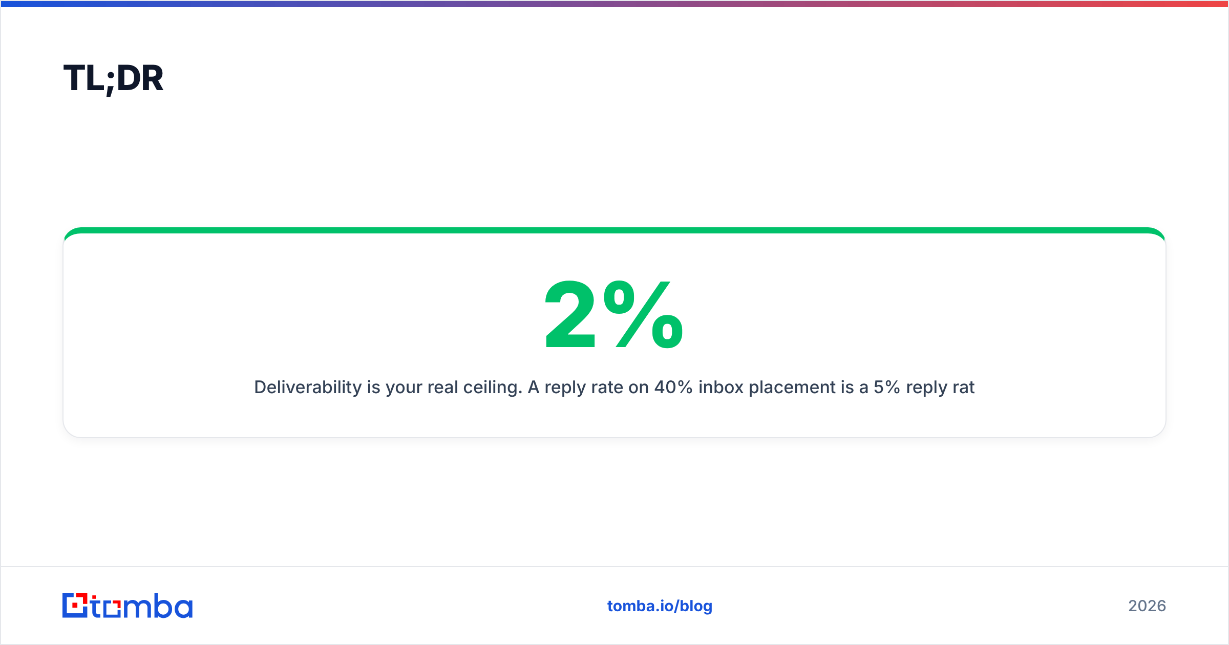
- Deliverability is your real ceiling. A 2% reply rate on 40% inbox placement is a 5% reply rate waiting to happen once you fix inboxing.
- Segment everything. Blended averages hide your best and worst segments. Cut analytics by persona, industry, list source, and send step.
- Clean data in, clean data out. Bounces poison sender reputation and corrupt every downstream number — verification is an analytics decision, not just a hygiene one.
What is cold email analytics, really?#
Cold email analytics is the practice of measuring how prospects move from sent to booked — and using those measurements to change what you send next. Think of it like a restaurant's books: counting how many people walked in the door (opens) tells you far less than counting how many ordered, tipped, and came back (replies, meetings, deals). Most teams obsess over foot traffic and ignore the register.
A useful analytics setup answers three questions at every stage:
- Did it arrive? Deliverability and inbox placement.
- Did it land? Opens and clicks, read with heavy skepticism.
- Did it convert? Replies, positive replies, meetings, and closed revenue.
Skip any layer and you'll misdiagnose the problem. A campaign with great copy and terrible inbox placement looks identical to a campaign with a bad offer and perfect deliverability — unless you're measuring both.
Which cold email metrics actually matter in 2026?#
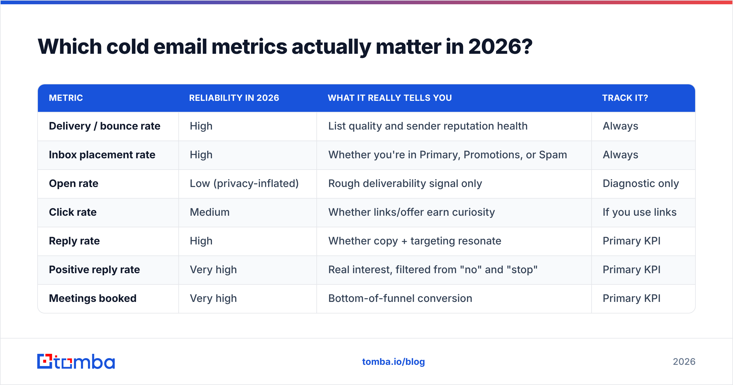
Here's the uncomfortable truth: the metric your dashboard shows first is usually the least important. Below is how the core metrics rank by how tightly they correlate with revenue, and what each one is actually good for.
| Metric | Reliability in 2026 | What it really tells you | Track it? |
|---|---|---|---|
| Delivery / bounce rate | High | List quality and sender reputation health | Always |
| Inbox placement rate | High | Whether you're in Primary, Promotions, or Spam | Always |
| Open rate | Low (privacy-inflated) | Rough deliverability signal only | Diagnostic only |
| Click rate | Medium | Whether links/offer earn curiosity | If you use links |
| Reply rate | High | Whether copy + targeting resonate | Primary KPI |
| Positive reply rate | Very high | Real interest, filtered from "no" and "stop" | Primary KPI |
| Meetings booked | Very high | Bottom-of-funnel conversion | Primary KPI |
| Revenue influenced | Highest | The only number your CFO cares about | North star |
Notice the pattern: the further down the funnel, the more trustworthy the number. Opens sit near the top precisely because they're the easiest to fake and the hardest to trust. Apple's Mail Privacy Protection pre-loads tracking pixels, so a chunk of your "opens" are bots, not humans. Google's Gmail Postmaster Tools will tell you more about your actual reputation than any open-rate chart.
The four metrics worth building dashboards around#
- Reply rate per step. A 4-email sequence that gets a blended 6% reply rate might be earning 5% on step one and 0.3% on step four. Kill the dead steps.
- Positive reply rate. Separate "interested" from "not now" and "remove me." A 10% reply rate that's 80% opt-outs is a deliverability grenade, not a win.
- Meetings booked per 100 sent. This normalizes across list sizes and is the cleanest campaign-to-campaign comparison you have.
- Bounce rate by list source. If one data source bounces at 12% and another at 2%, you've just found where to spend — and where to stop.
Why is open rate no longer a reliable KPI?#
Because you can't tell a human from a proxy server anymore. When Apple Mail (roughly half of US email opens) fires the tracking pixel automatically, your open rate becomes a blend of real reads and machine pre-fetches. Optimizing subject lines against that number is like tuning an engine by a speedometer that adds a random 20 mph.
Open rate still has one job: catching catastrophe. If your open rate drops from 45% to 8% overnight, you don't have a copy problem — you have a deliverability fire. Used that way, as a smoke alarm rather than a scoreboard, it's genuinely useful. As a KPI you A/B test against, it's noise dressed up as signal.
This is why deliverability measurement has to sit upstream of everything. Before you trust a single open or reply number, confirm your mail is actually reaching the inbox. Run your domain through a warmup schedule, monitor your Postmaster reputation, and treat placement as the foundation every other metric stands on. Our email warmup calculator is a fast way to sanity-check ramp volume before you scale.
How do you set up a cold email analytics stack?#
You don't need a data team. You need four layers, wired so each feeds the next. Here's the structure that works for teams sending anywhere from 500 to 50,000 emails a month.
- Collection layer — your sending tool. Instantly, Smartlead, Apollo, Salesloft, or Saleshandy all capture sends, opens, clicks, and replies. This is your raw feed. Pick one that exposes per-step and per-inbox data, not just campaign totals.
- Deliverability layer — reputation monitors. Google Postmaster Tools plus a placement tester (like GlockApps or MailReach) tells you where mail lands. Without this, every metric above is measured against an unknown denominator.
- Enrichment layer — your data source. Bounces, wrong titles, and stale contacts corrupt analytics before a single email sends. Verifying and enriching your list is an analytics control, not just hygiene. Feeding clean, current contacts in is how you keep the numbers honest.
- Reporting layer — the CRM. HubSpot, Salesforce, or Pipedrive is where replies become meetings become revenue. Push reply and meeting events here so you can tie a campaign to a closed deal, not just an open.
The magic is in the seams between layers. A reply that never reaches your CRM is a reply you can't attribute to revenue. A bounce that never updates your list source score is a lesson you'll pay for twice.
A quick word on attribution#
Cold email rarely closes a deal alone — it opens a door that a call, a demo, and three follow-ups walk through. So resist single-touch attribution that credits the last email before "closed won." Track influenced revenue: any deal where a cold email touched the account. It's messier, but it stops you from cutting a campaign that sources pipeline slowly but reliably. HubSpot's attribution reporting docs are a solid primer if you're building this in a CRM.
How should you segment cold email analytics?#
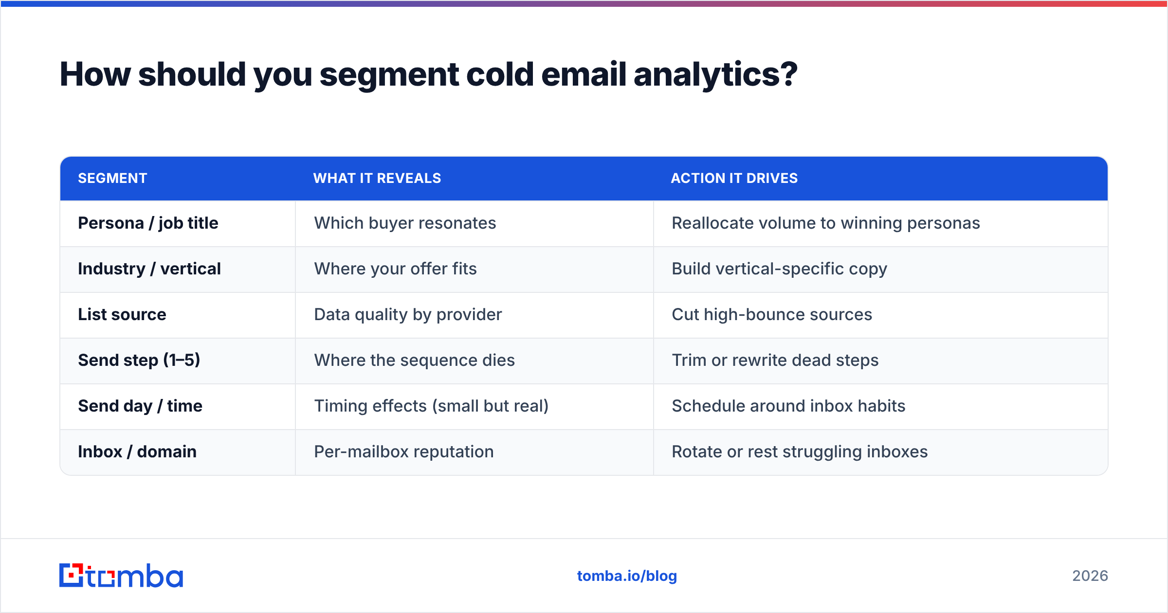
Blended averages are where good campaigns go to hide. A 5% overall reply rate can be a 12% win with your ideal persona dragged down by a 1% experiment you should have killed. Segmentation turns one confusing number into a map of where to double down.
Cut every core metric by at least these dimensions:
| Segment | What it reveals | Action it drives |
|---|---|---|
| Persona / job title | Which buyer resonates | Reallocate volume to winning personas |
| Industry / vertical | Where your offer fits | Build vertical-specific copy |
| List source | Data quality by provider | Cut high-bounce sources |
| Send step (1–5) | Where the sequence dies | Trim or rewrite dead steps |
| Send day / time | Timing effects (small but real) | Schedule around inbox habits |
| Inbox / domain | Per-mailbox reputation | Rotate or rest struggling inboxes |
The single highest-leverage cut is list source. If you're blending contacts from three vendors and one bounces at triple the rate of the others, that source is silently taxing your sender reputation and depressing every campaign that touches it — not just its own contacts. Clean sourcing is why a reliable email finder and a verification step pay for themselves in analytics accuracy alone.
What benchmarks should you compare against?#
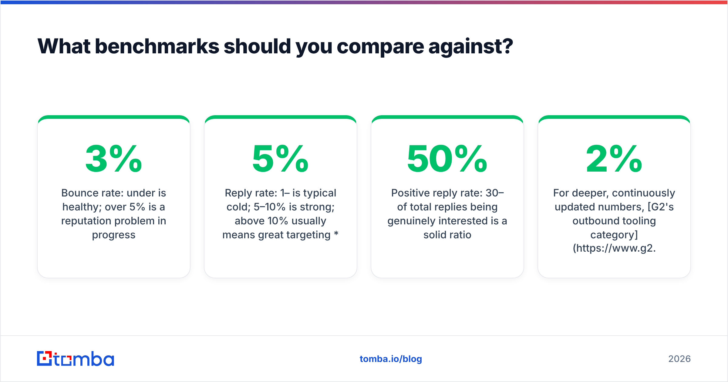
Benchmarks are useful as guardrails and dangerous as goals. Your ICP, offer, and list quality swing these numbers more than any industry average. Still, if you're wildly outside these ranges, something's off. Treat these as 2026 sanity checks, not targets:
- Bounce rate: under 3% is healthy; over 5% is a reputation problem in progress.
- Reply rate: 1–5% is typical cold; 5–10% is strong; above 10% usually means great targeting or a lot of opt-outs (check your positive-reply split).
- Positive reply rate: 30–50% of total replies being genuinely interested is a solid ratio.
- Meetings booked: 0.5–2 per 100 sent is a common range for well-targeted B2B outbound.
For deeper, continuously updated numbers, G2's outbound tooling category and vendor benchmark reports are more current than any static list. And remember the response rate you see is capped by deliverability — a mediocre 2% might really be a great 6% trapped behind a spam-foldered domain.
How does data quality change your analytics?#
Garbage in, garbage everywhere. This is the part teams underinvest in and then wonder why their dashboards contradict their bank account. Every invalid email in your list does three things at once:
- Inflates your denominator. You "sent 1,000" but 120 never existed, so your true reply rate is higher than reported — you're underselling working campaigns.
- Destroys sender reputation. High bounces tell Gmail and Outlook you're a spammer, which throttles inbox placement for your good contacts too.
- Corrupts segment comparisons. A list source looks like it has weak copy when it actually just has dead addresses.
The fix is boring and non-negotiable: verify before you send, and re-verify lists older than 90 days. Running contacts through an email verifier before a campaign strips the noise so your analytics measure messaging, not list rot. For high-volume senders, a bulk verification pass on every import should be a standing rule, not a one-off.
Putting it together: a weekly analytics routine#
You don't need to stare at dashboards daily. A disciplined weekly review beats anxious constant-checking. Here's a routine that fits in 30 minutes:
- Monday — deliverability check. Postmaster reputation, bounce rate, spam complaints. Fix fires before touching copy.
- Wednesday — segment scan. Pull reply and positive-reply rates by persona and list source. Note the top and bottom performers.
- Friday — funnel math. Meetings booked per 100 sent, per campaign. Kill anything below your floor, scale anything above your ceiling.
- Monthly — attribution review. Which campaigns influenced closed revenue? Fund those. Cut the vanity winners that never convert.
The teams that win at cold email aren't the ones with the cleverest subject lines. They're the ones who measure the right layer, trust the bottom of the funnel over the top, and feed clean data into an honest system.
Start with the data your analytics depend on#
Every number in this guide rests on one thing: a list of real, reachable people. If your contacts are guessed, stale, or unverified, no dashboard will save you — you'll optimize copy against ghosts. Build your campaigns on accurate, verified contacts and your analytics finally start telling the truth.
The Tomba Email Finder finds professional email addresses by name, company, or domain, with verification built in — so the list you measure is the list that actually exists. Pair it with verification on every import, wire your replies into your CRM, and start reading the metrics that move revenue instead of the ones that just move charts. See Tomba plans — the free tier gives you 25 searches a month to test it against your next campaign.
Related guides#
Ready to find emails that actually work?
Join 150,000+ professionals who stopped guessing and started sending. Free credits on signup — no credit card required.
Get the Tomba newsletter
Practical outbound tactics and product updates — once every two weeks.
About the author