Drip Campaign Flowchart: How to Map Sequences That Convert
Most drip campaigns fail because nobody drew them first. Here's how to build a drip campaign flowchart with real branch logic, exit rules, and timing that actually gets replies.

TL;DR
- A drip campaign flowchart is a visual map of every email, wait period, branch condition, and exit rule in an automated sequence — drawn before you build it in your sending tool.
- The single biggest reason drip campaigns underperform is not copy. It's undrawn logic: no exit conditions, no branch handling, and no plan for what happens when someone replies from a different address.
- Four node types cover 95% of real campaigns: trigger, message, wait, and condition. Everything else is decoration.
- Branch on behavior (opened, clicked, replied, booked), not on time alone. Time-only drips are just newsletters with extra steps.
- Garbage contact data breaks the chart before the first node fires. Verify addresses before anyone enters the flow.
What is a drip campaign flowchart?#
A drip campaign flowchart is a diagram showing the full path a contact takes through an automated email sequence — every send, every delay, every yes/no branch, and every way out.
Think of it like a subway map. The trains (your emails) run on a schedule, but riders (your leads) get on at different stations, transfer based on where they're going, and exit when they arrive. A flowchart shows the whole network at once. Without it, you're laying track one segment at a time and hoping the lines connect.
Most teams skip this step. They open Instantly or HubSpot, click "new sequence," and start typing email one. Three weeks later someone asks "what happens if they reply to email two but don't book?" and nobody knows, because that path was never designed — it was accidentally inherited from the tool's defaults.
The flowchart exists to force those questions early, when changing them costs nothing.
What are the core node types?#
Every drip flowchart, regardless of complexity, is built from four primitives:
- Trigger (oval) — The entry event. A form submission, a list import, a website visit, a CRM stage change, a closed-lost deal aging past 90 days. One flowchart can have multiple triggers, but each should be labeled with its source so you can attribute performance later.
- Message (rectangle) — A single send. Label it with the channel (email, LinkedIn, SMS), the intended job of that message, and a short subject-line note. Never label it "Email 3" and nothing else — six months from now that tells you nothing.
- Wait (parallelogram) — A time delay. Specify both duration and business-day handling. "Wait 3 days" and "wait 3 business days" produce very different Monday-morning inbox loads.
- Condition (diamond) — A yes/no fork. Opened? Clicked? Replied? Visited pricing? Every diamond must have both exits drawn. An unfinished branch in a diagram becomes an unfinished branch in production.
- Exit (rounded rectangle) — The terminal state. There are always at least three: converted, disqualified, and sequence-completed-no-response. Treating these as one bucket destroys your reporting.
- Goal (starred node) — The conversion event that pulls a contact out of the flow immediately regardless of where they are. Book a meeting, reply positively, start a trial.
If you can draw those six shapes, you can diagram any drip campaign that exists.
Why does drawing it first matter?#
Because logic errors are cheap on paper and expensive in production.
Here's the failure mode I see constantly. A team builds a seven-email sequence with three-day gaps. It goes live. On day nine, a prospect replies "not the right person, talk to Dana." The rep forwards it to Dana, has a great conversation — and the original prospect keeps getting emails four through seven, because the reply came in via a forwarded thread the automation never saw.
That's not a copy problem or a deliverability problem. It's a missing diamond. A flowchart would have surfaced it during the design review, because someone would have traced the "replied" path and noticed it only catches direct replies to the sending address.
Other things a flowchart catches before launch:
- Overlapping enrollment. The same contact in a nurture drip and a re-engagement drip receives eleven emails in two weeks and marks you as spam.
- Weekend clustering. Three "wait 2 days" nodes in a row means every third contact gets their most important email at 6am Sunday.
- Dead-end branches. The "clicked but didn't reply" path that loops back into a node that was deleted in revision four.
- Suppression gaps. No node checks whether the account is already an open opportunity, so your SDR sequence emails a customer's CFO a cold pitch.
Drawing it also makes handoffs survivable. When the person who built the campaign leaves, the flowchart is the documentation. The tool's UI is not — most sequence builders show you a linear list and hide branch logic three clicks deep.
What does a real drip campaign flowchart look like?#
Below is a five-touch B2B outbound sequence rendered as text. Draw this in Miro, Whimsical, Lucidchart, or on a whiteboard — the medium matters far less than the discipline.
[TRIGGER] Contact imported, email status = valid
    |
    v
[MESSAGE 1] Day 0 — Problem-led opener, no ask beyond a reply
    |
    v
[WAIT] 3 business days
    |
    v
<CONDITION> Replied?
    |-- YES --> [EXIT: Human takeover — route to rep]
    |-- NO
         v
    <CONDITION> Opened 2+ times?
        |-- YES --> [MESSAGE 2a] Case study, same thread, warmer CTA
        |-- NO  --> [MESSAGE 2b] New subject line, different angle
              |
              v
        [WAIT] 4 business days
              |
              v
    <CONDITION> Clicked any link?
        |-- YES --> [MESSAGE 3a] Direct meeting ask + calendar link
        |-- NO  --> [MESSAGE 3b] Social proof, one-line ask
              |
              v
        [WAIT] 5 business days
              |
              v
    [MESSAGE 4] Breakup email — permission to close the file
              |
              v
    <CONDITION> Replied within 5 days?
        |-- YES --> [EXIT: Human takeover]
        |-- NO  --> [EXIT: Nurture list, re-eligible in 120 days]
Notice what's explicit here: the entry gate requires a verified email, both branch exits are drawn, and the no-response exit sets a re-eligibility date rather than dumping contacts into a void.
How many touches and how much spacing?#
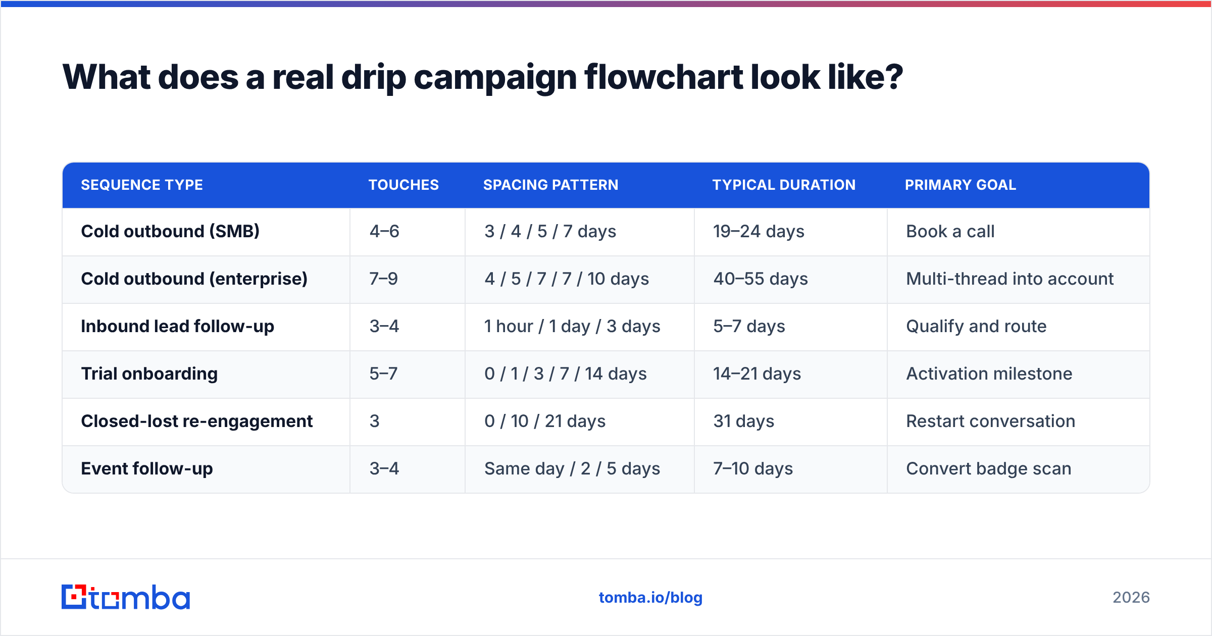
There is no universal number, but the shape of the answer is consistent across the sequences I've audited:
| Sequence type | Touches | Spacing pattern | Typical duration | Primary goal |
|---|---|---|---|---|
| Cold outbound (SMB) | 4–6 | 3 / 4 / 5 / 7 days | 19–24 days | Book a call |
| Cold outbound (enterprise) | 7–9 | 4 / 5 / 7 / 7 / 10 days | 40–55 days | Multi-thread into account |
| Inbound lead follow-up | 3–4 | 1 hour / 1 day / 3 days | 5–7 days | Qualify and route |
| Trial onboarding | 5–7 | 0 / 1 / 3 / 7 / 14 days | 14–21 days | Activation milestone |
| Closed-lost re-engagement | 3 | 0 / 10 / 21 days | 31 days | Restart conversation |
| Event follow-up | 3–4 | Same day / 2 / 5 days | 7–10 days | Convert badge scan |
The pattern that holds: gaps widen as the sequence progresses. Tight early spacing capitalizes on recency; widening later spacing avoids the pest effect. A flat "every 3 days" cadence is the signature of a sequence nobody diagrammed.
Which tools should you use to build it?#
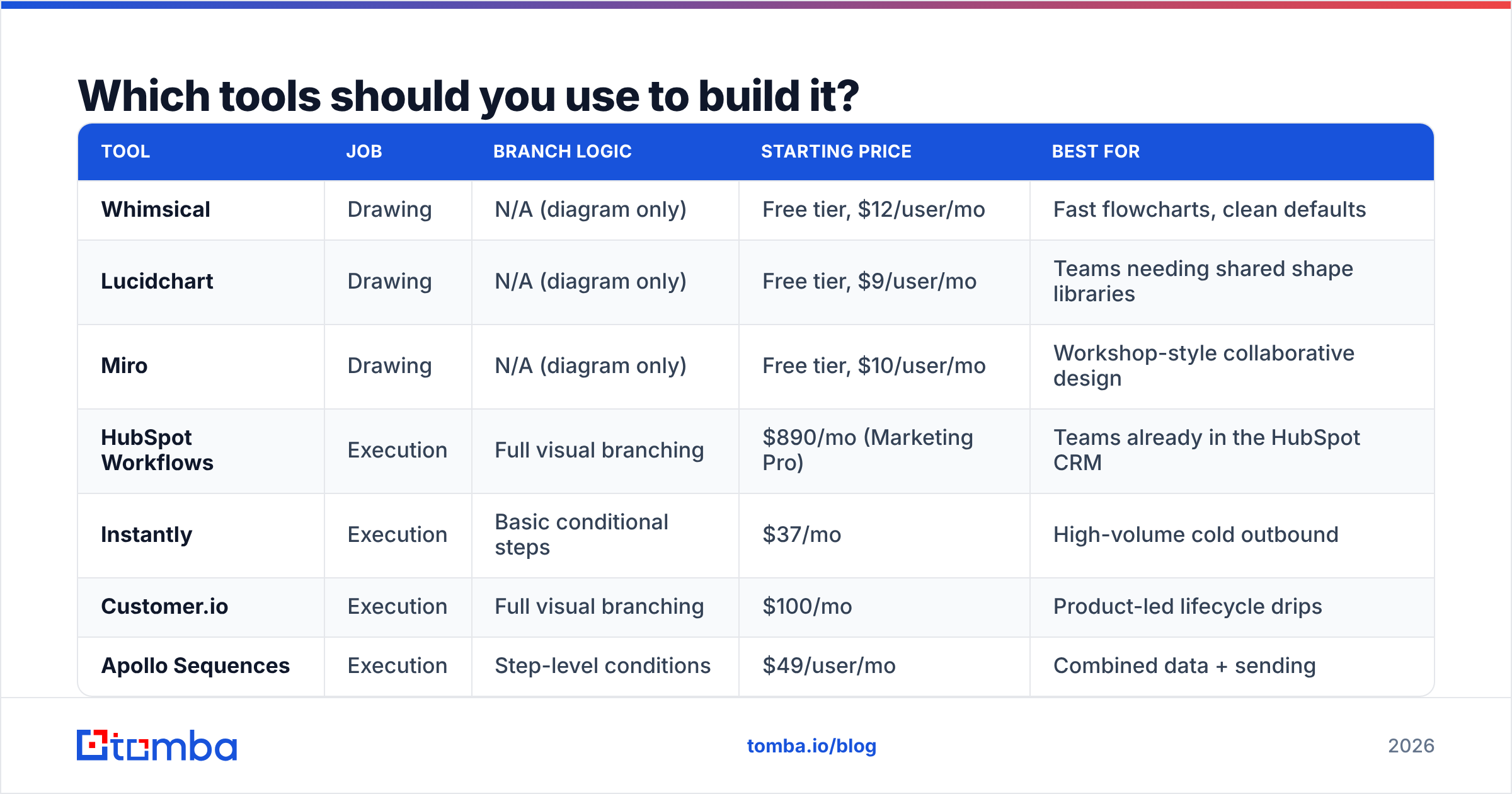
Two different jobs here — drawing the chart, and executing it. Don't conflate them.
| Tool | Job | Branch logic | Starting price | Best for |
|---|---|---|---|---|
| Whimsical | Drawing | N/A (diagram only) | Free tier, $12/user/mo | Fast flowcharts, clean defaults |
| Lucidchart | Drawing | N/A (diagram only) | Free tier, $9/user/mo | Teams needing shared shape libraries |
| Miro | Drawing | N/A (diagram only) | Free tier, $10/user/mo | Workshop-style collaborative design |
| HubSpot Workflows | Execution | Full visual branching | $890/mo (Marketing Pro) | Teams already in the HubSpot CRM |
| Instantly | Execution | Basic conditional steps | $37/mo | High-volume cold outbound |
| Customer.io | Execution | Full visual branching | $100/mo | Product-led lifecycle drips |
| Apollo Sequences | Execution | Step-level conditions | $49/user/mo | Combined data + sending |
Pricing reflects publicly listed rates as of early 2026 and changes frequently — check each vendor's page before budgeting.
A practical note: the execution tools with the best branching UIs (HubSpot, Customer.io) are the most expensive, and the cheap cold-email tools mostly support "if replied, stop" and little else. If your flowchart has five diamonds and your sender only supports one, either upgrade the sender or simplify the chart. Don't build a five-diamond chart and then implement three of the branches manually — that's how contacts get stuck.
Suggested visual: side-by-side screenshot of a Whimsical flowchart draft next to the same logic implemented in a HubSpot workflow canvas.
How do you handle branch conditions correctly?#
Branch on the strongest signal available, and always define the negative path.
Signals ranked by reliability:
- Replied — Unambiguous. Always exits to a human. The only caveat is out-of-office detection; most tools now filter these, but verify yours does before trusting the branch.
- Booked / converted — The goal node. Should fire an immediate exit from every other sequence the contact is in, not just this one.
- Clicked — Strong intent, but inflated by security scanners that pre-fetch links. If your click rates jumped and reply rates didn't, that's bot traffic, not interest.
- Visited a key page — Requires tracking installed and identity resolution. Useful when it works. Tomba's website visitor reveal is one way to attach a company to anonymous traffic so a visit can trigger a branch.
- Opened — Weakest signal since Apple Mail Privacy Protection. Treat opens as directional at best. Never branch on opens alone for a high-stakes decision.
The rules that keep charts sane:
- Every diamond has two labeled exits. No exceptions. If the "no" path is "do nothing," draw a node that says "do nothing, wait for next step" so the reader knows it was a choice.
- Cap total branch depth at three levels. Beyond that, testing becomes impossible and you can no longer tell which variable moved the result.
- Global suppression sits above the chart, not inside it. Unsubscribes, existing customers, open opportunities, and competitor domains get filtered at enrollment, not at step four.
- One goal per flowchart. If a sequence is simultaneously trying to book demos and drive webinar registrations, you have two flowcharts wearing a trench coat.
What breaks drip campaigns even with a perfect chart?#
Bad contact data, and it's not close.
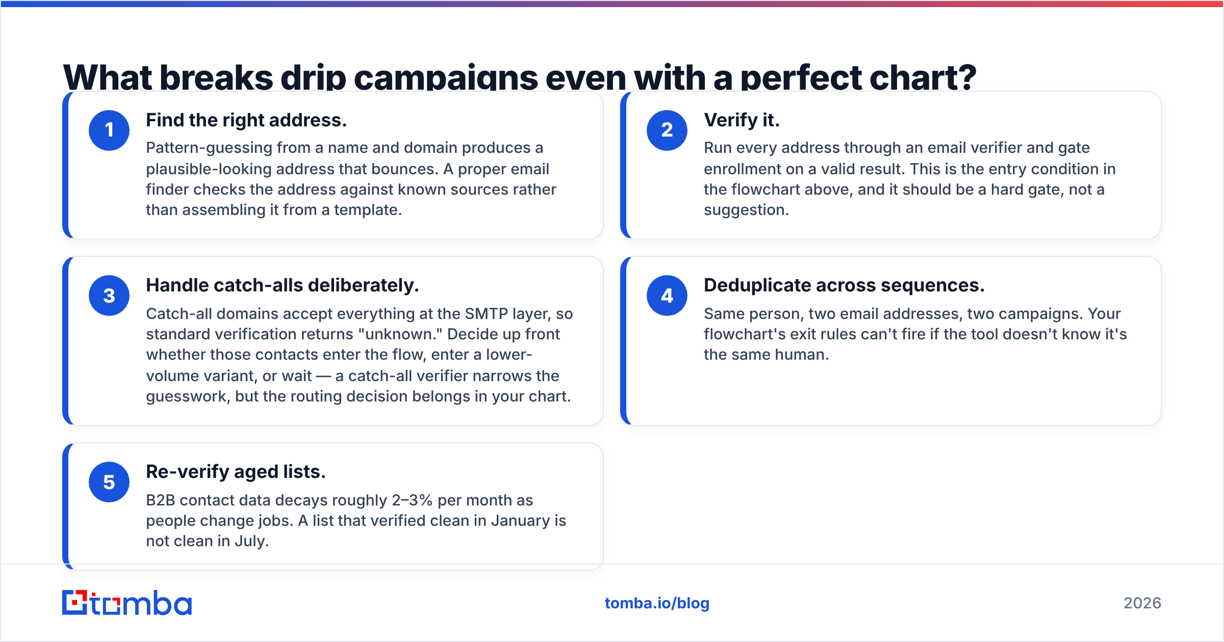
You can design flawless branch logic and it still fails if 22% of your list bounces on email one. Bounces damage your sender reputation, which suppresses inbox placement for the valid addresses in the same campaign, which means your beautifully branched sequence never gets seen by the people it was designed for. The flowchart executes perfectly into a spam folder.
Order of operations before any contact enters a flow:
- Find the right address. Pattern-guessing from a name and domain produces a plausible-looking address that bounces. A proper email finder checks the address against known sources rather than assembling it from a template.
- Verify it. Run every address through an email verifier and gate enrollment on a valid result. This is the entry condition in the flowchart above, and it should be a hard gate, not a suggestion.
- Handle catch-alls deliberately. Catch-all domains accept everything at the SMTP layer, so standard verification returns "unknown." Decide up front whether those contacts enter the flow, enter a lower-volume variant, or wait — a catch-all verifier narrows the guesswork, but the routing decision belongs in your chart.
- Deduplicate across sequences. Same person, two email addresses, two campaigns. Your flowchart's exit rules can't fire if the tool doesn't know it's the same human.
- Re-verify aged lists. B2B contact data decays roughly 2–3% per month as people change jobs. A list that verified clean in January is not clean in July.
Beyond data, three other silent killers:
- No throttling. Sending 400 emails in ten minutes from a new domain triggers filters regardless of how good your branching is. Ramp volume; the email warmup calculator gives you a sane schedule.
- Authentication gaps. Missing or misconfigured SPF, DKIM, and DMARC records send your carefully branched sequence straight to spam. Google and Yahoo's bulk sender requirements made this non-negotiable — Google's sender guidelines spell out the current thresholds.
- Copy that doesn't match the branch. If someone lands in the "clicked pricing" path and receives the same generic email as the "did nothing" path, the branch was pointless. Each path needs distinct copy, or delete the branch.
How do you test and iterate on the flowchart?#
Change one node at a time and give it enough volume to mean something.
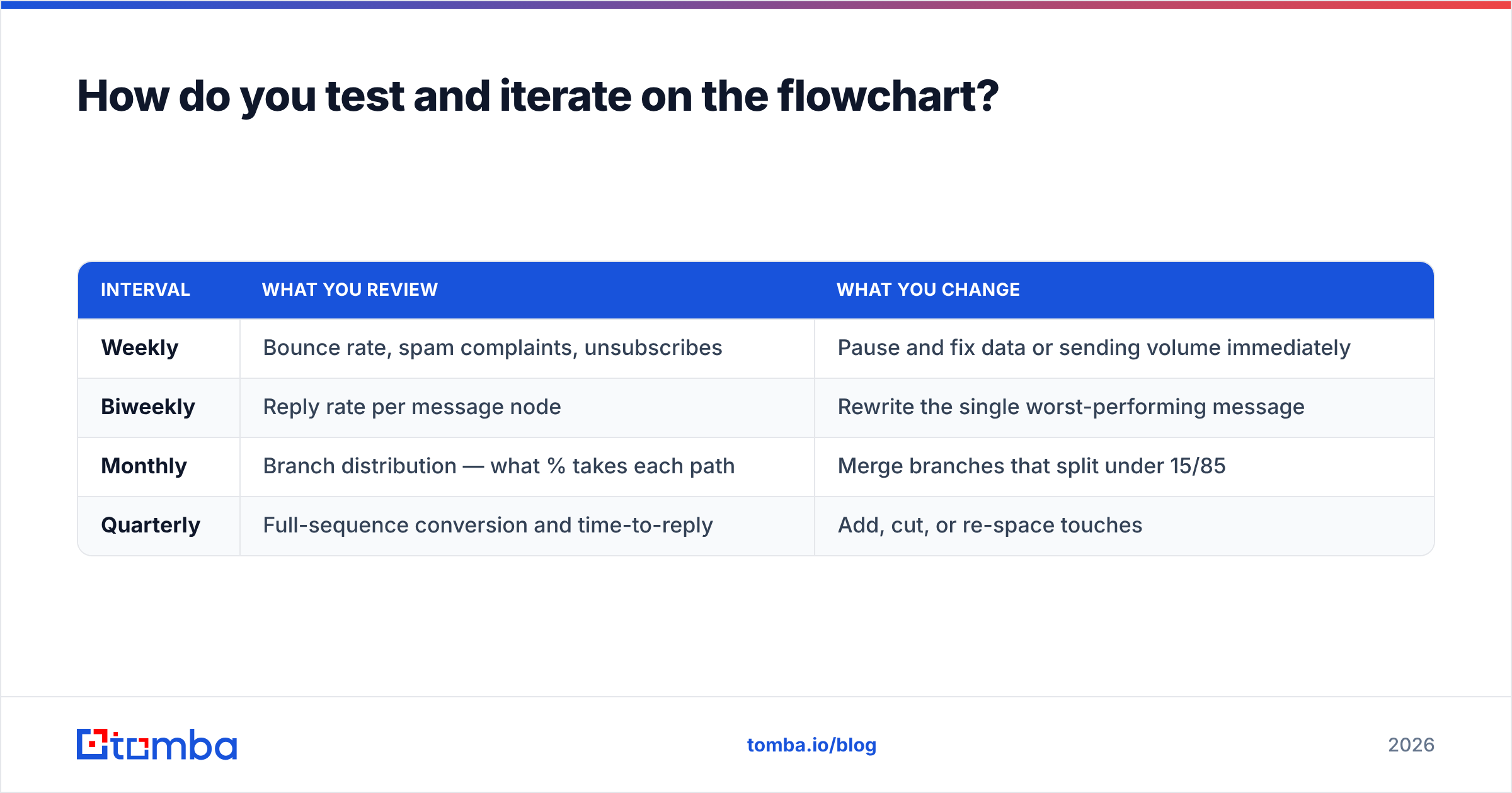
A workable review cadence:
| Interval | What you review | What you change |
|---|---|---|
| Weekly | Bounce rate, spam complaints, unsubscribes | Pause and fix data or sending volume immediately |
| Biweekly | Reply rate per message node | Rewrite the single worst-performing message |
| Monthly | Branch distribution — what % takes each path | Merge branches that split under 15/85 |
| Quarterly | Full-sequence conversion and time-to-reply | Add, cut, or re-space touches |
The branch-distribution review is the one most teams skip and the one that pays best. If 94% of contacts take the "no" path at a diamond, that branch is doing nothing but adding maintenance cost — collapse it. If a branch you assumed was minor takes 40% of traffic, it deserves its own copy investment.
Track per-node metrics, not just campaign totals. A sequence with a 6% overall reply rate might be a 14% reply on message one and near-zero afterward, which tells you to shorten the sequence. Or it might be flat at 6% across all five, which tells you the copy is fine and the targeting is the problem. Campaign-level averages hide both.
One more discipline: version your flowchart. Date each revision and note what changed. When reply rate drops 3 points in March, you want to know that you re-spaced the waits in February. The response rate numbers are only interpretable against a change log.
Start with clean data, then draw the chart#
A drip campaign flowchart is cheap insurance. An hour with a whiteboard surfaces the branch gaps, suppression holes, and dead ends that would otherwise take six weeks and a damaged sending domain to discover. Draw the six node types, define every exit, branch on behavior rather than time, and cap your depth at three levels.
Then make sure the contacts entering it are real. The most elegant sequence in the world converts nothing if the addresses bounce.
Start at the entry gate: use the Tomba Email Finder to source verified, deliverable addresses by domain, name, or company before anyone enters your flow — free tier includes 25 searches per month, and paid plans start at $49/mo on Tomba pricing. Clean data in, working flowchart out.
Related guides#
Ready to find emails that actually work?
Join 150,000+ professionals who stopped guessing and started sending. Free credits on signup — no credit card required.
Get the Tomba newsletter
Practical outbound tactics and product updates — once every two weeks.
About the author