Eblast Open Rate Industry Standard: 2026 Benchmarks by Sector
Median eblast open rates look great in 2026 — because bots and privacy proxies inflate them. Here are the real sector benchmarks, the math behind them, and the metrics that actually predict pipeline.
The eblast open rate industry standard looks healthier than ever in 2026, and that is exactly the problem. Bots, privacy proxies, and security scanners open your email before a human ever sees it. Here are the real sector numbers, the math behind them, and the metrics that still predict revenue.
TL;DR
- The eblast open rate industry standard now sits between 28% and 45% by sector, with a cross-industry median of 37-39%.
- That is roughly 15 points above pre-2021 numbers. Privacy proxies explain almost all of the lift.
- Apple Mail Privacy Protection (MPP) and corporate scanners pre-fetch images. Each pre-fetch logs an "open" nobody made. On a typical B2B list, 30-55% of recorded opens are machine opens.
Benchmarks only work when the math matches:
- Most vendors report opens ÷ delivered. If you use opens ÷ sent, your number looks 3-8% lower for no real reason.
- List quality moves open rate more than subject lines do. A list with 12% invalid addresses loses 10+ points before you write a single word.
- Track reply rate, click-to-delivered, unsubscribe rate, and inbox placement first. Keep open rate as a trend line, not a KPI you report upward.
What is an eblast, and why is its open rate still measured?#
An eblast (electronic blast) is one email sent to a large segment at once: a product announcement, a newsletter drop, a promo push, a webinar invite. It is the opposite of a one-to-one sequence. Little personalization, wide reach, one send window.
Open rate became the default health metric because it was the only feedback loop we had. You dropped a tracking pixel into the HTML. When the recipient's client loaded that 1x1 image, the ESP logged an open. Simple, and for about fifteen years, close to true.
It is no longer true. Apple's Mail Privacy Protection launched in 2021 and is now the default on most iPhones. It routes messages through a proxy that downloads all remote content on arrival, whether or not the human ever looks. Gmail image caching, Outlook Safe Links, and corporate security tools do much the same thing. So the eblast open rate industry standard drifts up every year and never corrects itself.
That does not make open rate useless. It makes it a relative metric. Compare your Tuesday send to your Thursday send on the same list and the number means something. Compare it to a published benchmark measured under different rules and it does not.
What is the eblast open rate industry standard in 2026?#
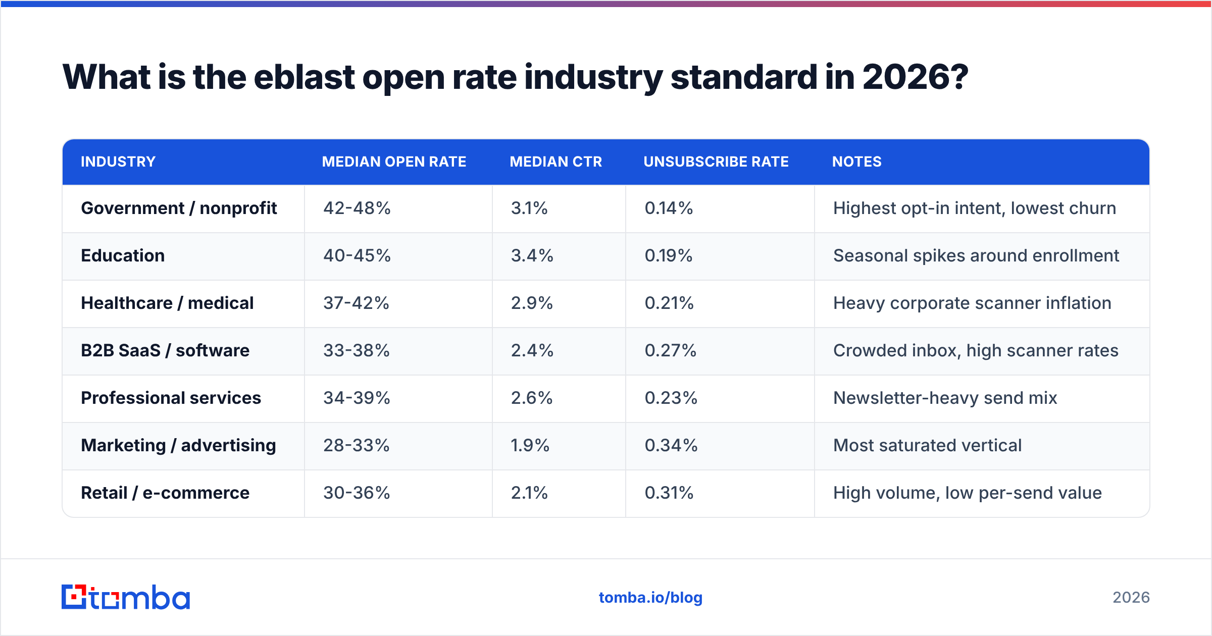
Here is the aggregate picture from the major ESP benchmark reports (Mailchimp and HubSpot publish the most widely cited datasets). Every number is normalized to opens ÷ delivered:
| Industry | Median open rate | Median CTR | Unsubscribe rate | Notes |
|---|---|---|---|---|
| Government / nonprofit | 42-48% | 3.1% | 0.14% | Highest opt-in intent, lowest churn |
| Education | 40-45% | 3.4% | 0.19% | Seasonal spikes around enrollment |
| Healthcare / medical | 37-42% | 2.9% | 0.21% | Heavy corporate scanner inflation |
| B2B SaaS / software | 33-38% | 2.4% | 0.27% | Crowded inbox, high scanner rates |
| Professional services | 34-39% | 2.6% | 0.23% | Newsletter-heavy send mix |
| Marketing / advertising | 28-33% | 1.9% | 0.34% | Most saturated vertical |
| Retail / e-commerce | 30-36% | 2.1% | 0.31% | High volume, low per-send value |
| Real estate | 35-40% | 2.7% | 0.25% | Local lists, strong relevance |
| Logistics / manufacturing | 32-37% | 2.3% | 0.22% | Older, more stable address bases |
| Travel / hospitality | 29-34% | 2.0% | 0.36% | Promotion fatigue is real |
Take two things from this table. First, the spread between the best and worst vertical is about 15 points. That is real, but the gap between a clean list and a dirty list inside one vertical is bigger. Second, click-through rate moves far less than open rate. CTR sits in a 1.9-3.4% band everywhere, which tells you real attention is similar across industries.
If you want one number to hold in your head: the eblast open rate industry standard in 2026 is about 38%, and the honest human-open equivalent is closer to 19-22%.
How much of your open rate is actually a machine?#
Almost nobody audits this. It also decides whether your benchmark comparison means anything at all.
Run this diagnostic on your last three eblasts:
- Segment by mail client. Most ESPs expose the user-agent bucket. Apple Mail opens with MPP active are your proxy opens. On a consumer list they can be 55-65% of recorded opens. On a B2B list, 25-40%.
- Look at the open-to-click ratio. Healthy eblasts used to produce one click per 6-10 opens. One click per 25-40 opens is a machine problem, not a copy problem.
- Check open timestamps. A cluster of opens within 90 seconds of send, spread evenly across the list, is a scanner signature. Humans open on a long tail over 48 hours.
Then dig into the two that hide the most:
- Isolate duplicate opens per recipient. Security appliances often log 3-8 opens per message in the first minute. Deduplicate to unique opens before you compute anything.
- Compare unique opens to unique clicks per domain. Corporate domains running Proofpoint, Mimecast, or Barracuda show near-100% open rates and near-zero clicks. Those are pure scanner artifacts.
Do this once. You will never quote a raw open rate to your leadership team again.
How do you calculate eblast open rate correctly?#
The formula matters more than people assume. Half of all "our open rate dropped" panics are denominator changes.
Open rate = (unique opens ÷ delivered emails) × 100
Delivered means sent minus hard bounces, soft bounces, and blocks. So a list with many bounces can post a higher open rate than a clean one. The dead addresses simply leave the denominator. That is why open rate is a poor list-health proxy on its own.
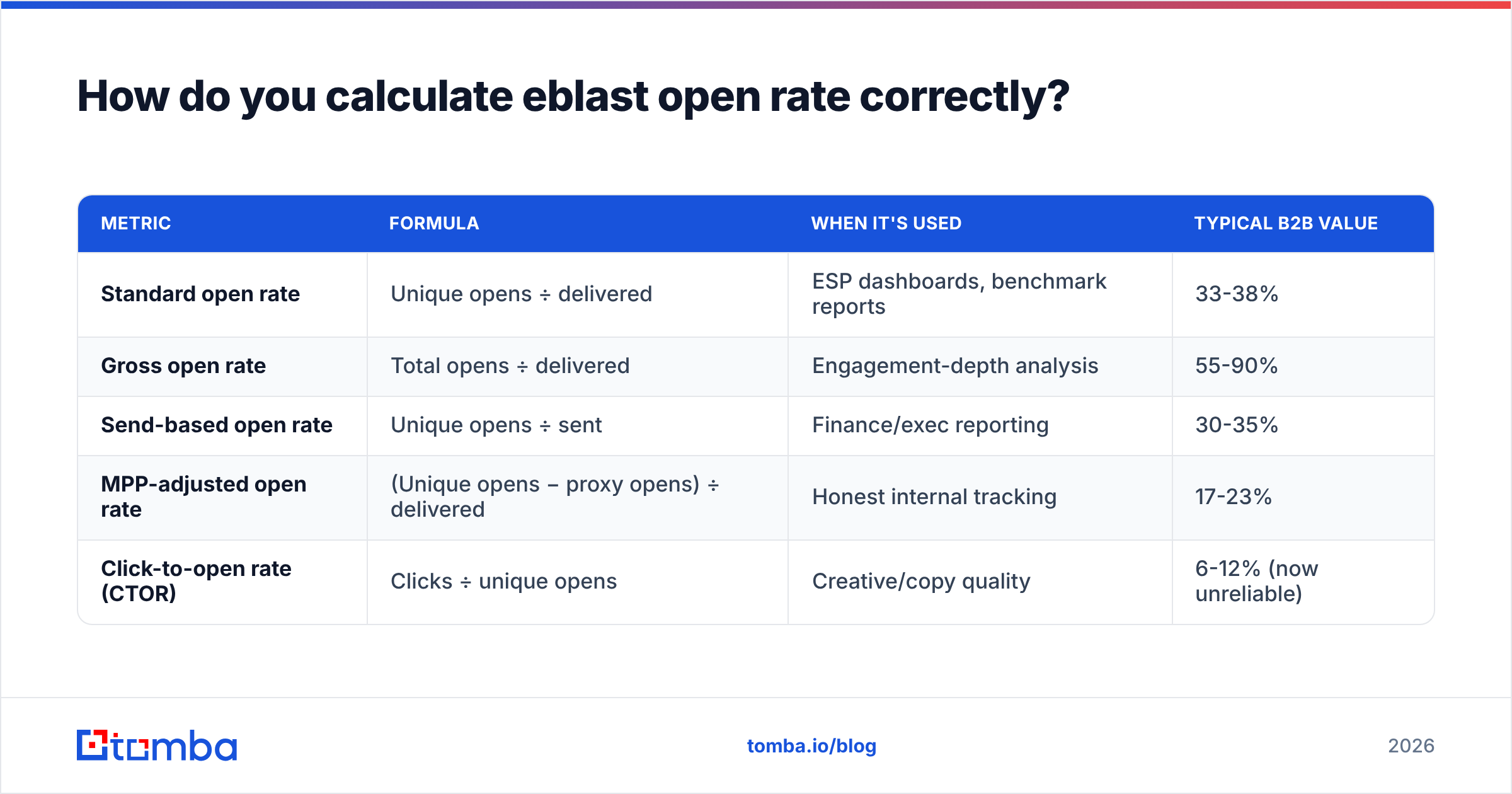
The variants you will run into:
| Metric | Formula | When it's used | Typical B2B value |
|---|---|---|---|
| Standard open rate | Unique opens ÷ delivered | ESP dashboards, benchmark reports | 33-38% |
| Gross open rate | Total opens ÷ delivered | Engagement-depth analysis | 55-90% |
| Send-based open rate | Unique opens ÷ sent | Finance/exec reporting | 30-35% |
| MPP-adjusted open rate | (Unique opens − proxy opens) ÷ delivered | Honest internal tracking | 17-23% |
| Click-to-open rate (CTOR) | Clicks ÷ unique opens | Creative/copy quality | 6-12% (now unreliable) |
When you compare yourself to the eblast open rate industry standard above, use the standard formula. When you report internally, use the MPP-adjusted number and label it in a footnote. Mixing the two across quarters is how teams report a 40% "improvement" that is really a measurement change.
Is a 60% open rate good or a warning sign?#
Usually a warning sign. Here is the uncomfortable logic.
Very high open rates on cold or semi-cold eblasts mean one of three things. Your list is small and highly engaged, which is great but hard to scale. Or it is heavily corporate and being scanned, which is meaningless. Or the addresses came from a source that seeded them with monitoring accounts, which is dangerous. A 68% open rate next to a 0.4% click rate and a 4% bounce rate is not a win. It is a deliverability incident in progress.
The healthy shape, measured against the eblast open rate industry standard, looks like this:
- Open rate: within 5 points of your vertical median
- Click rate: 2-3.5% of delivered
- Click-to-open: 6-12%
- Bounce rate: under 2% (under 1% for warm lists)
- Unsubscribe: 0.15-0.35%
- Spam complaint rate: under 0.10%, and never over 0.30% — Gmail and Yahoo enforce this threshold for bulk senders
That complaint threshold is the one that gets you blocked. Google and Yahoo made it a hard rule for bulk senders. No open rate, however flattering, saves you from crossing it. Not sure where you stand? Run your sending domain through a sender reputation checker and a blacklist checker before your next big send.

How does list quality change the benchmark?#
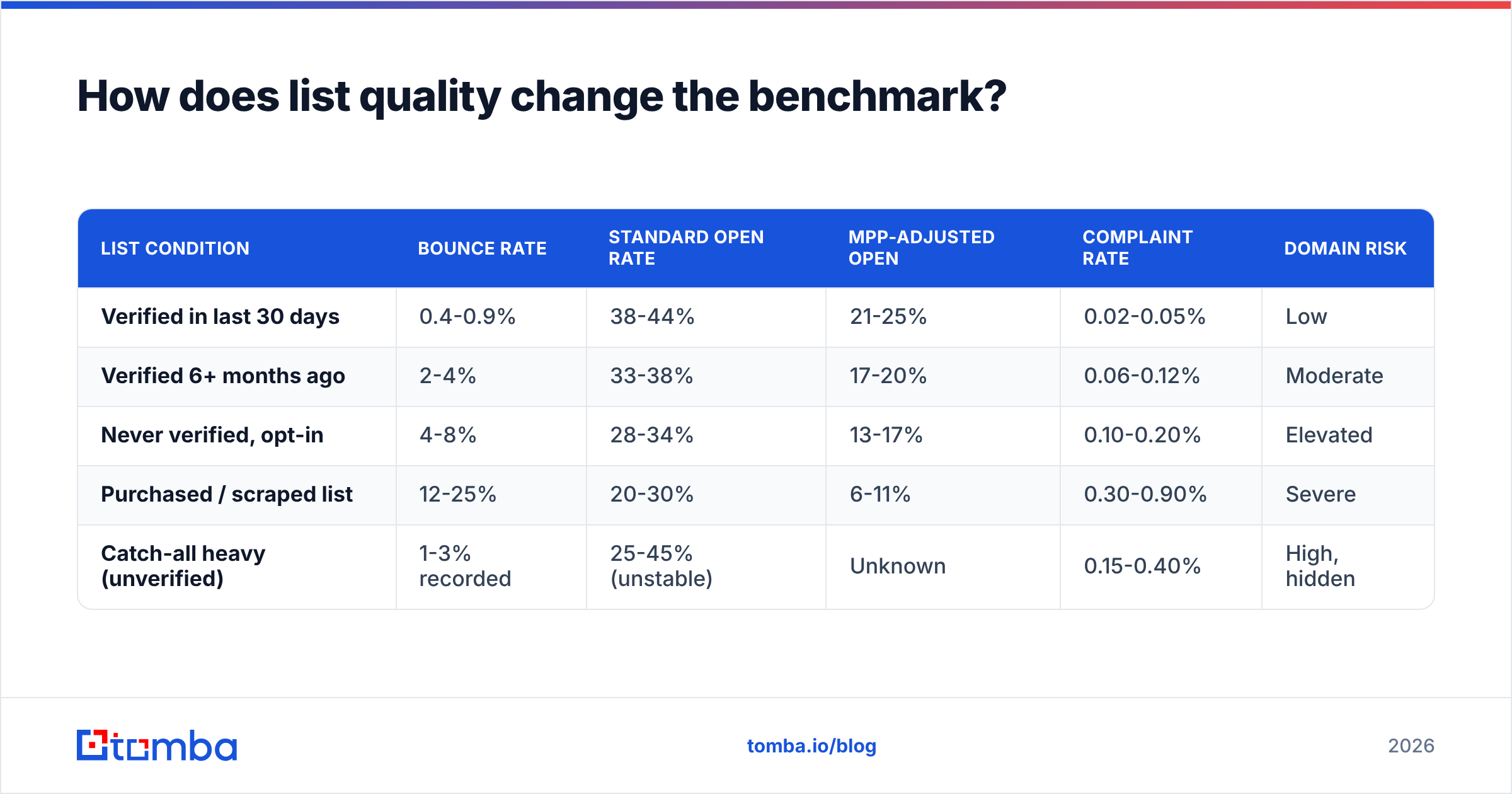
List quality moves the eblast open rate industry standard more than anything else you control. Here is the comparison most benchmark reports skip:
| List condition | Bounce rate | Standard open rate | MPP-adjusted open | Complaint rate | Domain risk |
|---|---|---|---|---|---|
| Verified in last 30 days | 0.4-0.9% | 38-44% | 21-25% | 0.02-0.05% | Low |
| Verified 6+ months ago | 2-4% | 33-38% | 17-20% | 0.06-0.12% | Moderate |
| Never verified, opt-in | 4-8% | 28-34% | 13-17% | 0.10-0.20% | Elevated |
| Purchased / scraped list | 12-25% | 20-30% | 6-11% | 0.30-0.90% | Severe |
| Catch-all heavy (unverified) | 1-3% recorded | 25-45% (unstable) | Unknown | 0.15-0.40% | High, hidden |
Look hard at the last row. Catch-all domains accept every address at the SMTP layer, so they never bounce. They just discard the mail. Your bounce rate looks fine while part of your send goes nowhere and engagement quietly rots. A dedicated catch-all verifier is the only way to tell real mailboxes from accept-all black holes.
The takeaway is simple. Cleaning a list beats any subject line test you will run this quarter. A bulk email verification pass before a large eblast usually recovers 4-9 points of open rate. It strips dead weight from the denominator and protects your sender reputation at the same time.
What should you track instead of open rate?#
Move open rate to the "context" column of your dashboard. Promote these instead:
- Reply rate — no proxy can fake it. For eblasts, 0.3-0.8% is meaningful. For segmented B2B sends, aim for 1-3%.
- Click-to-delivered — clicks divided by delivered, not by opens. It skips the inflated denominator and gives you a clean period-to-period read.
- Inbox placement rate — how much landed in the primary inbox versus Promotions versus spam. Seed-list tools measure this. Your ESP does not.
The last three catch damage early:
- Complaint rate by mailbox provider — track Gmail, Outlook, and Yahoo apart. They degrade on their own schedules, and an average hides a Gmail problem until it is severe.
- List churn rate — unsubscribes plus hard bounces plus complaints per month, as a share of the list. Above 1.5% you are burning the asset faster than you build it.
- Revenue or pipeline per thousand delivered — the number your CFO already cares about. Everything above feeds it.
Two of these depend on clean authentication: inbox placement and complaint rate by provider. Check your SPF record, DKIM, and DMARC alignment before you spend a week tuning send times. A broken DMARC policy costs you more open rate than any creative choice. For background on how the mechanics evolved, email marketing has a well-sourced technical overview.
How do you beat the eblast open rate industry standard?#
In rough order of impact per hour invested:
- Verify before every major send. Removing invalid and unknown addresses lifts open rate and inbox placement together. It is the best 30 minutes in the whole workflow.
- Segment by engagement recency. Split into 0-30, 31-90, 91-180, and 180+ day buckets. Send eblasts to the first three. Run a re-permission campaign to the last. Suppressing the 180+ group alone often adds 6-10 points.
- Fix the from-name before the subject line. Readers scan the sender first. A real human name at a known company beats "Marketing Team" every time.
The next three are cheap and often skipped:
- Match subject to preview text. The preview line gives you 40-90 unused characters. Treat it as the second half of the sentence, not a repeat of the first.
- Send from a warmed subdomain. Keep transactional mail on your root domain and marketing eblasts on a subdomain with its own reputation. One bad promo then cannot poison your password resets.
- Cap frequency per recipient. Send collisions between teams are a top cause of complaint spikes. One global cap fixes what a dozen A/B tests cannot.
Building a list from scratch instead of cleaning one? The order is: identify target accounts, find the right contacts, verify, then segment. Tools like domain search handle the middle two steps at company scale. If you are comparing vendors, the reviews on G2 are a reasonable place to start.
What's the honest verdict on the eblast open rate industry standard?#
Treat the eblast open rate industry standard as a floor check, not a scoreboard. More than 10 points below your vertical median? You have a real problem, usually list quality, authentication, or frequency. Inside the band? Stop optimizing opens and start optimizing clicks and replies. Far above the band? Audit for scanner inflation before you celebrate.
The benchmark that still matters in three years is not open rate. It is how many verified, reachable, relevant people sit on your list, and what share of them act after your email lands.
That starts with the data. If your list has never been verified, or you are building a new segment, run it through the Tomba Email Finder and verifier stack before your next send. The free tier covers 25 searches a month, paid plans start at $49/mo, and the gap between a verified and unverified list shows up in your open rate the same week.
Related guides#
Ready to find emails that actually work?
Join 150,000+ professionals who stopped guessing and started sending. Free credits on signup — no credit card required.
Get the Tomba newsletter
Practical outbound tactics and product updates — once every two weeks.
About the author