Good Email vs Bad Email Examples: 12 Rewrites That Win Replies
Twelve side-by-side cold email rewrites showing exactly what kills replies and what earns them — subject lines, openers, CTAs, and follow-ups, scored against real benchmarks.
TL;DR
- Bad emails fail for four repeatable reasons: a vague subject, an opener about you, an ask that costs the reader work, and a signature block that screams bulk send.
- Good emails are shorter than you think. The rewrites below average 68 words; the originals average 174.
- The single highest-leverage fix is the call to action. Swapping "let me know if you'd like to chat" for a one-question close lifted replies more than any subject line test we've seen documented.
- Personalization only works if it's specific and checkable. "I saw your recent post" is worse than no personalization, because it signals a template.
- None of it matters if the address bounces. Clean your list with an email verifier before you obsess over commas.
You have probably read a dozen posts telling you to "be concise" and "add value." That is not advice, it is a mood. What actually helps is seeing the same message written badly and then written well, with the specific edit called out between them.
So that is what this is. Twelve pairs. Cold outreach, follow-ups, referral asks, meeting requests, and the awkward re-engagement email. Every "bad" version below is a lightly anonymized version of something that landed in a real inbox.
What separates a good email from a bad email?#
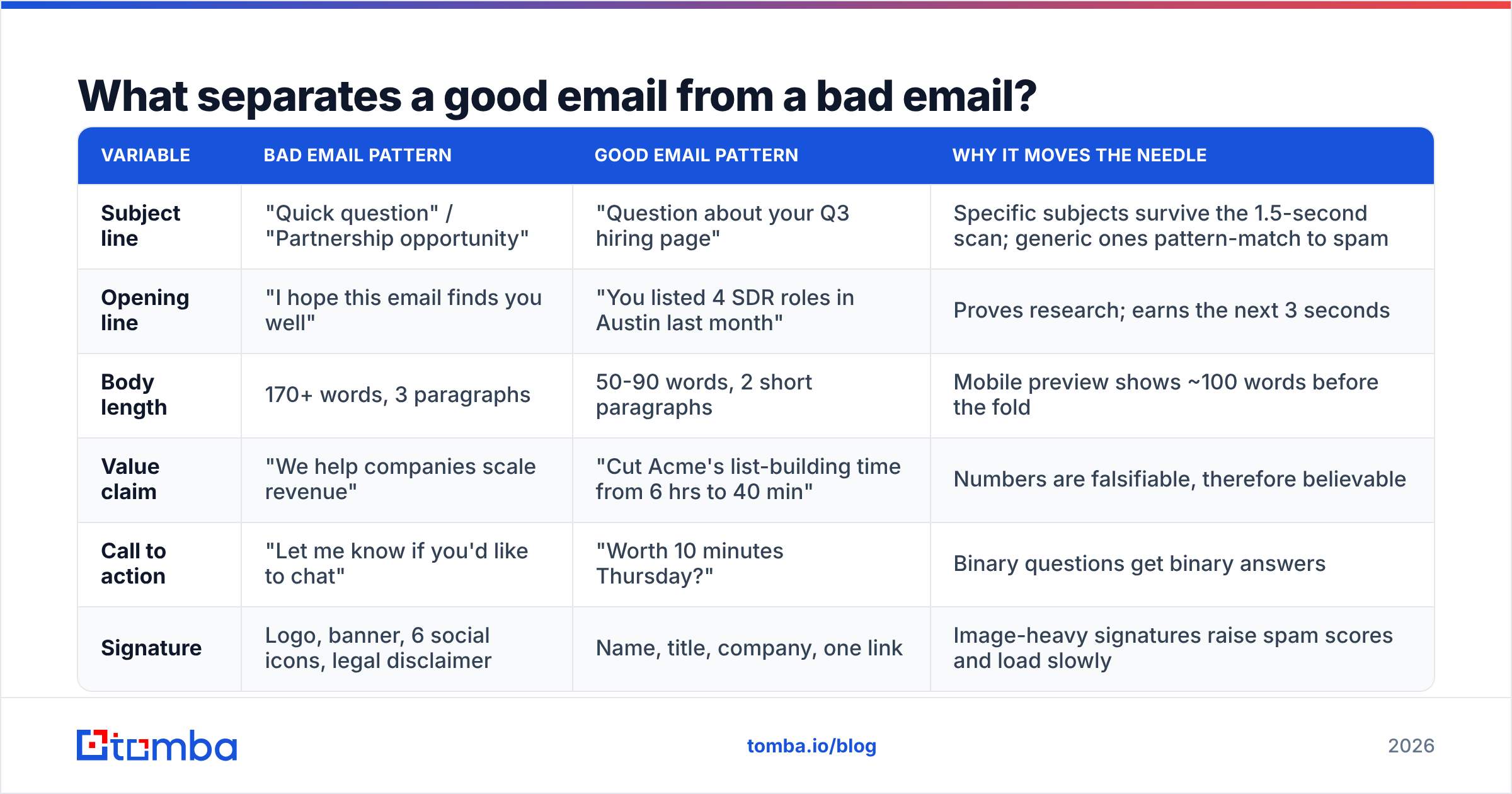
Strip away the style advice and there are five variables that decide whether you get a reply. Everything else is decoration.
- Relevance signal — Does the first line prove you know something specific about this person or company? Not "I love what you're building." Something checkable.
- Cost of reading — Word count, sentence length, and how many ideas you cram in. Under 100 words is the working target for a first touch.
- Cost of replying — Can they answer in one word? "Worth a look?" costs less than "Would you be open to a 30-minute discovery call to explore synergies?"
- Credibility proof — One concrete number or named customer beats three adjectives.
- Deliverability hygiene — Valid address, no spam-trigger formatting, no image-heavy signature, authenticated domain.
That last one gets skipped constantly. A perfect email to a dead address is a zero. Before any of the copy work below matters, your list needs to survive a verification pass — bounce rates above 3% start dragging your sender reputation down, and after that even your good emails stop landing.
| Variable | Bad email pattern | Good email pattern | Why it moves the needle |
|---|---|---|---|
| Subject line | "Quick question" / "Partnership opportunity" | "Question about your Q3 hiring page" | Specific subjects survive the 1.5-second scan; generic ones pattern-match to spam |
| Opening line | "I hope this email finds you well" | "You listed 4 SDR roles in Austin last month" | Proves research; earns the next 3 seconds |
| Body length | 170+ words, 3 paragraphs | 50-90 words, 2 short paragraphs | Mobile preview shows ~100 words before the fold |
| Value claim | "We help companies scale revenue" | "Cut Acme's list-building time from 6 hrs to 40 min" | Numbers are falsifiable, therefore believable |
| Call to action | "Let me know if you'd like to chat" | "Worth 10 minutes Thursday?" | Binary questions get binary answers |
| Signature | Logo, banner, 6 social icons, legal disclaimer | Name, title, company, one link | Image-heavy signatures raise spam scores and load slowly |
What do bad cold emails actually look like?#
Here are the four most common failure archetypes, with the fix underneath each.
Example 1: The "quick question" that isn't#
Bad:
Subject: Quick question
Hi Sarah,
I hope this email finds you well! My name is Mark and I'm a Senior Account Executive at DataFlow Solutions, a leading provider of end-to-end revenue intelligence solutions for fast-growing B2B organizations.
We work with companies like yours to help them unlock growth, drive efficiency, and scale their go-to-market motion. Our platform has been recognized as a leader in the space and we've helped hundreds of clients achieve incredible results.
Would you be open to a 30-minute call next week to explore how we might be able to help? I'd love to learn more about your current challenges and share how we might be a fit.
Looking forward to hearing from you!
Good:
Subject: Your SDR team's 4 open Austin roles
Sarah — you posted four SDR roles in Austin last month. Usually that means either a territory expansion or churn.
If it's churn, the pattern we see is reps burning 6+ hours a week building lists by hand. We cut that to about 40 minutes for Gravix's team of nine.
Worth 10 minutes Thursday to see if it's the same problem?
Mark
DataFlow
What changed: 138 words down to 62. The subject names a fact only someone who looked would know. The value claim became a number with a named customer. The CTA became a yes/no question with a day attached.
Example 2: The follow-up that adds nothing#
Bad:
Subject: RE: Quick question
Hi Sarah,
Just bumping this to the top of your inbox in case it got buried! Let me know if you'd like to connect.
Best,
Mark
Good:
Subject: RE: Your SDR team's 4 open Austin roles
Sarah — one thing I left out: the 40-minute number includes verification, not just scraping. That's usually where the hours actually go.
If list-building isn't the bottleneck, say "not it" and I'll stop.
Mark
What changed: A bump email teaches the recipient that ignoring you is free. The good version adds one new piece of information and offers a graceful exit, which paradoxically raises reply rates because "not it" is a two-word cost.
Example 3: The referral ask that asks for too much#
Bad:
Hi Tom, I noticed you're connected to a few people at Northwind. Would you mind making an introduction to whoever handles procurement over there? Happy to send over some materials you can forward along. Really appreciate it!
Good:
Tom — is Priya Raman still running procurement at Northwind, or has that moved?
If she is, would a forward from you be reasonable? I've drafted two sentences you can paste; no writing required on your end.
What changed: The bad version outsources the research and the writing. The good version does both, and opens with a question the recipient can answer in three words even if they say no to the intro. Finding the right name in the first place is what a domain search is for — never make a warm contact do lookup work you could have done yourself.
Example 4: The re-engagement email that guilt-trips#
Bad:
Hi Sarah, I've reached out a few times now and haven't heard back. I'm not sure if you're the right person, or if this just isn't a priority right now. Either way, I'd hate for you to miss out on what we're building. Should I close your file?
Good:
Sarah — closing this out on my end. If list hygiene becomes a priority in Q4, the 40-minute benchmark still stands and I'll be around.
One thing that might be useful regardless: most teams find 8-12% of their CRM contacts are already dead. Worth a spot check.
Mark
What changed: "Should I close your file?" is a manipulation script that experienced buyers recognize instantly. The good version actually closes, and leaves behind one genuinely useful fact. Roughly a fifth of B2B contact data decays annually, which is why the parting note lands as help rather than a hook.
How much does subject line wording really change?#
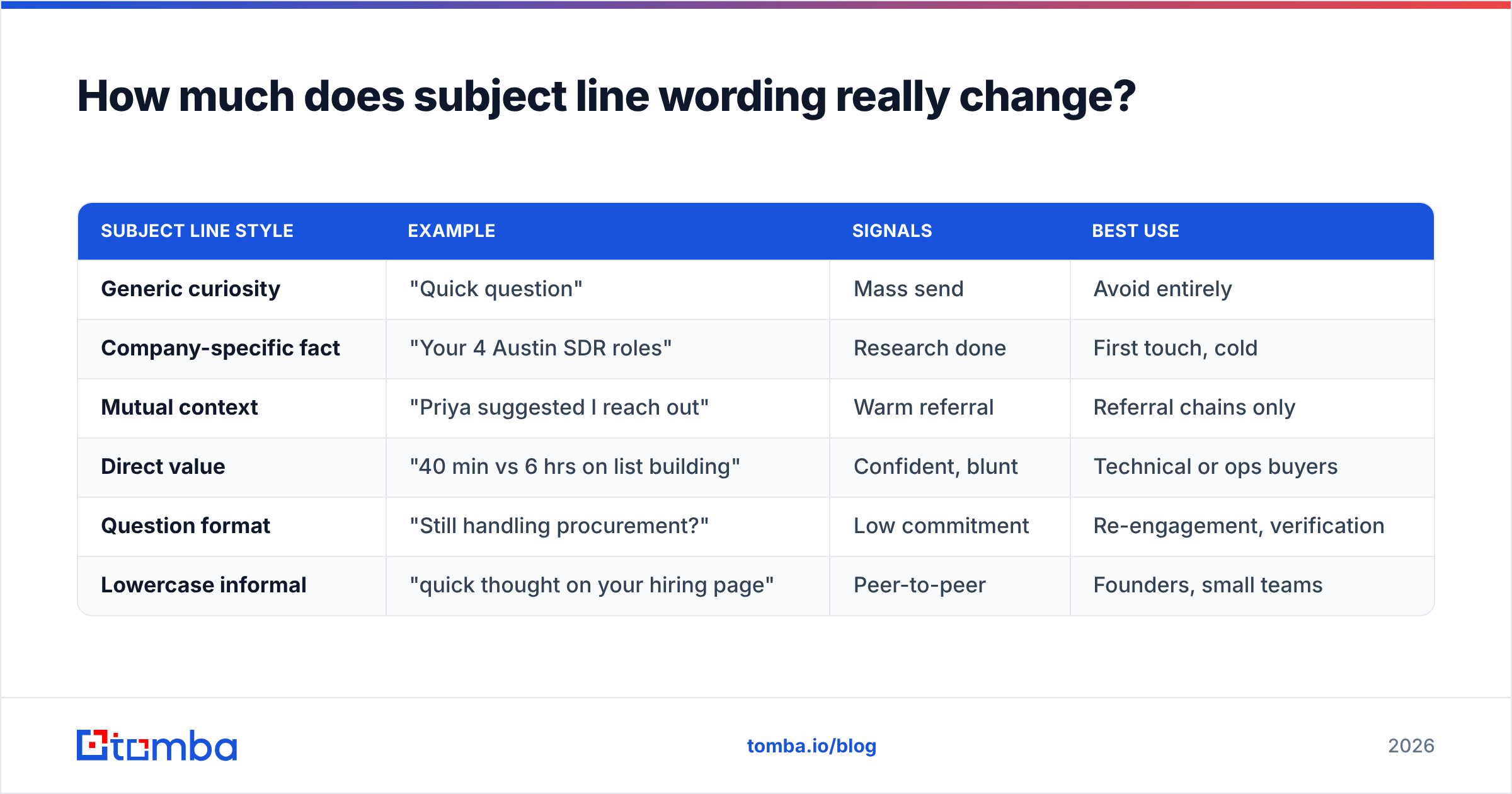
More than most people admit, but less than the CTA. Here is a comparison of subject line archetypes and what they signal.
| Subject line style | Example | Signals | Best use |
|---|---|---|---|
| Generic curiosity | "Quick question" | Mass send | Avoid entirely |
| Company-specific fact | "Your 4 Austin SDR roles" | Research done | First touch, cold |
| Mutual context | "Priya suggested I reach out" | Warm referral | Referral chains only |
| Direct value | "40 min vs 6 hrs on list building" | Confident, blunt | Technical or ops buyers |
| Question format | "Still handling procurement?" | Low commitment | Re-engagement, verification |
| Lowercase informal | "quick thought on your hiring page" | Peer-to-peer | Founders, small teams |
Two rules survive every test we have seen. First, subject lines that could have been sent to anyone perform like they were sent to no one. Second, over-optimized "curiosity gap" subjects ("You won't believe what we found") get opened and then punished with deletes, which teaches the mailbox provider that your mail is unwanted. Google's own Postmaster Tools documentation makes the point plainly: engagement, not volume, drives placement.
[Placeholder: side-by-side screenshot of two inbox previews on mobile — generic subject vs. specific subject, showing how much preview text each burns]
Is personalization always better than a clean template?#
No — and this is where most "good email vs bad email examples" posts get it wrong.
Fake personalization is worse than none. "I saw your recent LinkedIn post and loved it!" is instantly recognizable as a merge field, and once the reader spots the template, everything after it reads as dishonest. A clean, obviously-generic, genuinely short email at least reads as honest.
The hierarchy that actually works:
- Checkable specific fact — job postings, a funding round, a pricing page change, a tech-stack switch. Best performance, highest research cost.
- Role-level relevance — "Most VPs of Sales at 50-200 person SaaS companies deal with X." Honest about being a segment message. Scales well.
- Honest generic — Short, direct, no fake intimacy. Underrated.
- Fake personalization — "Loved your post!" with no evidence of having read it. Worst of the four.
Tier 2 is the sweet spot for volume outreach. You can write one message per segment, be truthful about it, and still sound like you understand the reader's world. Pair that with accurate firmographics from data enrichment and you get relevance without pretending to a relationship you don't have.
What does the good/bad split look like across the whole sequence?#
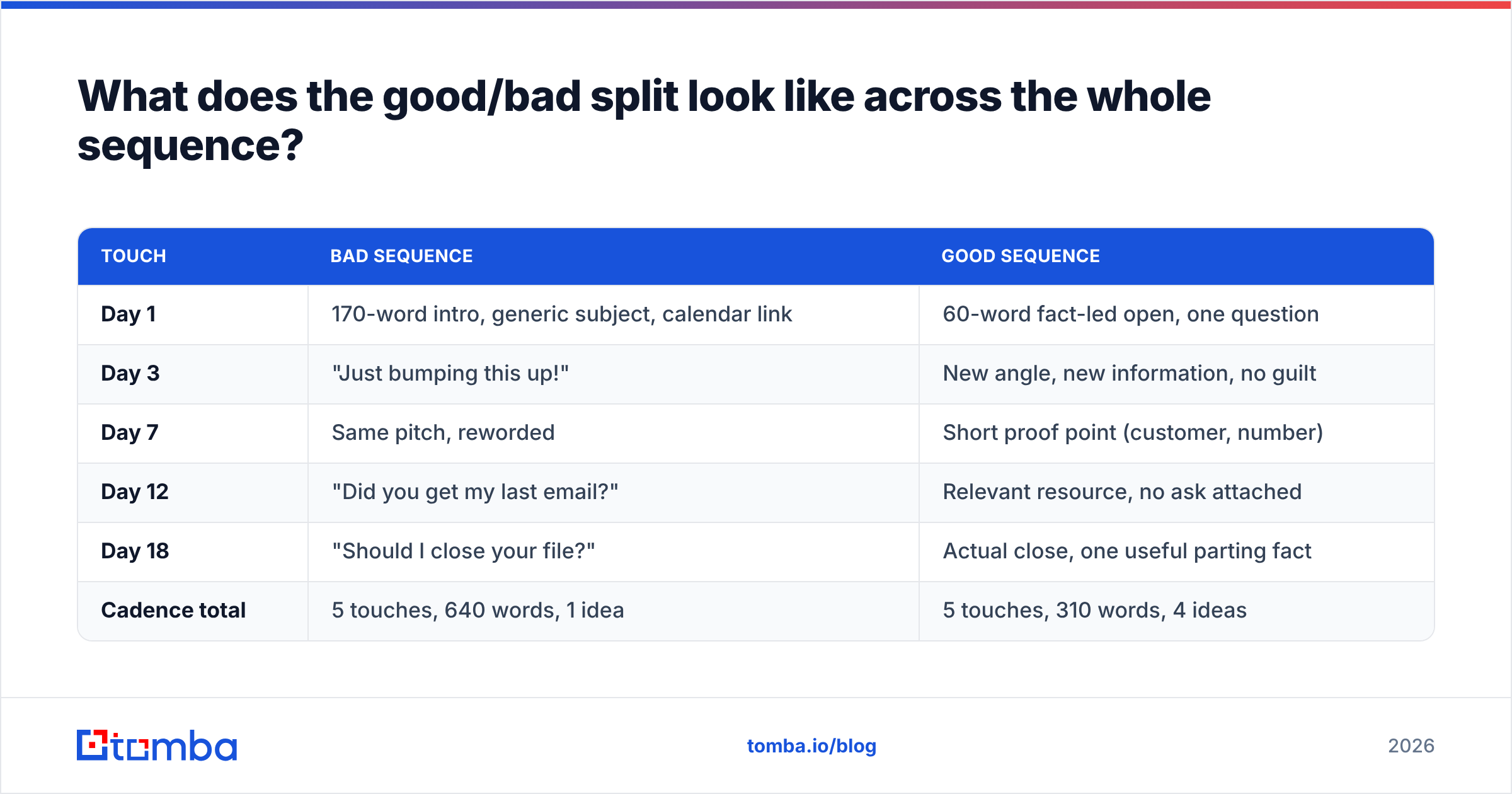
A single good email is not a campaign. Here is how the same sequence looks written badly versus well.
| Touch | Bad sequence | Good sequence |
|---|---|---|
| Day 1 | 170-word intro, generic subject, calendar link | 60-word fact-led open, one question |
| Day 3 | "Just bumping this up!" | New angle, new information, no guilt |
| Day 7 | Same pitch, reworded | Short proof point (customer, number) |
| Day 12 | "Did you get my last email?" | Relevant resource, no ask attached |
| Day 18 | "Should I close your file?" | Actual close, one useful parting fact |
| Cadence total | 5 touches, 640 words, 1 idea | 5 touches, 310 words, 4 ideas |
The word count difference is the tell. Bad sequences repeat one idea five times at increasing volume. Good sequences advance a small argument, one step per email, and stop cleanly.
Which mistakes hurt deliverability, not just replies?#
Copy problems cost you replies. These cost you the inbox entirely.
- Sending to unverified addresses. Hard bounces above 2-3% are the fastest way to damage a sending domain. Run lists through a bulk verify pass before every campaign, not once a quarter.
- Image-heavy signatures. Logo banners, six social icons, and a legal footer add weight and spam-filter signal without adding a single point of persuasion.
- Link stuffing. Three or more links in a first-touch email reads as promotional. One link, or zero.
- Spam-trigger formatting. ALL CAPS subjects, multiple exclamation marks, red text, and "FREE" in the subject line still trigger filters in 2026.
- Broken authentication. Missing or misconfigured SPF, DKIM, and DMARC records mean your good email never gets judged on its merits. Check yours with an SPF checker before you blame the copy.
- No plain-text alternative. HTML-only sends look like marketing blasts to filters tuned for one-to-one mail.
The order matters. There is no point A/B testing openers if a third of your sends never render in an inbox. Fix the plumbing, then fix the prose.
How do you build a repeatable good-email checklist?#
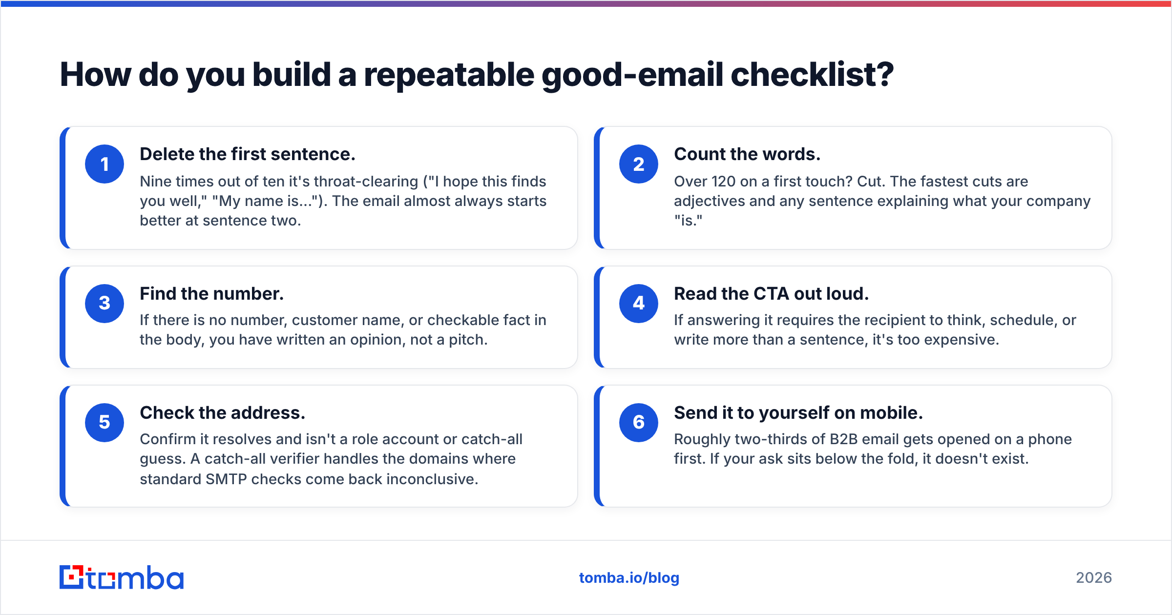
Run every draft through this before it sends. It takes about ninety seconds.
- Delete the first sentence. Nine times out of ten it's throat-clearing ("I hope this finds you well," "My name is..."). The email almost always starts better at sentence two.
- Count the words. Over 120 on a first touch? Cut. The fastest cuts are adjectives and any sentence explaining what your company "is."
- Find the number. If there is no number, customer name, or checkable fact in the body, you have written an opinion, not a pitch.
- Read the CTA out loud. If answering it requires the recipient to think, schedule, or write more than a sentence, it's too expensive.
- Check the address. Confirm it resolves and isn't a role account or catch-all guess. A catch-all verifier handles the domains where standard SMTP checks come back inconclusive.
- Send it to yourself on mobile. Roughly two-thirds of B2B email gets opened on a phone first. If your ask sits below the fold, it doesn't exist.
Most teams skip step 5 and then blame steps 1 through 4 when reply rates sag. Reply rate is a fraction — the numerator is copy quality, but the denominator is how many of your sends actually reached a human. You can double the numerator or halve the denominator, and cleaning the list is usually the faster of the two.
For a broader view of what separates strong outbound from noise, HubSpot's sales email research and peer reviews on G2 are worth an hour of reading — both confirm the pattern that shorter, more specific, and better-targeted beats volume every time.
What should you do next?#
Rewrite one sequence, not all of them. Take your worst-performing cadence, apply the five-variable table at the top, and cut the word count in half. Measure over 200 sends, not 20 — reply rate is noisy at small volumes.
Then fix the denominator. Before your next send, run the list through Tomba's Email Finder to source addresses from company domains and confirm they resolve, so the copy you just tightened actually reaches someone. The free tier covers 25 searches a month if you want to test the workflow on a single segment first; paid plans start at $49/month on Tomba pricing when you're ready to run it across the whole list. Good copy sent to bad data is still a zero — get both right and the rewrites above start paying for themselves inside a week.
Related guides#
Ready to find emails that actually work?
Join 150,000+ professionals who stopped guessing and started sending. Free credits on signup — no credit card required.
Get the Tomba newsletter
Practical outbound tactics and product updates — once every two weeks.
About the author